Sunday, 28 November 2021

Week 6 - Enhancement Week: Virtual Tour - Chernobyl

For the enhancement week task I had to draw an apocalyptic landscape or interior using the Chernobyl Virtual Tour as inspiration. 

While exploring through the tour I took screenshots of buildings and places that might be useful and that I could use as inspiration, particularly the gigantic cement blocks of flats, unfinished or abandoned, giving that ominous feeling of loneliness, coldness and deep silence. 

Screenshot: Chernobyl Virtual Tour https://3dmap.by/panorams/chernobyl/hight/


Screenshot: Chernobyl Virtual Tour https://3dmap.by/panorams/chernobyl/hight/

Screenshot: Chernobyl Virtual Tour https://3dmap.by/panorams/chernobyl/hight/

I then drew some thumbnails to decide on my composition. I was sure I would like an outside environment rather than an interior scene, but I still tried one in the last thumbnail.


I felt the third one was a bit too simplistic and wasn't very interesting in terms of composition. The second one was quite nice too, but I think the first one held the most detail and interest. 

I then made a sketch:


I changed the position of the tree from the original thumbnail because it was almost at the centre, so the positioning looked artificial and too intended. It was also cutting the drawing in half and cancelling the impression of space. I also added the boots and toy hanging in the tree to feed more detail and story into the foreground. I tried layering the objects into foreground, middle ground and background: I placed the branches of the bush very close to the viewer, the tree and waste barrels a bit farther away, in the middle, and the building and bridge in the background. I tried to use the perspective to my advantage, since it is very exaggerated in the case of the bridge especially, making it feel like it extends farther and farther away from the viewer. 

I then started to add colour:


Coloured pencils are not my strongest point I must admit, but I did my best to keep the colours blended. I used mainly cold colours, greys and blues to create the impression of that cold desolate feeling. 


I also added cracks and damage to the buildings. 


This was the final piece before feedback:


After getting feedback I realized the puddle of toxic waste seems to have a weird thickness to it that indicates more jelly like properties rather than liquid. That is because of the shadow. I will search for more references of puddles and liquid and do my best to fix that. I also now realize, looking at the example works given to us for the task, that I shouldn't have used pure black and rather tried to use colder and darker colours for the shadows. I will mix more colour into the black so I can mask it as much as possible. I also need to blend the colours more overall, since the toy is the only place that has purple and the yellow in the "danger" sign stands out too much. 

After turning the image to greyscale, I noticed there is more contrast in the background than in the foreground, which is another problem that needs to be fixed. 

I will update the post with the final work after applying the feedback. 


Wednesday, 24 November 2021

Survival Vehicle - Second Sketch

After getting feedback, I decided it would be a good idea to make one more sketch to experiment with one more design and choose between the two. 

So, following the feedback I've been given, I chose this one:


It has this kind of elongated shape that leans slightly back, which makes it look more dynamic and interesting. Overall, I feel like it looks more aggressive, which is what you would expect from a demon apocalypse. 

I quite like the gigantic light source on top, which would be an interesting gameplay element and would make sense as a weapon or at least something to distract and slow down the hordes of demons. 

So I started to sketch. 


There were a few things that I changed from the initial iterration. First of all, I added more detail such as the spikes on the wheels and the steel plates on the sides and bottom of the vehicle. I noticed that my other vehicle was fully protected on the sides, but had nothing to protect it's underside, so I added them here. I also remembered to leave space for the door this time, though I think on the final design there might be necessary to leave a bit more. I also changed the giant headlight on the top of the car: Instead of it being nailed down straight into the top of the car, I gave it a support that would enable the player to get on top of the car and move it to scare the demons off. I added more smaller spikes on the front of the car since it looked a bit empty. 

These are the two sketches:

 
I won't lie: the second one looks cleaner, more practical and agressive, while the first one now looks a bit like a toy car compared to it. I think I have already made my choice, but I will wait for the feedback before making a final decision. 


Wednesday, 17 November 2021

Horde Survival Vehicle - Iterations & Detailed Sketch

For this stage of the process I don't have much to say. It's mainly a step where I let my creativity flow, well I don't think that much and just draw whatever I find cool or that I consider might work within the high concept. 

I started making a detailed sketch which, in the middle of the process, I figured might not be the best way to approach it. So I took a step back and iterated, even though I quite liked how the design was coming together. This was the beginning of my sketch (and my first two iterations):


These are all the finalised iterations:


While designing all of this, I kept in mind my demon's weaknesses, plus some other aspects: 
- They are small so the car would have to be armoured mostly in the bottom part
- my driver is a religious and excentric person, so wether or not crosses or angel statues would help in any way against the demons she would probably have some of those as ornaments on her car
- She needs a weapon, something to fight back
- my demons are sensitive to light
- the driver is not an engineer so the car will obviously look put together from scraps

The last three I didn't like much. The first two on the last row look a bit like race cars, or like something that might have come out of Mad Max, so they don't fit my concept, while the last design is too plain. 

I really like the second one on the first row, but it somehow looks a bit like a small train and doesn't fit my driver's personality and the concept I have in mind that well. The third one is also nice and I kinda like the idea of an extra engine placed on top of the car and the machine gun. The second one on the second row I like too, especially the shotgun coming out of the window, though it doesn't sound that functional to me. If demons come from the side, how is she going to move it towards them to shoot?

Anyway, even if I liked them, none of them gave me the vibe that my first sketch did, so I think it's the first time I actually insist to proceed with my first idea.

This is the finalised sketch: 


The weapon would be moveable in more directions and the spikes are made to keep demons at a distance or stab them if they come to close, The metal plates keep the car as safe as posible without obstructing the spikes and some of the luggage is stored on the small platform at the side of the car. There is a powder barrel in the back to reload the hunting rifle. Since demons are sensitive to light, we have two pairs of headlights, the bigger ones set quickly on the car. As for details, there's the angel statue on the front of the car and the photos stuck to th window. They are photos of the driver's daughter. 

That being said, I will probably proceed to model my car in 3D before experimenting with values and colour. 


Week 4 & 5 - Pumpkin Texturing and Presentation

Having the bake done, I set on to texture the pumpkin. 

I colour picked my base from the pumpkin references I saved into my moodboard. Then I started building onto it. I added some texture to the pumpkin using a fill layer with a black mask set on multiply, on which I applied a charcoal procedural. I found this method in this pumpkin texturing tutorial on YouTube: https://youtu.be/4GcZMBsLdEs

I then made some lighter edges using the mask editor generator. I used the same technique for the cracks, but using the Cavities option in the Curvature tab. I used an Ambient Occlusion generator for the Ambient Occlusion and tweaked it a bit using Levels. 


I then drew the parts where the pumpkin is supposed to be cut, where the light flesh shows, on a paint layer. I then duplicated the layer and used a black mask and the fur procedural in order to get some texture that would somehow indicate the pumpkin has been cut with a knife, leaving behind some lines. I modified it further and controled the contrast using Levels. 


I tried to give it a put together look by using a base colour fill layer set to linear dodge, with its opacity turned down. I also added another layer with a black mask for the ambient occlusion created by the ground, using a mask editor generator. I also got in a bit of colour variation using a layer with a Light generator set to Divide. I tighetened the edges and darkened the cavities using another layer for each of them, tweaking the from the mask editor in order to make them sharper and more detailed. For the edges one I used a lighter one then the original, of course, and for the cavities a darker one. 


I used mostly the same process with the stalk and the vines and leaves, paiting manually the even lighter accents that the generator didn't produce using a paint layer and using it to paint over other errors that the mask editor might have produced or things that didn't quite fit. 


Almost at the end of texturing, I noticed a polygon missing, so I had to go back in 3DS Max and add it. When I opened the Unwrap Editor I noticed that the only thing that happened after adding it was that one of the verts from the polygon has extended out of the shape of the object, so I only pulled it back in to keep the position of the unwrap the same.


I then simply replaced the low poly in the Substance Painter file with no other complications. The textures I had already done fit perfectly on the updated pumpkin. 


Since I had already painted over the artifacts from the Normal Map and Ambient Occlusion bake and I didn't really want to do it again, I copied the former maps over the new ones and cut the top off the older ones so I would have the updated version where the polygon wasn't missing. They merged perfectly so there wasn't any problem there. 

There were also some problems with the Albedo Map, since I couldn't make it bake perfectly in any way: the small vine at the top of the pumpkin left some green traces on the orange surface. Also the candle had some artifacts at the bottom. After exporting, I opened the textures in Photoshop and painted over the errors. 

Having done the textures and fixed the mistakes, I exported my textures and assembled the asset in UE4. 

I opened an empty level and followed this tutorial for some guidance in establishing a proper lighting for presenting my asset: https://youtu.be/Y2ro27Xw-lw

I used three main lighting sources: one from the back (the rim light) one from the front and one from the side. I also placed the skylight and set all of them to movable to build the lighting. 

Following the tutorial, I also used a Post Process Volume actor and a Sphere Reflection Capture. I must admit at the moment I didn't quite understand what they were used for, so I searched for an explanation and found the Unreal Engine site, where the function of every actor and more is explained: https://docs.unrealengine.com/4.27/en-US/Resources/ContentExamples/Reflections/1_4/ 

So I started managing to wrap my head around how the Sphere Reflection Capture is used and from my understanding, it helps blend the lighting better into the scene, while the Post Process helps achieve effects like flares, blur and more. 

I used an Exponential Height Fog to achieve the grey gradient effect in the background.


Now seeing my pumpkin in a new light (pun intended), I noticed some weird whiter spots around the edges of the pumpkin, where I had painted the lighter edges on the paint layer in Substance. They showed up only in the normal map, so the normal was clearly the problem. When I went back into Substance Painter to check, I went into Normal mode and noticed I had accidentally painted normal information with my paint layer, since I forgot to turn off the normal and height. Even when I turned them off now in the layer, they wouldn't disappear, so I had to quickly paint them again. Thankfully, it wasn't a large surface, so it didn't take very long. 

I forgot to take a screenshot of the faulty texture maps, but it manifested as some weird lighter dots where the painted normal information was supposed to blend into the map. 

And this is how it looked in substance:

A mess. 

Anyway, after reimporting the textures and remaking the materials, this is the final outcome:


I am quite pleased with my presentation and textures. I think I improved quite a bit in this regard, so I consider this and achievement. I will continue to improve and do my research, especially when it comes to presenting my work, since I now understand better how important it is. 

Making this Pumpkin was quite a ride. I made a lot of mistakes, but as Thomas Edison said: "I have not failed. I just found 10.000 ways that won't work". And, in the end, this mistakes led me to success and helped me learn more than I would have if the path had been smooth. 


Tuesday, 9 November 2021

Backyard - Research, Planning & Sketching

 When it comes to art, stylized is my true love. Why would I want to replicate real life when it already exists? So when I found out we are free to choose this project's style, I immediately chose stylized. 

So with this decision already made, I set to figure out what exactly I wanted to do with my backyard. Since there are already a lot of new things and challenges for this project, I chose to do something a bit closer to my comfort zone, just to give me space to experiment with the techniques rather than with the concept without taking on too much and risking to not finish the project. One step at a time is my motto when it comes to projects and experimentation. If I can learn a new thing every day, that's perfect. I believe that if I try to just yank myself out of my comfort zone it would do more bad than good. 

My mind then went to the fantasy MMORPGs such as World of Warcraft, thought of the vibe that those kind of fantasy worlds give, the mysterious and eerie feeling, I started to wonder how the backyard of a sorcerer's house would look like and set out to find some reference. 


For this I mostly concentrated on the aesthetic and general feeling, trying to figure out how the house would look so I could visualize the backyard using that information. As I went on and the idea grew, I also gathered some reference for the assets and style. I knew I needed a focal point, so I thought about modelling a tree, something like a blueish, purplish willow type of tree that would inspire a mystical feeling through that colour palette. I believe that the combination of blues and purples and all their tones tends to convey the idea of magic, of something arcane and mysterious. An example of this are the Night Elves of Warcraft. Their entire colour palette is made out of these colours, sometimes even some green, though even this leans more towards a turquoise in the case of the character Tyrande.

I analysed the colour palette used in the work of Kevin Young, dungeon artist at Blizzard Entertainment, so I could hopefully get an idea of how I could convey a similar feeling in my own work. 

Kevin Young, 3D Dungeon Artist; additional art: Denis Rogic; Blizzard Entertainment
Art Station
https://www.artstation.com/artwork/EV0Ey2

I then started putting together a second mood board, to research in more detail what I would like my assets to look like, what materials they would be made of, and how I could make that material look stylized. 


I noticed that the big forms and symbols that inspire the idea of the object to the viewer are kept and exaggerated, while the realistic detail is discarded. For example, when it comes to wood, in most cases, the surface property is only showed by the winding lines that imply the model of the wood and immediately make the viewer think of wood, without any further information needed. 
 
I then sketched my idea, to visualize it better. 


The sketch is pretty detailed in terms of lighting, but I still made a blockout in 3ds Max and brought it in Unreal to see how things would look in 3D and make sure that it would fit, that no things would overlap badly and that the lighting would be proper. 


Being satisfied with this, I set out to model my backyard.


Horde Survival Vehicle Research & High Concept

For the Horde Survival Vehicle I wanted something unique, that I would be excited to work on. I first thought of doing something sci-fi, a few years in the future, before I found out that we could also go back in time, until the year when cars were invented. That's how the idea of a demon apocalypse at the beginning of the 20th Century came up. The vintage feel of those times as well as the mentality of people, who were more religious back then, could fit together into this concept, in my opinion: the creatures might or might not be actual demons, but what matters is how the people fighting them perceive them because, besides the means and weapons to defeat them, there will be glimpses of their beliefs and religion in their surroundings. Therefore, in the design of the vehicles the characters use too. 

So, I'm looking for a vintage, not exactly steampunk but close to it, dystopic and gothic atmosphere. 

For this, I made a moodboard to convey this aesthetic and get a better idea about it. 


I also added some images that I think might be reprezentative for the driver: a 20th Century classy widow driving to save her daughter. I believe that characters are the ones that drive the plot and affect the world, so she was the first thing I started to think about and ellaborate. Sure enough, all the other ideas came rushing and came together quickly after this. 

While figuring out my story world and aesthetic, I also gathered images of how my final work would look in terms of style and presentation.


I obviously want this look of a makeshift survival vehicle. My character, my driver, is not an engineer, but a mother desperate to save her daughter and, of course, she wouldn't have the means of puting together something more than this. Of course, as the brief requires, the style will be realistic. I also saved some photos for how I'd like my sketches to be presented, since I want them too to be readable and clean. 

While doing this, I also wrote down the answers to the questions about my high concept and will continue to add to it as I go and ideas come up:

General Idea – 20th Century. The world is on its way to modernity. Steam is being replaced by electricity. Fashion is thriving. Women get the right to vote.

And demons are spawning from beneath the ground, ravaging the whole world…

What a great time to be alive! (at least for now)

-          I want to blend the stylish feel of the 20th century with the horrors of going through a demon apocalypse. I believe the contrast would be an interesting point to base the design around. 


a.       Style – Realism

b.      Where in the world are they driving? – 19th – 20th Century European cities ravaged by demons (torn down buildings and swarms of demons running around)

c.       When are they driving? What year is it? – end of the 19th century, beginning of the 20th maybe not sure yet

d.      Who is driving? – high class lady who had to toughen up to survive, but didn’t lose her elegance and class hehe. Husband was eaten by demons (unfortunate, really). She went a bit bonkers probably.

Or

Bus driver in the 20th Century trying to get to safety (note: discarded this idea because it simply doesn't have as much soul as the other, didn't evolve as quickly as the other and doesn't make me as excited to work on it.)

e.       The enemy - Demons: crawling out of the ground, the smaller ones, the imps, go around in swarms, they don’t grow over 1 meter. The swarms have a bigger demon, ogre-like, that leads them; can be more than 2 m tall and are massive, but are quite slow and dumb.

f.        Why are they driving? Where are they going? – She’s driving to the boarding school that she sent her daughter to and that is being assaulted by demons, to rescue her.

g.      Vulnerability – Though this is really a minor point: What are your persons/vehicles vulnerability?

-          Parts thrown together in a rush: an extra engine might be attached to the car through pipes and mechanisms, but it will be vulnerable since it’s not covered by anything.  


The 20th century helpful info and research:

-          Steam was slowly being replaced by electricity

-          - Transport became petrol engine powered

-          - Women were still regarded as objects in some circles, though they have aquired the right to vote


-           


Monday, 8 November 2021

Week 5 - Urban Exploration. Lighting, Colour and Mood

With the preparatory sketches done, I had several ideas: if I were to use the first drawing I could draw an industrial area, with cranes and machines. The second one could represent, as mentioned in the last post, a poor Victorian neighbourhood, while the third one could be the exact opposite: a rich district street with a menacing mood induced by a chiaroscuro lighting scenario. 

The contrast between the poor and the rich in that period was what stuck with me after doing some research (and wandering around Assassin's Creed Syndicate's environment to get some inspiration). I felt like the industrial area environment wouldn't be able to tell as much of a compelling story of the disparity between classes, so I discarded it quite early in my process. I proceeded to draw some thumbnail for the poor district environment and the rich street one. 


This helped me make the decision of proceeding with the laundry street, since I found the scene more interesting and able to tell the story of its inhabitants better. The objects are distributed in the foreground and background of the page evenly, creating the impression of depth. Moreover, I think it gives me more opportunities of storytelling through details. 

In the left corner I changed the scene a bit to show more of the buildings and give more space so I wouldn't have to cut the pot at the bottom of the page. It looked way better and less crammed than the first thumbnail, so I ended up going with that option. 

I began by sketching out the scene. I added some details such as the broken window to create more interest since I felt like that wall in the foreground was too empty. I saw the opportunity of illustrating poverty through the state that the buildings are in. I did this with the broken shutters of the window farther away too. 


I decided that the light source would be the two windows to the left, candlelight seeping through them into the dark street. I started shading while keeping this in mind and tried to keep a high contrast between light and shadow while doing so:


I quite like how the folds on the clothes ended up. There is variety in the tones of gray and they don't look overworked, like I usually tended to do with the light objects. Moreover, they contrast with the darker surroundings. 


I faded the top of the buildings, since they didn't add anything interesting to the composition, so that the points of interest, the street and the objects populating it, would remain the focus. 


I really like the lighting since it casts interesting shadows on the ground, but I thought the scene could use more contrast. The ground was also very plain so I added some cobblestones, only a few, so it wouldn't end up looking too busy or overworked. This was the final result:


After the feedback, I fixed the weird shadow of the pants as best as I could and darkened the back of the street in order to direct the attention to the foreground. I also did my best to add more detail and contrast on the hanged clothes.

This is the final result:


Looking back, I could have added more contrast in order to properly achieve the mood I was aiming for: a depressing, almost scary night scene. In my drawing, things are a little bit to bright, and the objects close to the back of the alley could have been obscured more by shadow. Otherwise, I really like how the details of the clothes turned out, as well as the machine on the left. 


Sunday, 7 November 2021

Week 4 - Urban exploration. Victorian architecture

 The trip to Abbey Pumping Station Museum was truly informative, not only in regard to drawing, but also my knowledge about the Victorian era. It gave me an idea of the mood those times had, the vibe I should convey into my final drawing. 

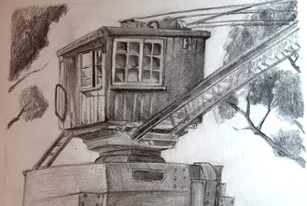
First, I found this crane looking machine and thought it would make a good composition. Since the metal part was large and mostly made of repeating forms, I decided that I would have the wooden box as the focus while cutting a bit from the steel crane, not drawing it whole. 


Photo taken on location - Abbey Pumping Station


I also added some trees in order to portray the surrounding environment too, to fit the theme of the task. The upper part was tilted and gave me some problems in terms of perspective; it still looks like the perspective is slightly wrong. Exaggerating the tilt might have helped if I think about it now, but I mostly strived to portray the object and its surroundings quickly, add some light and shadow, in order to inform my final drawing.

The next environment was a corner of a street, with laundry hanging from strings and a machine that I suppose helped with washing clothes, though I might be wrong. 

Photo taken on location - Abbey Pumping Station


The angle from where I was sitting was a bit tricky and it obstructed most of the scene, so I changed it to a view from slightly above. The scene made me think of poverty, of a poor district, and the idea of bringing forward that image stuck into my mind and grew. I could portray the less fortunate aspects of the industrial revolution. I held onto this idea and moved on to the last drawing, which was exactly the opposite. 

Photo taken on location - Abbey Pumping Station

This part of the museum looked like the entrance into a rich Victorian house, which made me imagine the possibility of portraying a night scene, maybe a cobblestone street lit by a lone lamp, producing a chiaroscuro lighting scenario that would then create an ominous, dark atmosphere. 


I only drew the rounded part of the building, since I found it most interesting. I also added the bushes and tree in order to fill in the blank space and show the environment surrounding the focal point. 

The Victorian era was quite the time of contrasts, where industrial development and the lush higher society clashed with the poverty ridden districts and child labor. I had ideas for portraying both of these worlds, so I pondered quite a while before I chose my theme. To be honest, I currently lean both towards a rich district street environment, as well as the poor back alley.
 

In the end, I chose to depict the poverty of a back alley from a poor district. 


Major Project - "Gold": Texturing The Zmeu

 The texturing for Zmeu was the most tedious out of all of them. I used fill layers and masks as much as possible to give the scales some de...