Showing posts with label Digital Art Practice. Show all posts

Thursday, 29 April 2021

Materials

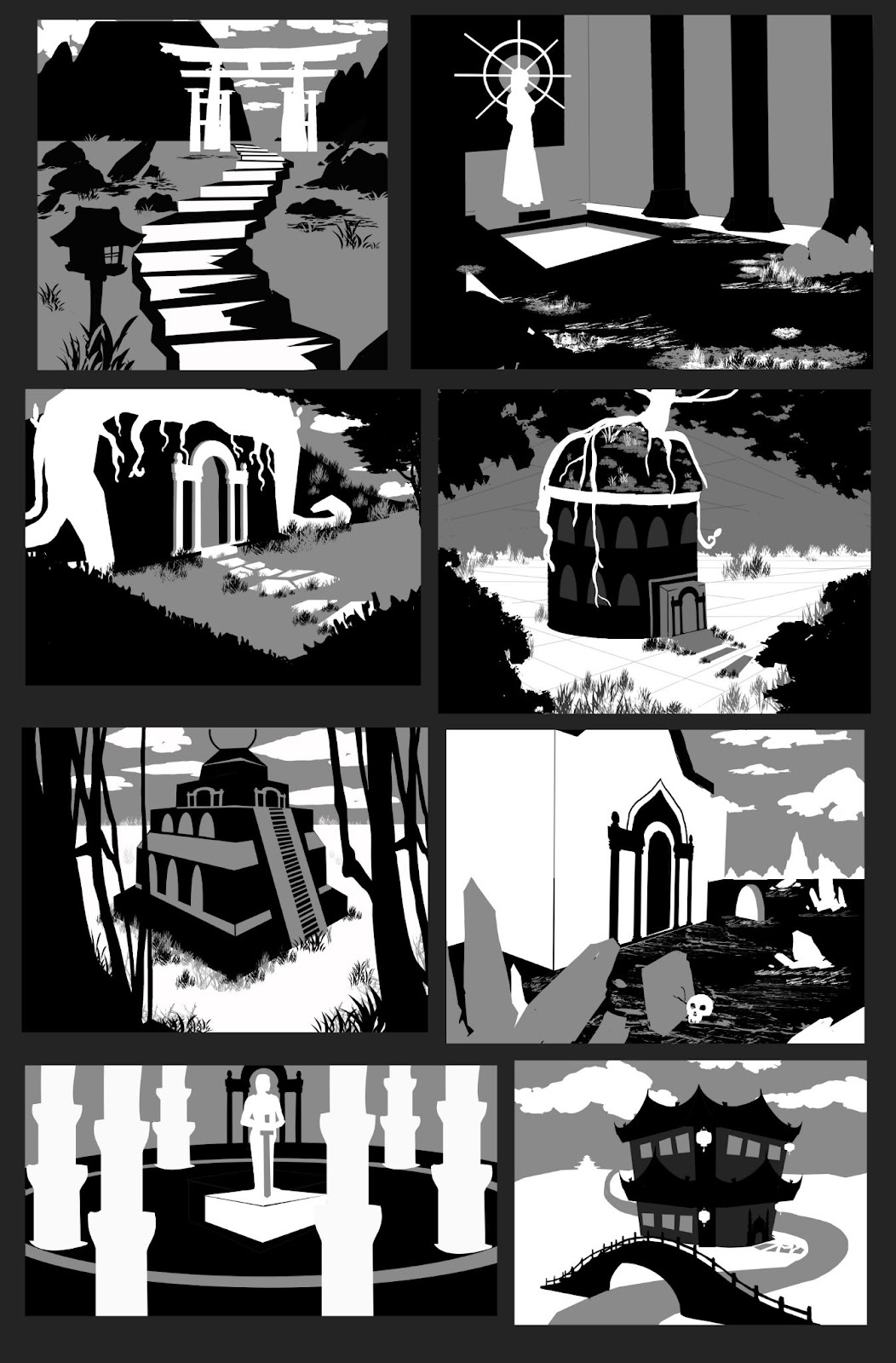
 For the materials project I started by making a potion bottle. At this point I wasn't really sure what I was doing and how to do a material study, how to observe these things. As a result, the final product looked quite stylized instead of realistic:


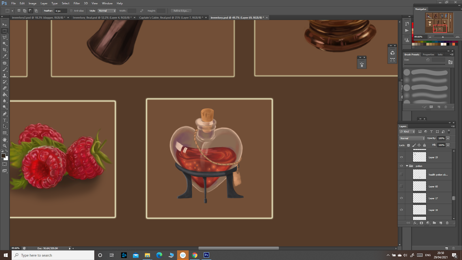
After the feedback though, and after studying more glass and gaining some experience, I come to understand how the glass reflects the light and how the highlights work, adding the impression of reflectivity. I then added some to my potion to make it look at least a bit more realistic. 


Also, for this whole project I must admit I didn’t use a very organised workflow, but rather one that might be considered destructive. I painted the studies like I would do traditionally, since I am more used to traditional painting than to photoshop. This being a study, I believe the observation and the learning outcome to be more important, so I continued like this for the next ones too. 


The dagger ended up looking a bit more realistic, but it still held that stylized look that I was trying to avoid. 


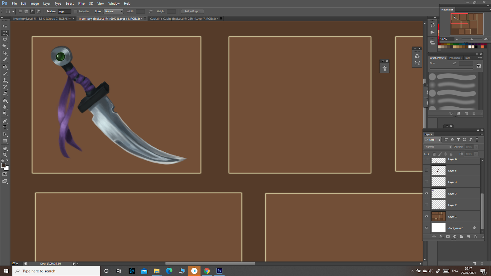
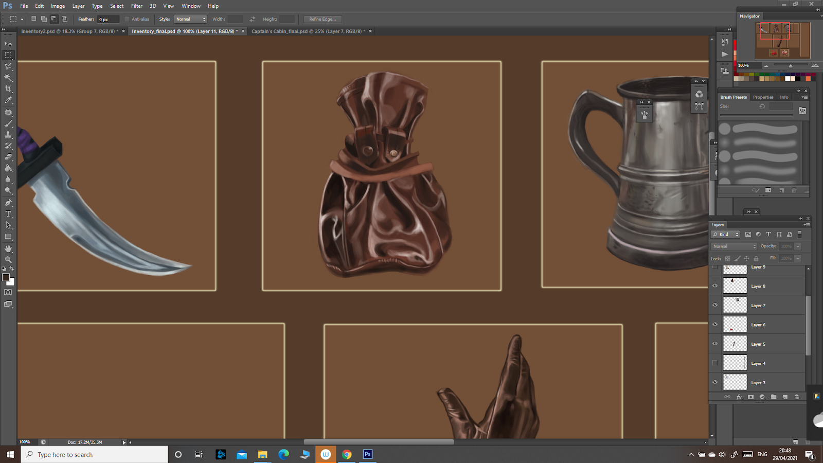
During this study, I observed how the metallic surface is affected by light, reflecting it. It was quite similar with the glass in terms of characteristics, since metal is also reflective. Still, as I noticed while studying this material, it’s reflectiveness depends on some properties such as how damaged/corroded the metal is. The dagger, being made from new metal, reflects the light more, creating lighter portions, especially on the sharp edge. 


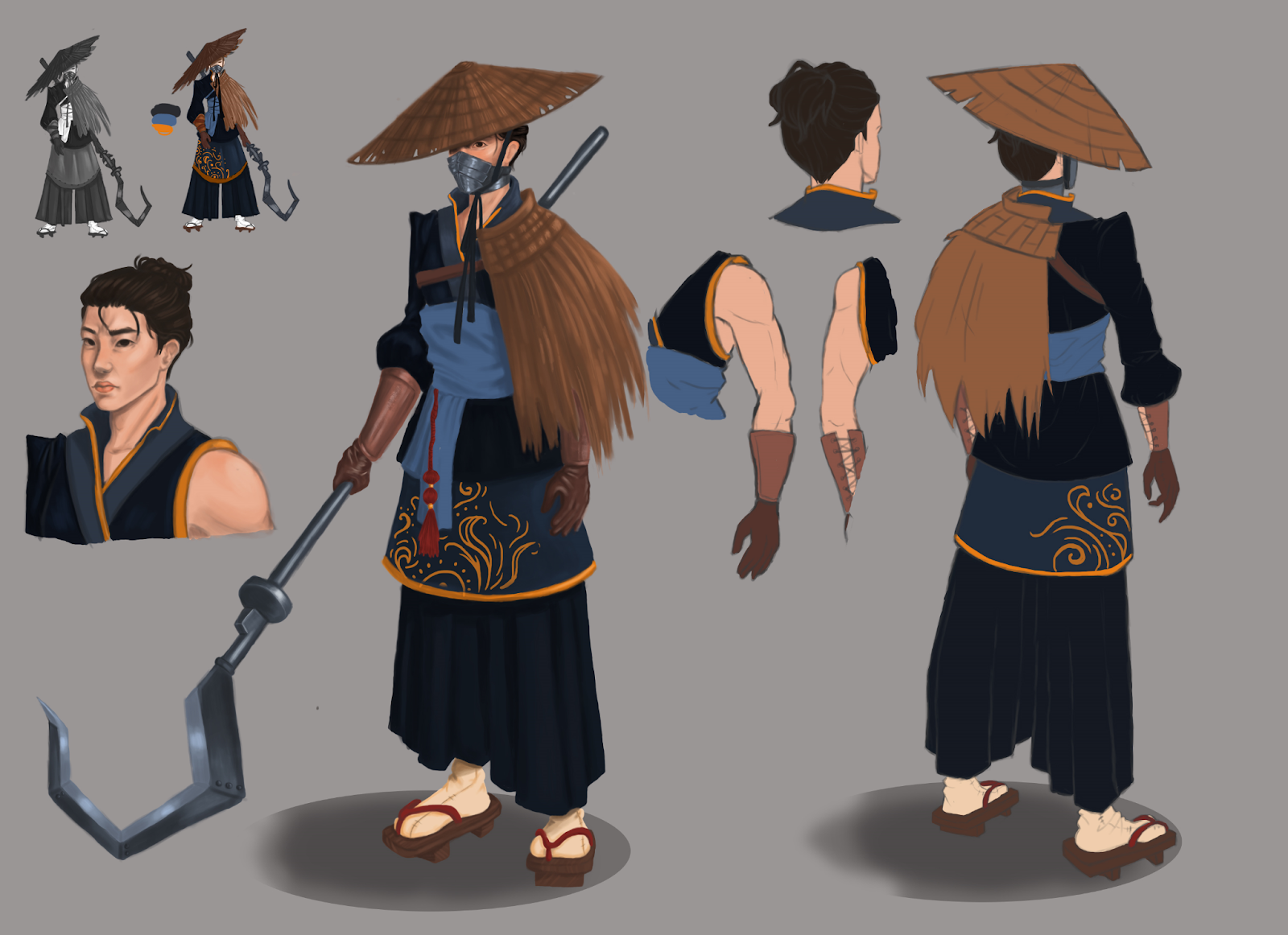
I then drew a spear and frankly, it was quite a disappointment:

It was simple and very stylized and didn’t reflect the properties of the materials it is made of. At the end of the studies I noticed how much it contrasted with the rest of the more detailed realistic objects. 


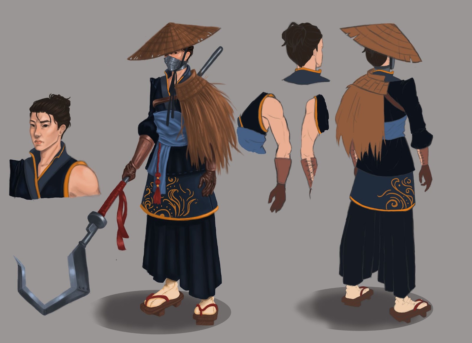
I decided to use what I learned to make it look at least a bit more decent:


It might not be perfect since it was a bit rushed, but at least in terms of the metal blade it looks a bit better.


 I went on to study the next material: leather. 


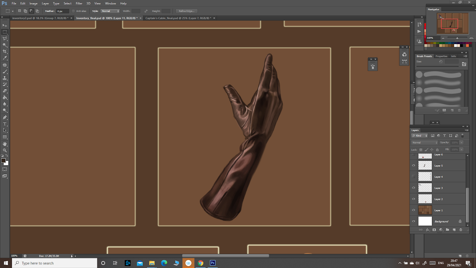
It is of course not as reflective as glass and metal, but it can still be a bit shiny depending on the type of leather. Also, the light and shadow depend on the folds and creases of the material. This study went well and I managed to achieve the realistic look I was going for. 

Next, I continued with leather and drew a leather pouch, which I am really pleased with:


I then took on a challenge in terms of detail:


Here, I observed the subsurface scattering in the raspberry at the front. The light, penetrating the rasberry, makes the colours on that part seem very bright, like they are burning. To recreate that, I used a very saturated colour. 


I then went back to drawing metal, this time a more damaged, scraped one, so it was less shiny then the dagger.


Next I drew an hourglass and continued studying metal and glass:


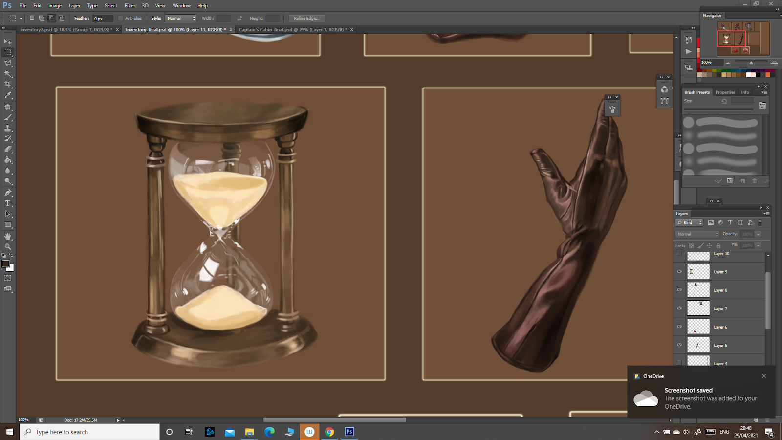
The improvements when drawing glass are clear here: the highlights are more detailed, following the form of the hourglass. Some are stronger, depending on how the light hits the surface. The metal is less reflective, scattering the light a bit more, so the highlights are weaker. 


The next drawing was a challenge in terms of detail:


Next, I drew a lamp:


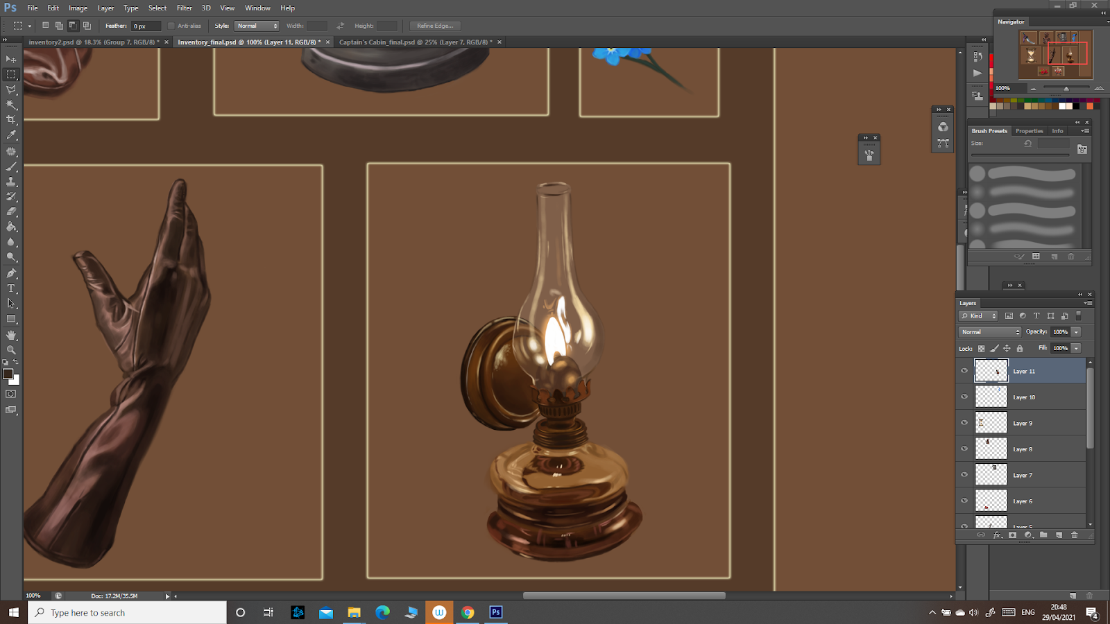
As for the other ones, the glass reflected the light strongly, especially since the light source is so close, and follows the form of the object. For the flame I used almost pure white, then added a yellowish glow with a soft brush. The metal was quite reflective too. 


This is the final outcome:


Three Point Perspective: Captain's Cabin

 For the three point perspective I already knew what I wanted to draw: a pirate captain’s cabin. I first put together a moodboard to get some inspiration:


I then made a few sketches to get a better idea of what I wanted to do:


I chose the second one since I found it to be the most interesting: the desk would be the focal point, with props and also the light source from the candle. 


Next, I drew the detailed, refined sketch:


I want to specify that the back wall is quite inclined not due to a perspective error, but because the captain’s cabin was usually at the back, where the ship wall had this specific form.


I started drawing the wooden planks with grayscale values and added a gradient to quickly get done the majority of the room:

I then rendered all the objects and the rest of the room:

After getting feedback, I added a pattern on the rug, a map on the wall since it was a bit plain and then used a mask to add a more dramatic lighting in the room. I also drew more candles to add more interest. This is the final outcome:


Two Point Perspective: Ancient Temple

 For the Ancient Temple it was unexpectedly harder to come up with ideas, so my moodboard was composed from scattered ideas:


I then made the notans:


I chose the second one, since I found it to be the most interesting. 


I then detailed it:

Though I am proud of the general idea, looking at the drawing I realised that the perspective is messed up in some part, especially for the columns: they seem to have their own vanishing point, different form the rest, and that makes them seem crooked and, well, generally wrong. I will keep this mistake in mind and make sure I will not repeat it. Also, I will practice the two point perspective more. 


One Point Perspective: Sci-Fi Corridor

 For the Sci-Fi corridor I started by making a moodboard to get some ideas:


I then went on to make eight notans. I was a bit worried since I was used with drawing characters, but not environment. Plus, I’ve never actually drawn something “sci-fi” so when I searched for ideas through my head, it was absolutely blank. Still, I used the moodboard and the internet to get some inspiration and made the notans:


I chose the bottom left one, since it had nice depth and I could make the pipes in front the focal point through detail. The windows on the ceiling also gave me the opportunity for interesting lighting.


I then made the detailed drawing. This was the final result:


One point perspective was quite easy, as expected, but the sci-fi theme challenged my creativity to go in a different direction to what it was used to.


Future Tribes

 For the Future Tribes project I had a few ideas from the beginning, which I put into some messy sketches:


My main idea was one of a world where humans live as tribes in isolated domes, sending warriors outside to scout the immediate area and hopefully slowly eliminate the danger that has initially forced them into hiding. Though I had this idea about a warrior monk, I prefered to keep the general idea (asian inspired future tribes character) and experiment more. So I made a moodboard:


I also put together a mood board with materials I could use for my character:

I then went on to make the iterations:

I chose a few that I liked best from these, dividing them by the category I meant them to be in a game: Ronin, Brawler, Assassin and Healer. I experimented with the warrior monk idea too, but I ended up choosing a completely different iteration.


I then detailed my favourite from those:

By this time, I already knew which one I would choose. To be quite fair, I had set my eyes on this one from the first iteration stage, but decided to experiment more just to be safe. I chose the top left ronin character since I liked its flow and the unique weapon. Then I experimented with the values:


I chose these three as my favourite values since I considered them to be the most clearly readable ones, with most contrast and punch. From these, I liked the first one best. 


I went on by experimenting with colour:

I liked the blue and orange one most and detailed it to see where I could go with it.


Next, I started sketching the character. Since my main interest has always been character art and I had taken some classes in drawing human proportions, I didn’t find drawing anatomy especially hard. Still, I made sure to double-check the proportions and use reference.


I added the details to the sketch, building up my character:


Then added colour and rendered it, adding the back and the cut-outs:

After getting feedback I added more detail on the straws as to show their texture, as well as on the gloves. I did my best to apply what I learned from the material studies. I also added a ribbon tied to the weapon so it would break up the monotony of the metallic surface. Also, I added some seams on the clothes to make them look more realistic:

Overall, I am quite proud of what I achieved during this project, and I will do my best to learn and do even better in the next ones.

Monday, 14 December 2020

Week 3: Treasure Chest

Everything about game art being new to me, I didn’t know anything about texturing, about working in Photoshop and then applying it to the 3D model, so all of this took a while. At first, it seemed overwhelming, like I couldn’t take in all of the information. There was always another problem waiting around the corner, but following the tutorials I managed to finish the treasure chest and understand the steps of texturing an object.

I first made a mood board to gather some ideas, figure out what I wanted my treasure chest to look like:


I set up my solid base and added a brown colour to the background for the padding, since I knew my treasure chest would be made of wood. 


I then started by blocking out the silhouettes of other details and adding some shadow at the base of the chest:


Then the shadow and implied lighting. Besides the fact I had to be careful to not go over the line with my selections, there were no problems with this step, just me figuring out more about Photoshop:


After this, I made the wood texture, starting with diffuse shadows and darkening them, then adding the lighter parts. I had a tendency of going too dark with my shadows, exaggerating them. I was careful to get a new layer every time I was darkening them so I could turn down the opacity if need be.


I then added the details for the metal:


And the colours, using gradient maps. I had problems figuring out how to apply the gradient and it took me a while to understand how it works, which gray corresponds with which colour I applied and so on:


Also, I drew the coins inside the chest separately, then duplicated them to cover the base of the treasure chest:


I admit I could have been a bit more creative with my treasure chest, but being new to all of this I first wanted to understand the basic steps following the tutorials and make sure I would finish the project in time.


Week 7: Cube World


When we first started the Cube World project, I honestly had no clue what I wanted it to be. No concept, no aesthetic, no idea. So I browsed for inspiration and slowly, the idea came: since we had the isometric grid and floating base, I wanted floating islands, maybe something that would inspire the feeling of a mysterious forest, trees with overgrown roots and maybe a round faerie gate, taking you to other magical places (or, in the case of a video game, another level perhaps). 


I started gathering images in my mood board and jotting down ideas, the main things I wanted to convey through my drawing of the Cube World, and also the ways I might be able to do that: 


After the mood board was done, I started sketching some ideas, figuring out what exactly I wanted my mysterious floating islands to look like. I knew I wanted them to seem like they have been dislodged from a bigger piece of land. I also wanted a tree that would grow over the stone gate, some floating steps that would lead from one island to the other and some details, some kind of objects that would make the space look less empty. this way, I ended up with my first sketch:


It was nice, but a bit simplistic and didn’t portray the sense of mystery I was looking for. Plus, it gave me a bit of a childish vibe. So I made more sketches. The second one, I went for a similar form, but linked the two islands through the roots. I made the tree a bit more massive and the foliage flatter so it fit in with the composition:


The third one, I went for a slightly different approach, to see how it would fit: 


It resembled more of a temple entrance, hidden into the trunk of an old tree, merging with its surroundings. I liked the idea, since it gave off an eerie feeling, making you ask yourself what could be hidden behind that entrance, but I wanted to keep the original one of the faerie gate. I was conflicted, so I placed them all on the same page to figure out which one I liked most, which had the best composition and conveyed what I wanted.


For the first one, though I liked the form of the tree hugging the gate, it was the first idea and it seemed too simple. The two islands didn’t connect enough in the composition, something that the other two did well. The second one I liked, especially the way only the base of the tree could be seen, extending upwards and disappearing, conveying the massiveness. Still, I liked the third one in the picture best, due to the way the islands are linked to each other by the roots of the tree, making the composition flow nicely. 


I took the sketch and started painting over it, starting with the flat colours and working my way through the drawing, building up the shadow, the light and details:


Some details, such as the floating stone to the right, the bird in the tree and the changing in the stairs' positioning were added after getting feedback, and helped make the composition more balanced and interesting.


While working on this project I had the chance of getting out of my comfort zone, since drawing environments has never been my strong point. I always prefered drawing characters, rather than places. I was scared at first, thinking that I would not succeed creating anything, but I worked on it and pushed through. Though still a bit messy, my workflow has improved a lot too since the treasure chest project, helping me work faster through this one.


Major Project - "Gold": Texturing The Zmeu

 The texturing for Zmeu was the most tedious out of all of them. I used fill layers and masks as much as possible to give the scales some de...