Showing posts with label 3D Game Production. Show all posts

Thursday, 29 April 2021

Going Forward

These days, knowing the first year is close to an end, I started thinking about the summer break and, of course, the second year. It was quite a challenge, the Game Art course, but it’s a challenge I would accept all over again and one that I will for sure take on next year too. 

During this year I learned a lot, not only about game art, but also about organising myself and my time. Next year, knowing what I know now about university life and game art, I want to manage my time even better and, honestly, stop panicking every time something goes even slightly wrong. I want to learn to calm down whenever that happens and find solutions with a clear mind. 

Over the summer break I will take on my own personal projects and also review everything I learned this year. I would also like to search for an internship, if possible, or at least do some activities that would add to my CV.

Creating games has proven to be more of a challenge than I had first expected, but it fascinated me and it still does. Maybe even more now. 

Honestly, at first I wasn’t sure this was what I wanted to do. It just sounded like something interesting to learn and something that would fit me seeing that I’ve been drawing and playing video games since I was little. Now, though, I know for sure. 


PBR Project: Fireplace

 For this project, my aim was to make a Hobbiton-like hearth, so I gathered some references for my moodboard, to get an idea of what it should look like and how I could accomplish it. 

I thought about how I would hit the requirements of the brief and made a 3Ds Max blockout:

The fireplace itself would of course be rock, there would be the wooden beams on the walls and the part of the fireplace where all the props are would also be wood. The piece in front of the fireplace would be metal, as to fit the requirements of the brief. The wall would be plaster. And, of course, there would be props: candles and books and the two paintings on the wall. 

During the process, though, I encountered problems while modelling the details in Zbrush: the file would not open at all. I figured it was because of how big it was, how much information the fireplace contained, so I had to make the choice of giving up on some details to make it work (while making sure it still hit the requirements, of course). 

Retopology, as well as Baking and texturing in Substance Painter was quite quick, though I must admit I could have done a better job. Given the circumstances of having been left with less time after the problems I had with the Zbrush program though, I would say they ended up looking fine in this situation. 

This is the final result, after making the fire effect too: 


Though I encountered some problems and maybe the Hobbiton-like hearth look might not have been completely achieved, I’m quite proud of what I made despite of the setbacks.


Gladiator: Lighting and Presentation

 In order to create the setting for taking the beauty shots of my gladiator, I researched the 3-point light setup:

Key Light - a bright light that emphasizes the form and dimensions of the subject. It must be the brightest light in the setting.

Fill Light - set opposite of the key light; has the role of filling the dark shadows cast by the bright key light. 

Rim Light - placed behind the object. Adds a light outline to the subject.  

With this information, I went on to place my character in Unreal and take the screenshots:

Gladiator: Final Steps

 In terms of unwrap, being quite an organic and complex form, it was a difficult and long process, making sure that the seams would be as hidden as possible, that the checker pattern was even and as unwarped as possible. Unwrapping and straightening the hand UVs took an especially long time. 

When texturing, it was even more complicated, since I had to always check the model to see if the textures fit it. The face was most difficult: at the beginning it looked absolutely horrendous and I was scared I would not be able to make it look like an actual human being. But after a while, with a little bit of work and some references, the results started to show and I found the process quite enjoyable. During it, I also searched for how professionals do the texturing of a low poly character: I looked mostly at league of legends characters’ textures and World of Warcraft ones. 

This was the result:

The rigging and skinning went well too, though they were a detailed process, especially doing and correcting the skinning while looking at the animation. Not all the movements looked completely natural, but I would say I managed to make it look decent and prevent most of the clipping and other major problems.


Gladiator: Initial Ideas and Moodboard

For the Gladiator I didn’t really set many expectations. I knew, being something new, my initial plans would not survive through all the setbacks until the end, especially since I tend to set high expectations for my work. Knowing that, I decided to go with the flow, not setting a definite design, and let myself explore all the possibilities. The only thing I knew for sure is that I wanted my gladiator to be female.

Of course, I did my research beforehand, so I would have an idea of what a gladiator looks like, and put together a mood board.

I searched for some historically accurate photos and information, but also for some designs from video games like Assassin’s Creed Odyssey. Though it might not be about roman gladiators, the design was similar in some aspects and I knew I wanted my female gladiator to have the same fierce vibe as Kassandra from the game. 

What I observed is that most gladiators weren’t fully armoured, since, historically speaking, the people that organised the fights were looking for exactly that: bloodshed to entertain the public. Also, the main colours that make people think immediately about gladiators and Ancient Rome are red and gold, sometimes white. The materials for the armour seem to be leather and bronze (or at least the armor has a bronze like colour). The gladiators fought with a two edged sword called Gladius and sometimes a short dagger called Pugio. 

Having this information, I went on to build my gladiator.


Gladiator: Mid-Project Reflection

 While Modelling the gladiator I didn’t face many major setbacks. I found modelling the face of the character easier than I had expected and understood pretty much how the loops on the face should come together, although I’m sure I would need more practice to learn to work quicker and for my modelling to go smooth.  The body was even easier, since every part started out as simple forms like cylinders and boxes. The hands were a bit more complicated, I must admit, and they took me longer to make. Also, at the end of modelling the general form, I used some anatomy references from the internet in order to make the body look more accurate. Especially the legs, which looked like very stiff cylinders at the beginning.

The armour was also easy to make. I used mostly the step build method to make the armour fit the body better. Welding the armour to the body I encountered a few problems here and there, missing polygons or triangulation problems, but I got over them and reached the final model:


My initial model didn’t have the strap on the right shoulder, but I decided to put it there so that the seam I would place there when unwrapping the model’s head and neck would not be that visible. It didn’t look bad, visually speaking, so I kept it.


Thursday, 31 December 2020

Project Post-Mortem

It might be a bit late for this, but since the year hasn't yet ended I'd like to believe it isn't. The end of term was complete chaos for me, filled with stress and panic. I'm not good at managing stress, so being aware of this, I should have made sure I didn't end up in this situation. Therefore, before the year ends, I want to look back on my progress and find ways of oganising myself better. Because, if there is one thing I would do for next term, is manage my time more efficiently. 

For my projects, I tried making a plan, but, as I probably mentioned in the Shop Front Project post, it was quite vague and didn't have specific steps for me to follow in order to not fall behind. I always ended up working a lot for one module and neglecting the others, which in return made me slowly fall behind on most things. So, for next term, I am going to organise myself better and make sure I don't make the same mistakes. 

Though Game Art is hard, it wasn't as hard as I worried it would be. Even so, everything was overwhelming this year. Besides it being my first year at university, a new experience, it was also marked by special circumstances and I think this, combined with the lack of organisation, led me to fall behind, panic, and overwork myself in the last few weeks before the deadline. 

Next term, I am going to make a strict squedule for myself and follow it, making sure I don't ever fall behind on my work again. Also, I will catch up with the writing for the blog and do my best in order to make sure the next term will be better than this one. 


Friday, 18 December 2020

Project: Shop Front

Starting the project, I felt a bit overwhelmed. I didn’t feel like I had enough experience to build something as big and as complex as a building in 3Ds Max. It seemed complicated and I was worrying that I wouldn’t manage it. Still, I found that it was a matter of stacking boxes on top of each other and making them look like a house through carefully chosen placement and textures. Checking for unnecessary or weird geometry was also important. 

I wanted my shop to be unique, so I chose to model a fortuneteller’s shop. As always, I started by gathering ideas in a mood board: 

Since fortuneteller’s in most media are portrayed as excentric and unique people, I wanted my house to reflect that: it had to be something very colourful, with an interesting shape. Maybe a bit hippie and overall look intriguing. With the mood boards, my biggest problem is that I get ideas, I know what I want to do with them, but I can’t find the words to write clearly on the page and I mostly need to work on the way I organize my projects. 

Having gathered the ideas, I wanted to get a clearer image of what I was going for, so I quickly sketched something in a random notebook:


From the first page, I liked the idea of a wagon, a house on wheels, because it implies the owner moves a lot, and fortune tellers are usually travelers, moving from place to place. Still, the form of the house was a bit too simple, too perfectly geometrical and I didn’t quite like that. So, in the second and third pages I tried varying the form.

After getting a clearer image of what I intended to do for my shop, I painted my textures, using the references I had gathered in my mood board. 

I started with the brick wall texture:


It turned out fine, without any problems on the way, and I managed to paint it quicker than I had expected. Looking at it now though, I would have straightened out those slightly diagonal lines. I think it would have looked way better, especially when it tiles. 

The second one was the roof tile, which I like how it turned out the most:


It looks colourful, and the flowers give off that magical, easy-going, excentric impression, like the owner of the house is used to living in nature and doesn’t mind a bit of colour and spontaneity in their lives. I don’t think there’s anything I would have done differently for this one, Though maybe I should have checked how it tiles in the earlier phases, since it took longer to correct later. It is something I’ll keep in mind from now on. 

The next one was the plaster:

The colour seems a bit dirty, greish, so that’s something I would change now. Otherwise, it was a simple texture to make and I finished it quickly, though I had a tendency of making the cracks too dark and it looked visually tiring on the model. I had to change the opacity of the shadow layer.

I proceeded with the details such as the wood beams and windows:

I wasted a lot of time on this, worrying about how it looked, trying to make it perfect. I ended up not using some of the space I had on the texture sheet, so that is something I will need to work on in the future. I worried about how the windows looked in Photoshop, they seemed too simple and I wanted everything to look perfect from the beginning, which slowed me down. Turned out, the windows looked quite okay on the model and I was worrying for nothing. I like how the wood beams, especially the ornate ones look, though. I made the grass for the plane underneath the house last, so it looks a bit stretched on the model. I’ll have to organize the space on the texture sheet better and think in advance what I’m going to do with it. 

The last texture sheet was the one for the props, which I made after I finished modeling the house, unwrapping the objects first and using the method we used for the treasure chest:

In my opinion, the texture sheet looks messy, but the textures looked alright on the model and since I didn’t have that much time left on my hands anymore I left it like this. Doing the texture for the crystal globe was the hardest part (that and organising my layers, if I’m being honest), since I didn’t really know how to properly unwrap a sphere. In the end, through trial and error, I managed to make it look right.

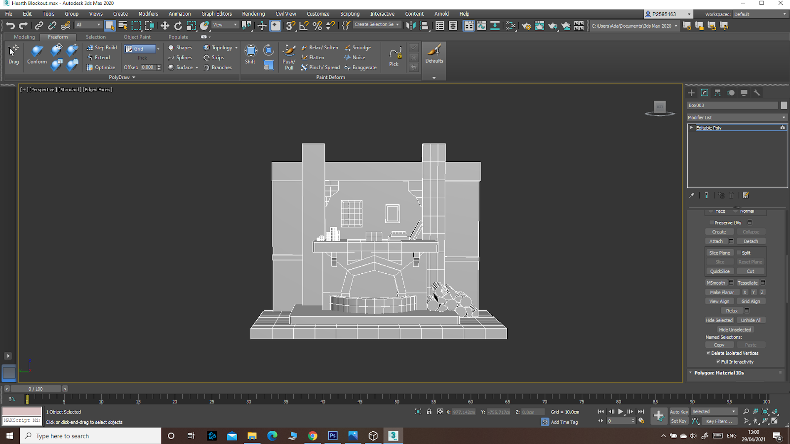
As for modeling, I first brought my textures into 3Ds Max and made the main body for the house: the walls and roof. Then I made all the other pieces: wood beams, door, windows and wheels and put them all together. I still didn’t have an exact image of what the shape of my house would be, just a vague idea, but I moved the pieces around until I was pleased. Before the first feedback, my house wasn’t well balanced: if it were a real house, it would have collapsed. So I followed the advice and added more pieces to balance it:

I then proceeded to build up the rest of the house, add more beams and do my best to match the tris limit. I then modeled the props and the plane on which the house would stand and, after finishing the props’ texture I added that too. The most difficult part was reaching the limit and respecting the budget. I also had some unnecessary geometry I had to erase, and it caused problems when it came to the tris and polygon count. I will have to remember to always check for that during the process and not only at the end. I also had some shading problems with the roof after I cut out the 3D tiles, but I solved it by detaching the tiles and erasing the cut out forms, flattening the roof. 

This was the final model:


Overall, it turned out better than I expected, though I really need to organize myself, make a plan for projects and stick with it. I had made one, but it wasn’t a clear, structured one and, though it helped me figure out what I still had to get done and how far I was behind with my work, since it wasn’t a fixed schedule, I always ended up not following through with what I had decided. So organization and a cleaner workflow are the things that I need to work on the most. 

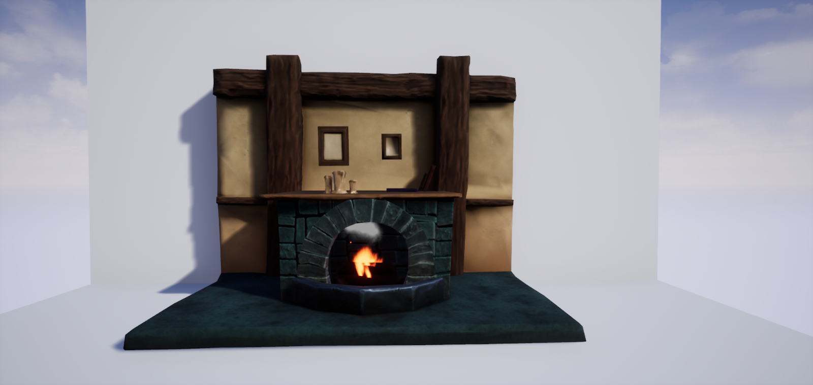
And this is the model after I imported it into the Unreal Engine:


Wednesday, 14 October 2020

World of 3D


Since I am barely getting into 3Ds Max and Game Art, I didn’t know many 3D artists and artworks. So I decided to do my research and check out 3D works on sites like Artstation. After a bit of scrolling around through them, I chose to blog about this character model, since I like it the most of what I’ve seen. 

I’ve always been more interested in character art than anything else, so there is no surprise to me I chose a character to blog about. Even so, this wasn’t the only thing that prompted me to this. Since my current art style is a bit more on the cartoony side (more towards the Overwatch art style, rather than the Assassin’s Creed one, for example), it caught my attention before the other equally good, but more realistic artworks. I think this style fits the fantasy concept well, giving off a fun and lighthearted vibe.


I love how the lower part of the composition, more massive due to the cape, large boots and even pieces of armour on the knees that are slightly bigger than the ones on the upper part, contrast with the thinner, smaller torso. Despite this, the use of orange, complementary to the blue used on the rest of the character, and the overall warmer tones contrasting to the rest of the composition (which uses colder colours) points the viewer’s attention to the face and expression of the character. Even more, it uses only the metallic texture on the armour, suggesting the other materials (the clothes, the wood of the wand, etc.) through form rather than textures.


Overall, I find the composition beautiful through its simplicity and use of carefully placed details that create centers of interest.  


I also love the overall design of the cute little fairy companion ^^


Original Artist: Etienne Beschet

https://www.artstation.com/artwork/YawoGK 


Major Project - "Gold": Texturing The Zmeu

 The texturing for Zmeu was the most tedious out of all of them. I used fill layers and masks as much as possible to give the scales some de...