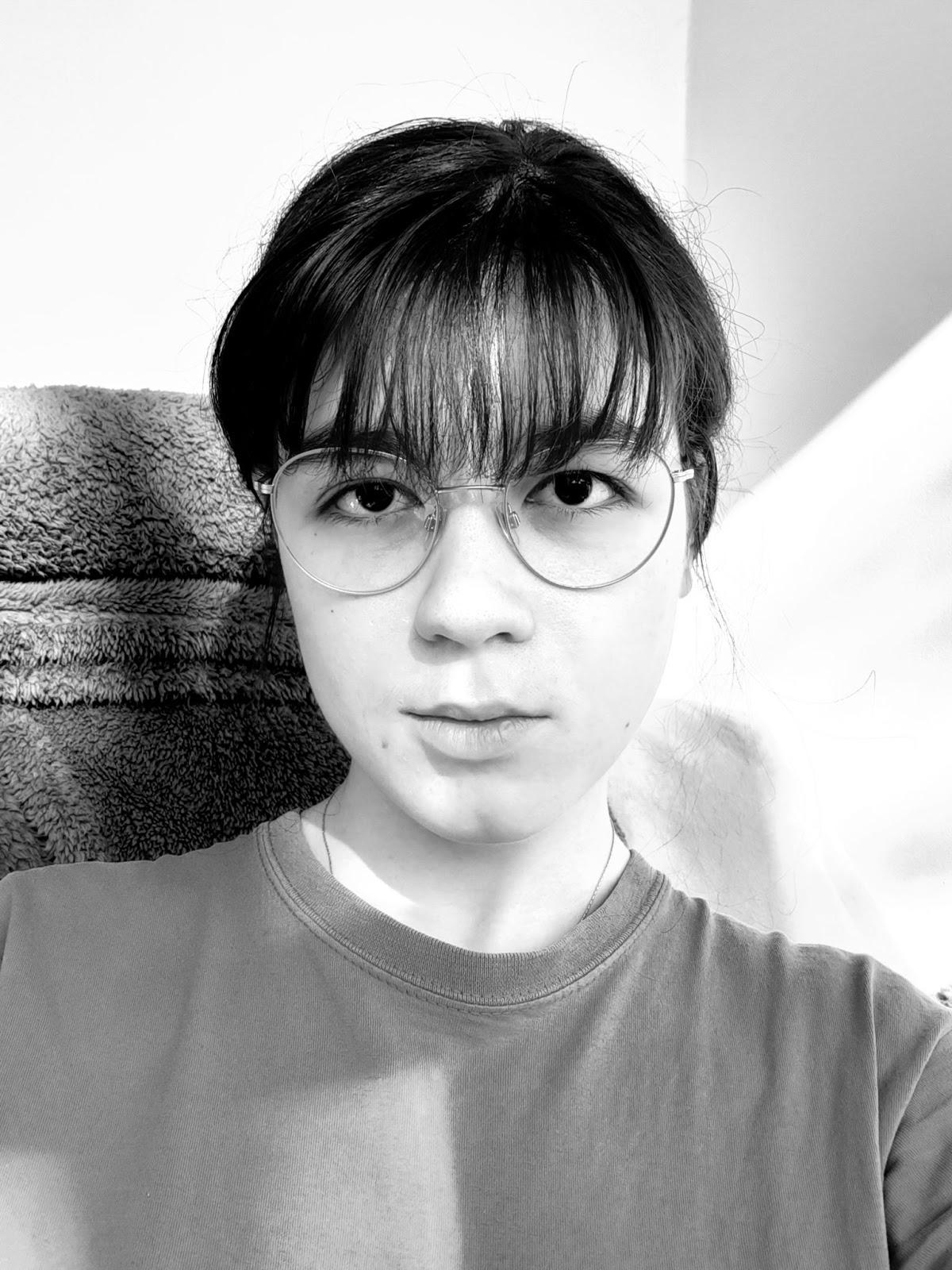
This task was quite scary for me. I had tried to draw my self portrait before. I was younger and had less practice, yes, but for me, when drawing my portrait, my own perception of myself and the way I look plays a big role, influencing my view. I was worried this might be the case this time too, but I did my best to keep it as accurate as possible by always checking my measurements twice.
This was the reference:
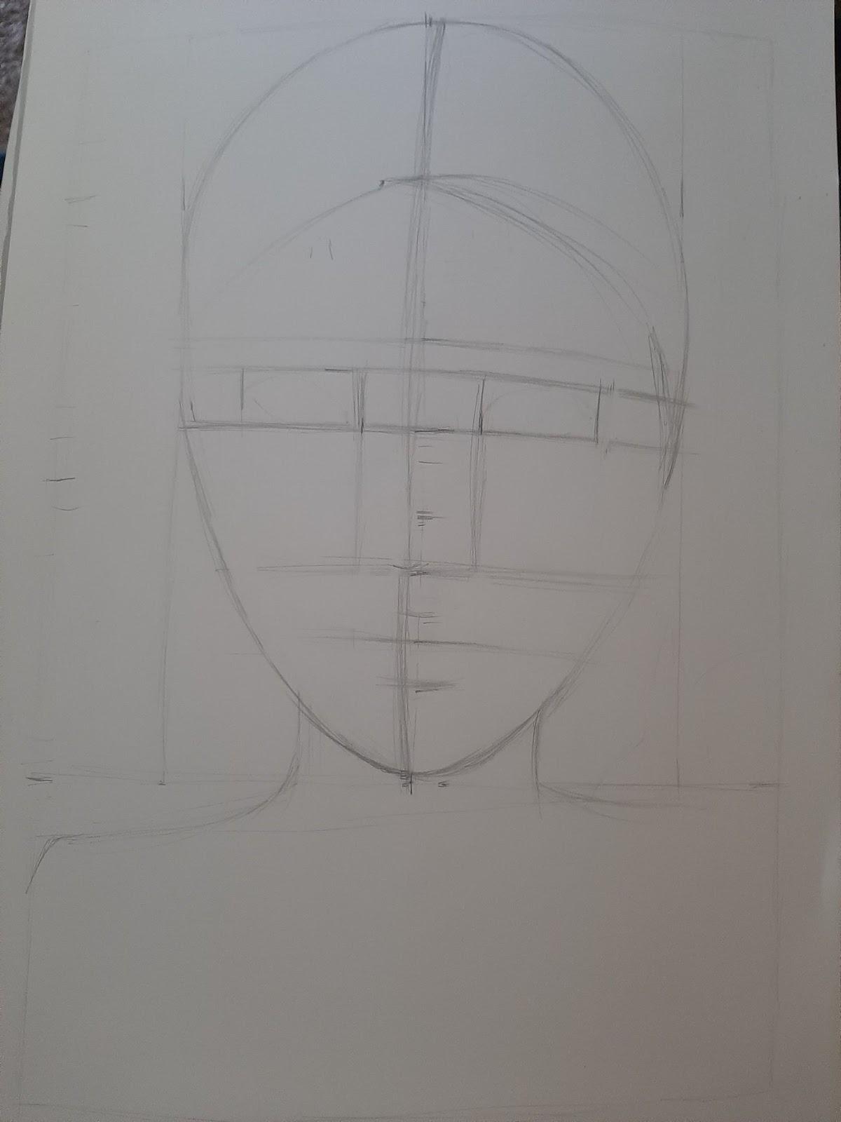
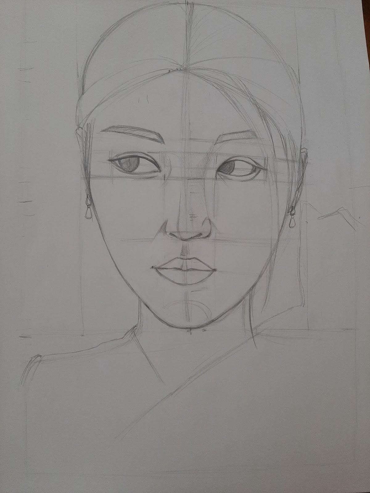
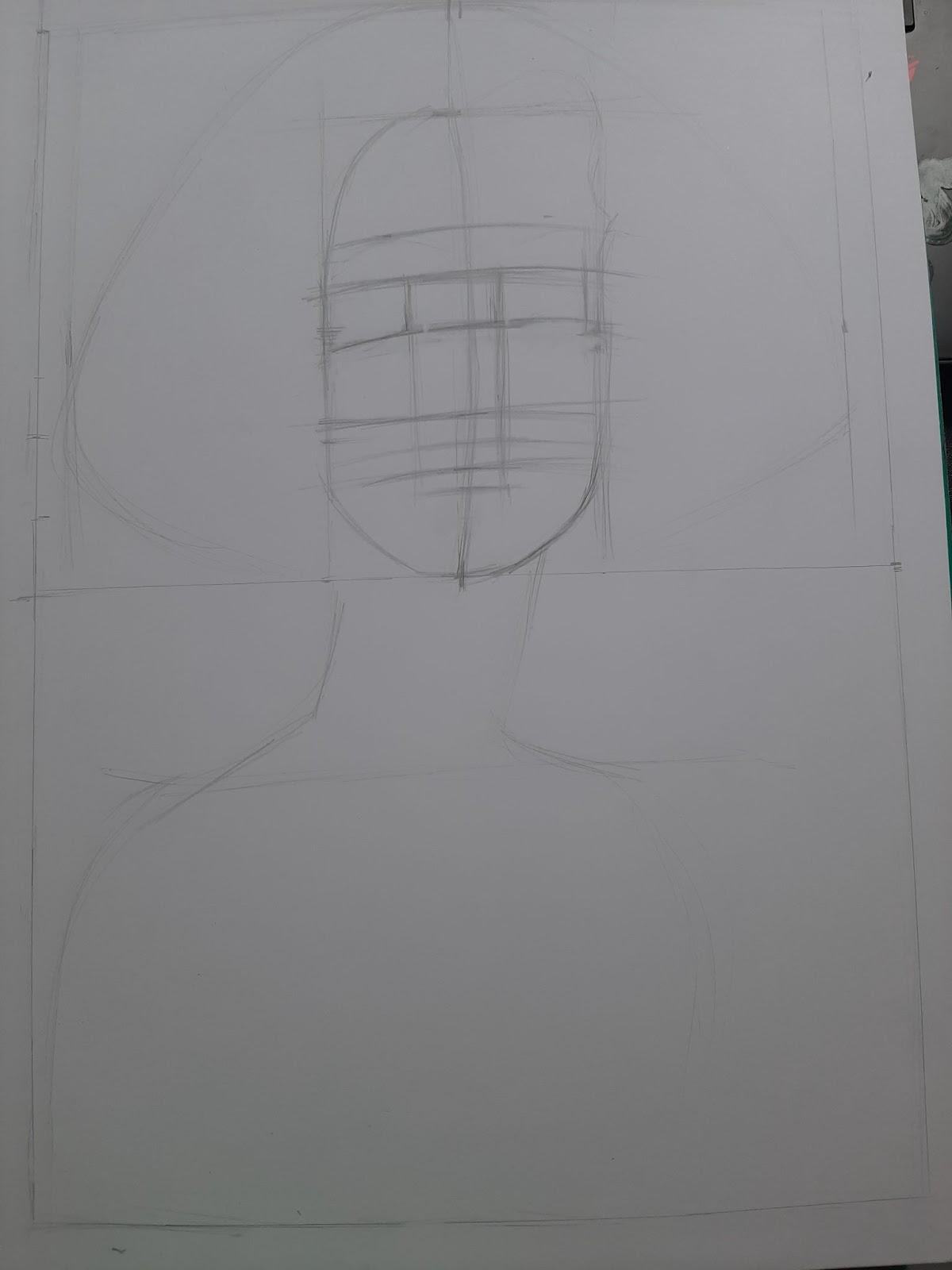
I blocked out the proportions first, then sketched the face:

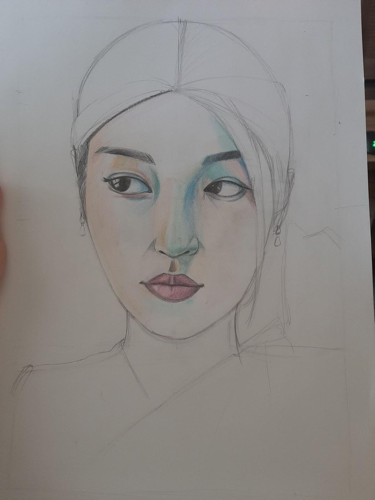
I then started to shade:

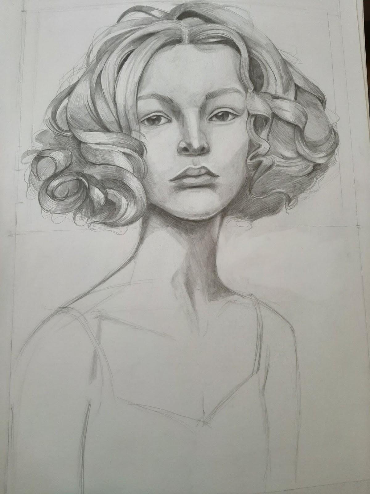
This was the first version of the drawing, before getting the first feedback:
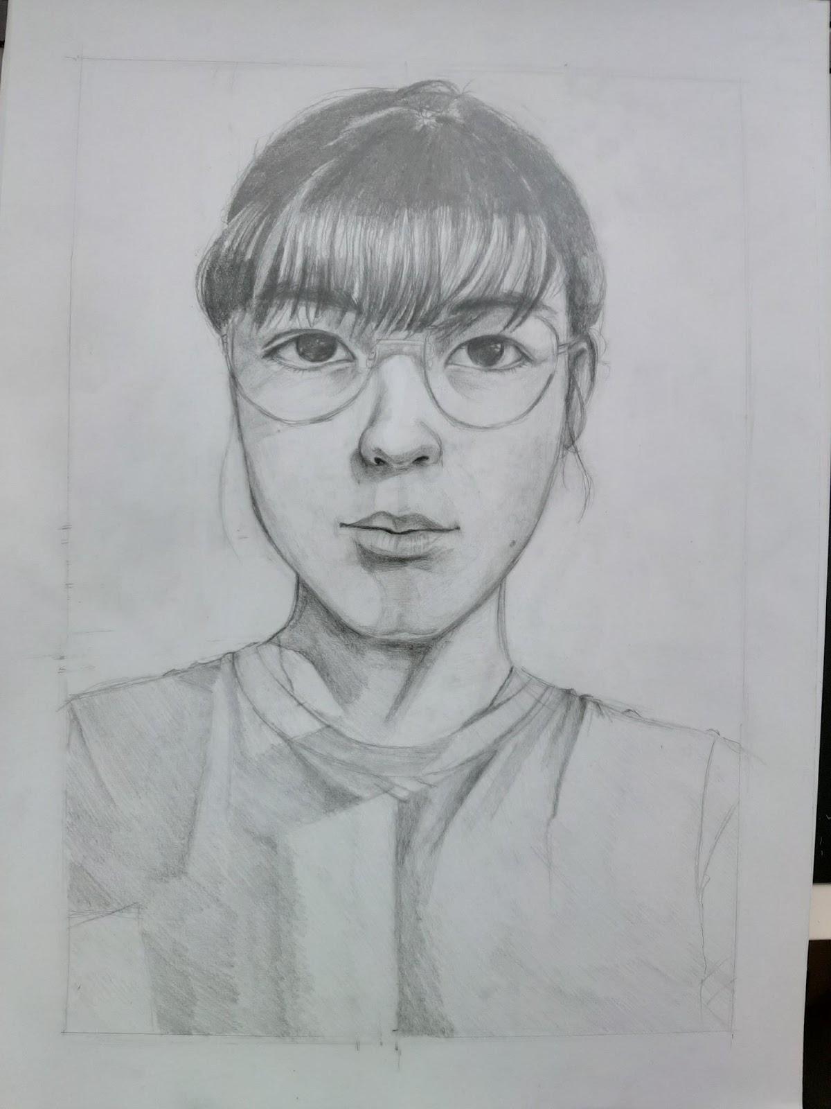
The eyes were flat and the nostrils were different, while the shadow at the base of the nose should have been darker. Also, the bounce light on the nose was too strong and the lips looked flat, so I enhanced the shadow on the lips, especially on the top one since the light doesn’t hit it as strongly as on the bottom one. The ear was also a bit too high, it should have ended approximately at the height of the nose. I also had to enhance the shadow of the glasses.
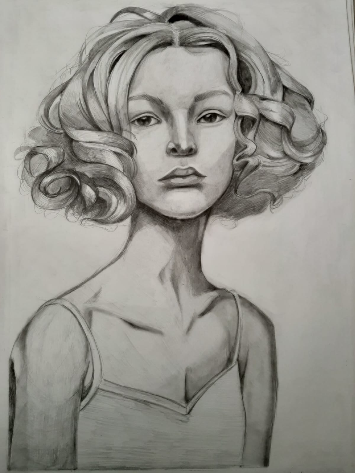
This was the drawing after applying the first feedback:
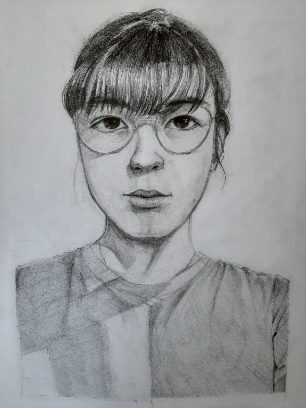
The shadow on the side of the nose was a bit too small, too abrupt, so I enhanced it. The shadow cast by the glasses needed to be a bit darker too and the shadow at the base of the nose even stronger. I also made the shirt slowly disappear towards the bottom to make sure the focus is on the face.
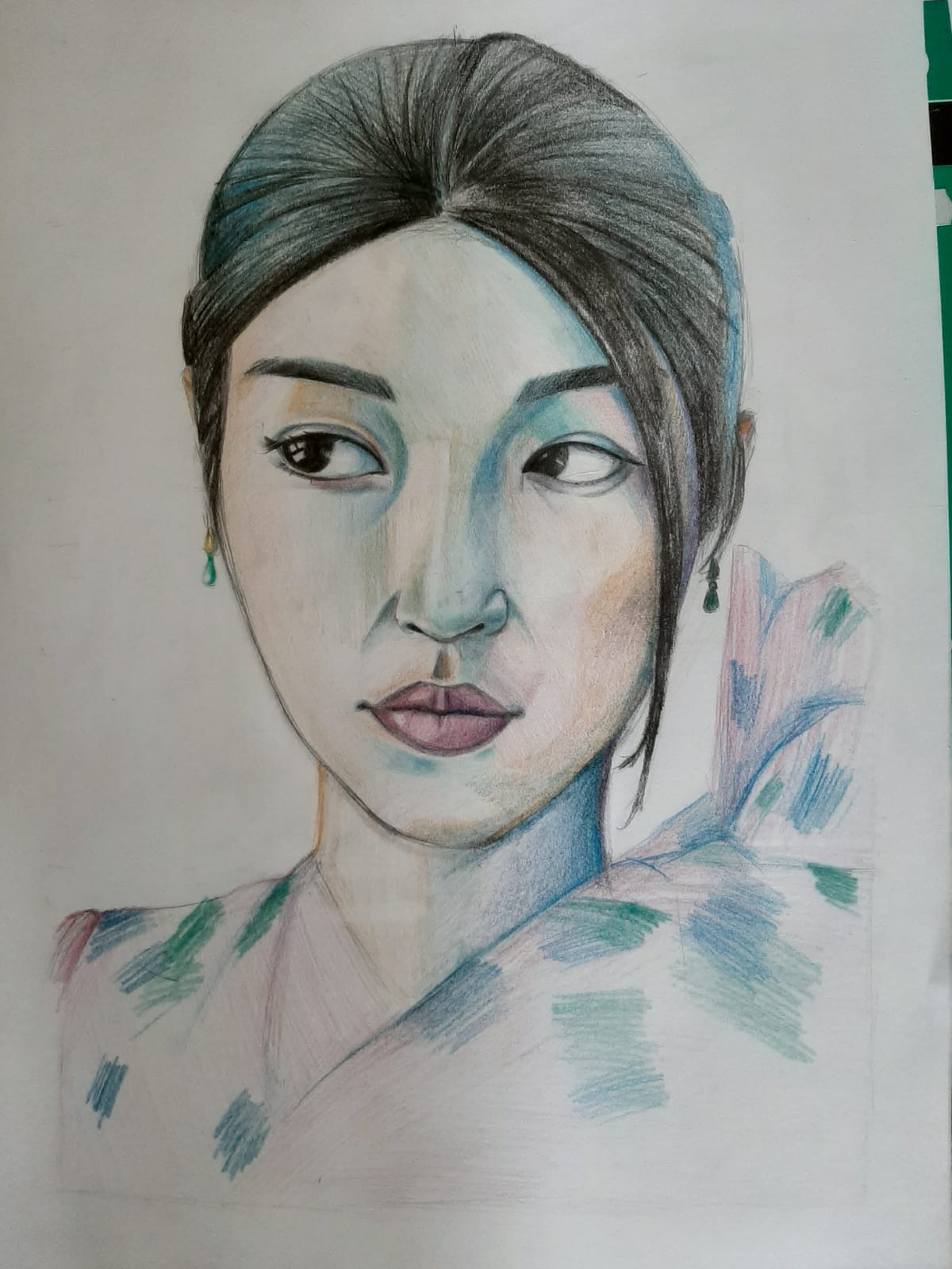
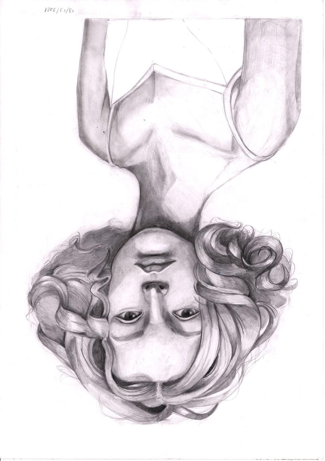
This was the final result:
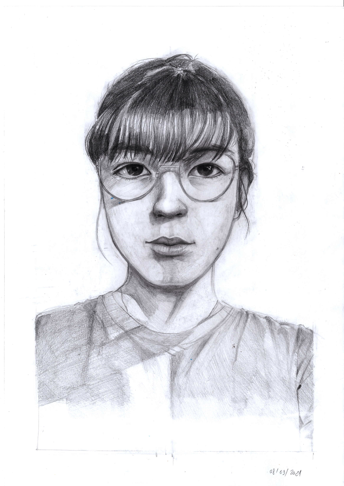
For the first time I managed to make my self portrait actually resemble me, even if it might not be perfect. This is quite a success for me.