Tuesday, 9 November 2021

Horde Survival Vehicle Research & High Concept

For the Horde Survival Vehicle I wanted something unique, that I would be excited to work on. I first thought of doing something sci-fi, a few years in the future, before I found out that we could also go back in time, until the year when cars were invented. That's how the idea of a demon apocalypse at the beginning of the 20th Century came up. The vintage feel of those times as well as the mentality of people, who were more religious back then, could fit together into this concept, in my opinion: the creatures might or might not be actual demons, but what matters is how the people fighting them perceive them because, besides the means and weapons to defeat them, there will be glimpses of their beliefs and religion in their surroundings. Therefore, in the design of the vehicles the characters use too. 

So, I'm looking for a vintage, not exactly steampunk but close to it, dystopic and gothic atmosphere. 

For this, I made a moodboard to convey this aesthetic and get a better idea about it. 


I also added some images that I think might be reprezentative for the driver: a 20th Century classy widow driving to save her daughter. I believe that characters are the ones that drive the plot and affect the world, so she was the first thing I started to think about and ellaborate. Sure enough, all the other ideas came rushing and came together quickly after this. 

While figuring out my story world and aesthetic, I also gathered images of how my final work would look in terms of style and presentation.


I obviously want this look of a makeshift survival vehicle. My character, my driver, is not an engineer, but a mother desperate to save her daughter and, of course, she wouldn't have the means of puting together something more than this. Of course, as the brief requires, the style will be realistic. I also saved some photos for how I'd like my sketches to be presented, since I want them too to be readable and clean. 

While doing this, I also wrote down the answers to the questions about my high concept and will continue to add to it as I go and ideas come up:

General Idea – 20th Century. The world is on its way to modernity. Steam is being replaced by electricity. Fashion is thriving. Women get the right to vote.

And demons are spawning from beneath the ground, ravaging the whole world…

What a great time to be alive! (at least for now)

-          I want to blend the stylish feel of the 20th century with the horrors of going through a demon apocalypse. I believe the contrast would be an interesting point to base the design around. 


a.       Style – Realism

b.      Where in the world are they driving? – 19th – 20th Century European cities ravaged by demons (torn down buildings and swarms of demons running around)

c.       When are they driving? What year is it? – end of the 19th century, beginning of the 20th maybe not sure yet

d.      Who is driving? – high class lady who had to toughen up to survive, but didn’t lose her elegance and class hehe. Husband was eaten by demons (unfortunate, really). She went a bit bonkers probably.

Or

Bus driver in the 20th Century trying to get to safety (note: discarded this idea because it simply doesn't have as much soul as the other, didn't evolve as quickly as the other and doesn't make me as excited to work on it.)

e.       The enemy - Demons: crawling out of the ground, the smaller ones, the imps, go around in swarms, they don’t grow over 1 meter. The swarms have a bigger demon, ogre-like, that leads them; can be more than 2 m tall and are massive, but are quite slow and dumb.

f.        Why are they driving? Where are they going? – She’s driving to the boarding school that she sent her daughter to and that is being assaulted by demons, to rescue her.

g.      Vulnerability – Though this is really a minor point: What are your persons/vehicles vulnerability?

-          Parts thrown together in a rush: an extra engine might be attached to the car through pipes and mechanisms, but it will be vulnerable since it’s not covered by anything.  


The 20th century helpful info and research:

-          Steam was slowly being replaced by electricity

-          - Transport became petrol engine powered

-          - Women were still regarded as objects in some circles, though they have aquired the right to vote


-           


Monday, 8 November 2021

Week 5 - Urban Exploration. Lighting, Colour and Mood

With the preparatory sketches done, I had several ideas: if I were to use the first drawing I could draw an industrial area, with cranes and machines. The second one could represent, as mentioned in the last post, a poor Victorian neighbourhood, while the third one could be the exact opposite: a rich district street with a menacing mood induced by a chiaroscuro lighting scenario. 

The contrast between the poor and the rich in that period was what stuck with me after doing some research (and wandering around Assassin's Creed Syndicate's environment to get some inspiration). I felt like the industrial area environment wouldn't be able to tell as much of a compelling story of the disparity between classes, so I discarded it quite early in my process. I proceeded to draw some thumbnail for the poor district environment and the rich street one. 


This helped me make the decision of proceeding with the laundry street, since I found the scene more interesting and able to tell the story of its inhabitants better. The objects are distributed in the foreground and background of the page evenly, creating the impression of depth. Moreover, I think it gives me more opportunities of storytelling through details. 

In the left corner I changed the scene a bit to show more of the buildings and give more space so I wouldn't have to cut the pot at the bottom of the page. It looked way better and less crammed than the first thumbnail, so I ended up going with that option. 

I began by sketching out the scene. I added some details such as the broken window to create more interest since I felt like that wall in the foreground was too empty. I saw the opportunity of illustrating poverty through the state that the buildings are in. I did this with the broken shutters of the window farther away too. 


I decided that the light source would be the two windows to the left, candlelight seeping through them into the dark street. I started shading while keeping this in mind and tried to keep a high contrast between light and shadow while doing so:


I quite like how the folds on the clothes ended up. There is variety in the tones of gray and they don't look overworked, like I usually tended to do with the light objects. Moreover, they contrast with the darker surroundings. 


I faded the top of the buildings, since they didn't add anything interesting to the composition, so that the points of interest, the street and the objects populating it, would remain the focus. 


I really like the lighting since it casts interesting shadows on the ground, but I thought the scene could use more contrast. The ground was also very plain so I added some cobblestones, only a few, so it wouldn't end up looking too busy or overworked. This was the final result:


After the feedback, I fixed the weird shadow of the pants as best as I could and darkened the back of the street in order to direct the attention to the foreground. I also did my best to add more detail and contrast on the hanged clothes.

This is the final result:


Looking back, I could have added more contrast in order to properly achieve the mood I was aiming for: a depressing, almost scary night scene. In my drawing, things are a little bit to bright, and the objects close to the back of the alley could have been obscured more by shadow. Otherwise, I really like how the details of the clothes turned out, as well as the machine on the left. 


Sunday, 7 November 2021

Week 4 - Urban exploration. Victorian architecture

 The trip to Abbey Pumping Station Museum was truly informative, not only in regard to drawing, but also my knowledge about the Victorian era. It gave me an idea of the mood those times had, the vibe I should convey into my final drawing. 

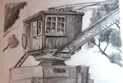
First, I found this crane looking machine and thought it would make a good composition. Since the metal part was large and mostly made of repeating forms, I decided that I would have the wooden box as the focus while cutting a bit from the steel crane, not drawing it whole. 


Photo taken on location - Abbey Pumping Station


I also added some trees in order to portray the surrounding environment too, to fit the theme of the task. The upper part was tilted and gave me some problems in terms of perspective; it still looks like the perspective is slightly wrong. Exaggerating the tilt might have helped if I think about it now, but I mostly strived to portray the object and its surroundings quickly, add some light and shadow, in order to inform my final drawing.

The next environment was a corner of a street, with laundry hanging from strings and a machine that I suppose helped with washing clothes, though I might be wrong. 

Photo taken on location - Abbey Pumping Station


The angle from where I was sitting was a bit tricky and it obstructed most of the scene, so I changed it to a view from slightly above. The scene made me think of poverty, of a poor district, and the idea of bringing forward that image stuck into my mind and grew. I could portray the less fortunate aspects of the industrial revolution. I held onto this idea and moved on to the last drawing, which was exactly the opposite. 

Photo taken on location - Abbey Pumping Station

This part of the museum looked like the entrance into a rich Victorian house, which made me imagine the possibility of portraying a night scene, maybe a cobblestone street lit by a lone lamp, producing a chiaroscuro lighting scenario that would then create an ominous, dark atmosphere. 


I only drew the rounded part of the building, since I found it most interesting. I also added the bushes and tree in order to fill in the blank space and show the environment surrounding the focal point. 

The Victorian era was quite the time of contrasts, where industrial development and the lush higher society clashed with the poverty ridden districts and child labor. I had ideas for portraying both of these worlds, so I pondered quite a while before I chose my theme. To be honest, I currently lean both towards a rich district street environment, as well as the poor back alley.
 

In the end, I chose to depict the poverty of a back alley from a poor district. 


Sunday, 24 October 2021

Week 3 & 4 - Blending the Tank Bug Photobash

Blending all the photos together into a finished piece of art seemed daunting at first, until I got the hang of it. I first added some more pattern by overlapping another photo in places where it was needed: on the chest plate I added a piece of a big whose shell looked similar to a metallic surface with vertical lines using a clipping mask and reducing the opacity. On the boots I used a piece of one of the black beetles than overlapped a grey-metallic one over it to make it fit into the colour palette and with the rest of the textures. 


I used a lot of reference, especially for the metallic surface and the latex-like suit underneath. A lot of the times it was just a matter of tweaking the lighting so it would come from the right, as well as increasing the contrast by painting over some areas. On the skirt I used an ink brush to draw the claw scratches and a noisy brush to add a bit of wear to the metal. Also, on the helmet I used a cloud like noise brush in order to obtain more variation in the surface and give the impression of worn out and slightly dull metal. 

After getting the hang of it and understanding the workflow, things went smoothly and, even though I know I still have a lot to learn, I am now a bit more confident in my photobashing skills

After getting some feedback, I will see what can be refined more, and update with the final, polished version. 


Saturday, 23 October 2021

My Comfort Zone

Getting out of my comfort zone is a very scary thought and maybe this fear is what keeps me from growing faster and better as an artist.

Ever since I started to draw I enjoyed creating characters and drawing humans the most, maybe because of the complexity of it, both in terms of technique and in terms of conveying the character's personality and backstory through their looks, their clothing and generally the way they are drawn. 

That being said, I am also confident in my storytelling skills. I have been writing stories and following online writing classes ever since I was little, and I believe this will help me think up the stories behind my character's design, adding a plus of creativity and detail. That, if I practice applying this skill in game art.


My style is generally stylized, maybe towards the cartoony side. I won't lie: I find realistic stuff boring most of the time and I am mostly inclined towards the fantasy-medieval themes. Even in 3D, I lean more towards a stylized look, which can be seen especially in my first year house project, and maybe the gladiator, but I will have to work more in 3D to be sure. 

On the other hand I dislike drawing vehicles, robots, mechanic things... not because I wouldn't want to do it, but because it involves leaving my comfort zone and making mistakes, things that make me highly anxious and self-conscious. 

Also, I still find the 3D modelling workflow quite daunting, especially Substance Painter and Substance Designer, which are very new to me. 

Since the industry can be harsh and the character artist is one of the most sought out jobs, I am aware that I might not become one right after graduating. That being said, I want to get out of my comfort zone and go into the environment art more, developing more diverse skills. I plan on starting making some personal projects, creating some small props and then increasing the complexity of the object, going to environments. 

I also would like to practice the process of creating 3D art more, beginning from the mood boards and sketches, to detailed concept art and blockout and ending with the modelling (with all its steps: low poly to high poly/ high poly to low poly, texturing, presenting in engine). I will also learn more and practice using Substance Painter and Designer so I get more confident in working with them (as well as the other programs, since I sometimes still get confused when using them and it slows me down). 

Last but not least, I want to reinforce my existing skills, since they are the things I enjoy doing and that I do best and I shouldn't neglect them either.


Week 3 - Pumpkin Unwrap and Bake

The unwrapping took a little bit longer than I would have liked, since the forms were mostly organic and I couldn't straighten them out to make them fit better and make it easier to pack into the texture space. I ended up having to move the leaves on another texture sheet since they didn't fit with the rest unless I sized them down, and since I was offered the resources,I might as well use them. To be honest, I think if I had given myself more time I might have been able to come up with better ways of using the budget I was given, texture wise, but I didn't want to sacrifice time and fall behind with my projects, so I decided to just use another texture sheet for only the leaves. 


The bake turned out well after a few tries where I changed the cage until it fit. There is a bit of artifacting, but it's only in the places where the leaves and vines are stuck to the main pumpkin, so they won't be visible. The bake for the leaves came out well after only two tries, since there weren't as many details. But because they are subtle, the first version didn't capture the details well, they were barely visible because the cage was too far out, so I decreased the distance and they baked well this time.


Week 3 - Material and Surface Properties

Since first year, I've liked drawing glass and metal since I could recreate the reflective surface (not perfectly though, I still have problems with putting in the right amount of contrast) without much of a thought. I enjoyed this task and got so engrossed in it that I didn't notice time passing and finished it in a day of working continuously. It still has its flaws and, after getting feedback, I will most likely have changes to do and some more contrast to add. 


This time I turned the image to greyscale from the beginning hehe.

I first drew some thumbnails to establish what the best composition would be. The second and third thumbnail were quite cramped, so I chose the first one. I sketched the objects and encountered problems in placing them properly on the page. I made the bottles too big, not leaving enough space for the metal pot, so the metal utensil  propped on it didn't have any space left on the page. I had to tweak that in order to not have to redo the whole sketch, so I moved it as if it were turned towards us, which had to be conveyed by using foreshortening (gave myself more work and had to pay for my mistake, but it was a good exercise).


I started to shade, focusing on keeping the right contrast, since it is a big part of conveying reflectivity in a drawing. At some point I noticed that the forms were starting to stray from the round shape of the bottle, making it look flat, so I did my best to fix that and pay attention to it during the process of shading by keeping the rest of the lines curved in the form of the bottle.


For the final stages I tried to strengthen the contrast, but I think it will need a bit more than what I added. Also the bounce light on the lemon might be a bit too strong now that I look at it. After I get feedback, I will make the corrections and update the final version in this post.


After getting feedback, this is the final result:


I did my best to fix the symmetry in the light bottle, though looking back at it I realise I could have done more in regard to that and it is something to keep in mind for future tasks. I also darkened the dark bottle even more, to brink forward the light bottle. I also got rid of the corner of the round glass object behind the bottle, as it was useless. I think the dark bottle looks a bit plain, so more highlights and contrast could have added more interest. On the other hand, I am really happy how the metal pot and the other object turned out as well as the overall composition. 


Major Project - "Gold": Texturing The Zmeu

 The texturing for Zmeu was the most tedious out of all of them. I used fill layers and masks as much as possible to give the scales some de...