Thursday, 29 April 2021

Gladiator: Initial Ideas and Moodboard

For the Gladiator I didn’t really set many expectations. I knew, being something new, my initial plans would not survive through all the setbacks until the end, especially since I tend to set high expectations for my work. Knowing that, I decided to go with the flow, not setting a definite design, and let myself explore all the possibilities. The only thing I knew for sure is that I wanted my gladiator to be female.

Of course, I did my research beforehand, so I would have an idea of what a gladiator looks like, and put together a mood board.
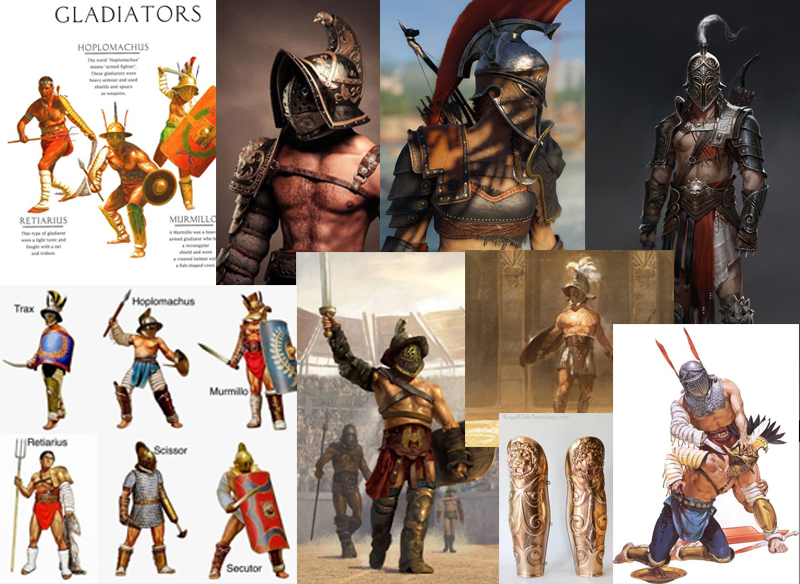
I searched for some historically accurate photos and information, but also for some designs from video games like Assassin’s Creed Odyssey. Though it might not be about roman gladiators, the design was similar in some aspects and I knew I wanted my female gladiator to have the same fierce vibe as Kassandra from the game. 

What I observed is that most gladiators weren’t fully armoured, since, historically speaking, the people that organised the fights were looking for exactly that: bloodshed to entertain the public. Also, the main colours that make people think immediately about gladiators and Ancient Rome are red and gold, sometimes white. The materials for the armour seem to be leather and bronze (or at least the armor has a bronze like colour). The gladiators fought with a two edged sword called Gladius and sometimes a short dagger called Pugio. 

Having this information, I went on to build my gladiator.


Gladiator: Mid-Project Reflection

 While Modelling the gladiator I didn’t face many major setbacks. I found modelling the face of the character easier than I had expected and understood pretty much how the loops on the face should come together, although I’m sure I would need more practice to learn to work quicker and for my modelling to go smooth.  The body was even easier, since every part started out as simple forms like cylinders and boxes. The hands were a bit more complicated, I must admit, and they took me longer to make. Also, at the end of modelling the general form, I used some anatomy references from the internet in order to make the body look more accurate. Especially the legs, which looked like very stiff cylinders at the beginning.

The armour was also easy to make. I used mostly the step build method to make the armour fit the body better. Welding the armour to the body I encountered a few problems here and there, missing polygons or triangulation problems, but I got over them and reached the final model:

My initial model didn’t have the strap on the right shoulder, but I decided to put it there so that the seam I would place there when unwrapping the model’s head and neck would not be that visible. It didn’t look bad, visually speaking, so I kept it.

Tuesday, 27 April 2021

Week 29: Virtual Tour: Transport Museum

 I don’t usually draw cars, so I was a bit scared to try it to be honest. 


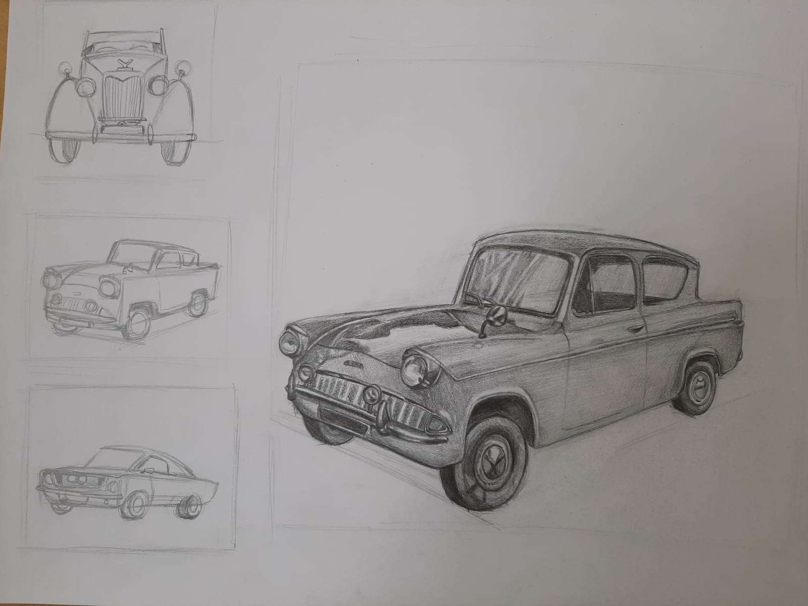
I started with some thumbnails to figure out the perspective, get used to drawing cars and also choose the best subject for my drawing:

I chose the second one. This was the reference image:


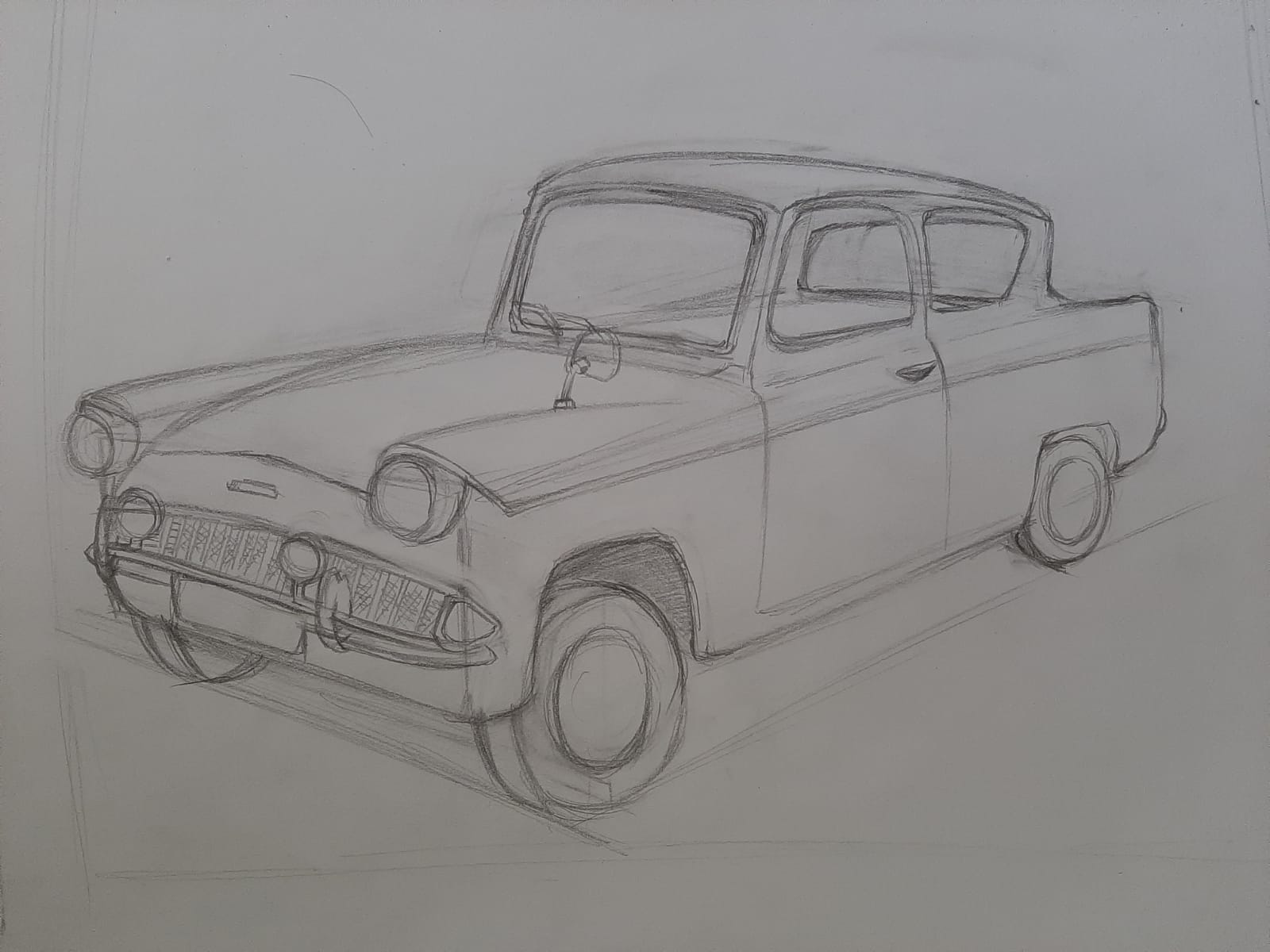
I first sketched out the big forms using boxes so I could figure out the perspective:

I then added the details and finished the sketch, before starting to shade:

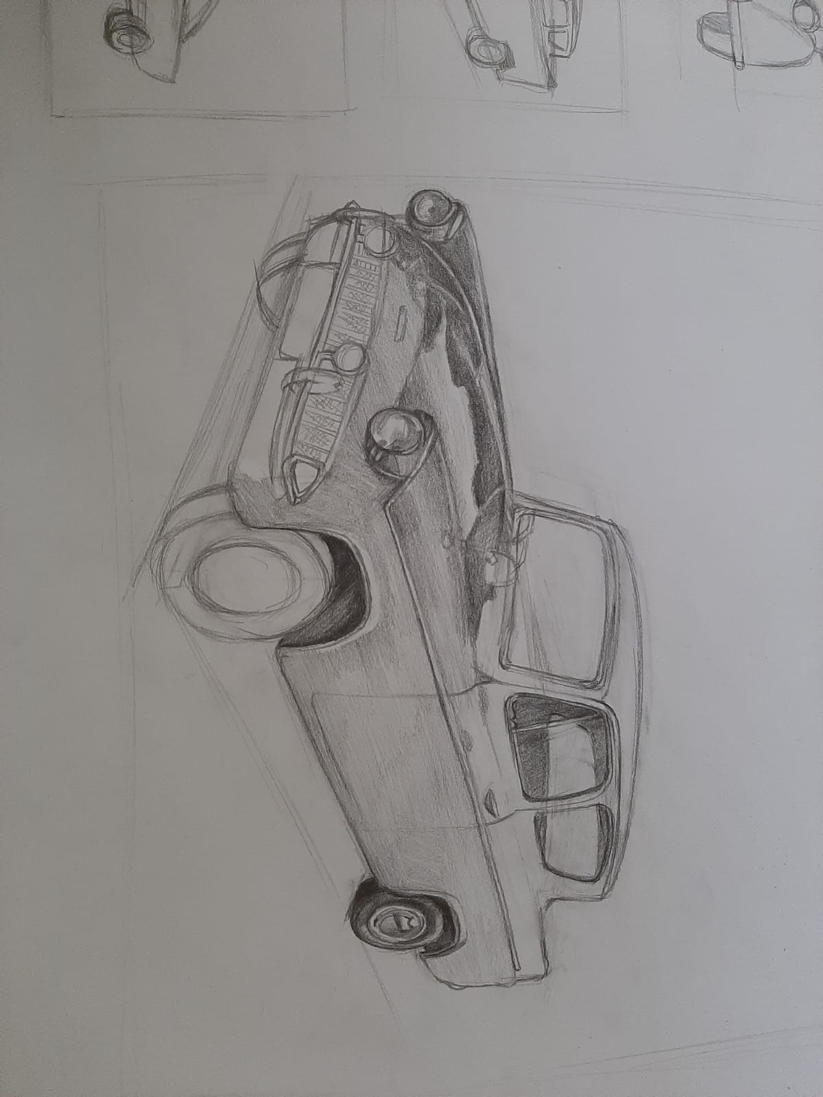
This was the drawing before the feedback:

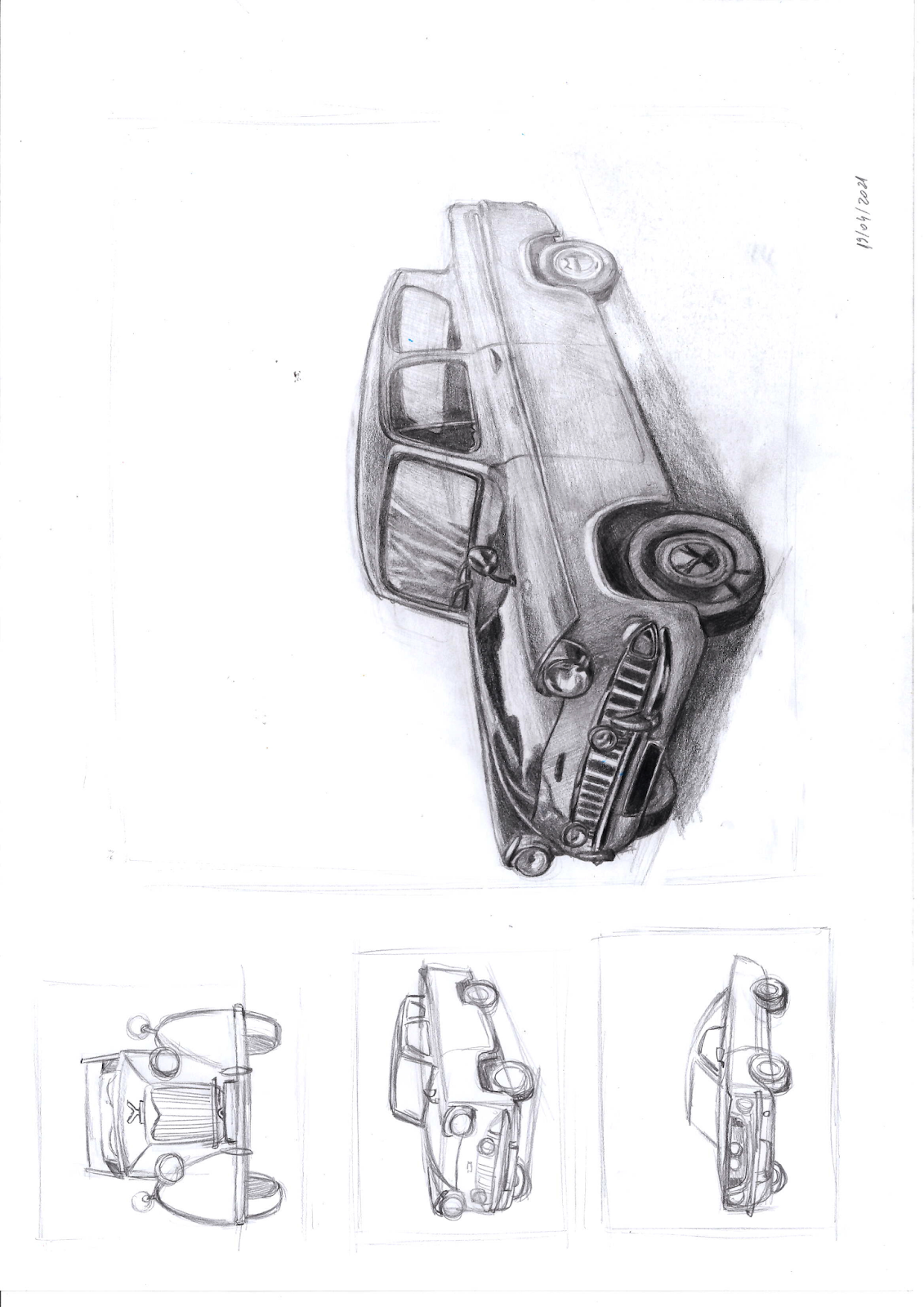
I then enhanced the contrast, faded the part of the car that is farther from the foreground and added the shadow on the ground, as suggested. This is the final work, of which I am quite proud:


Week 25: Architecture. Urban Landscape

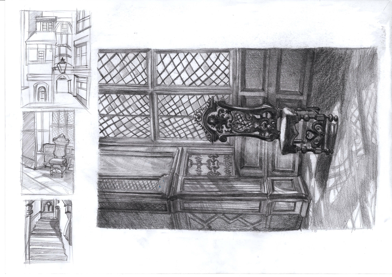
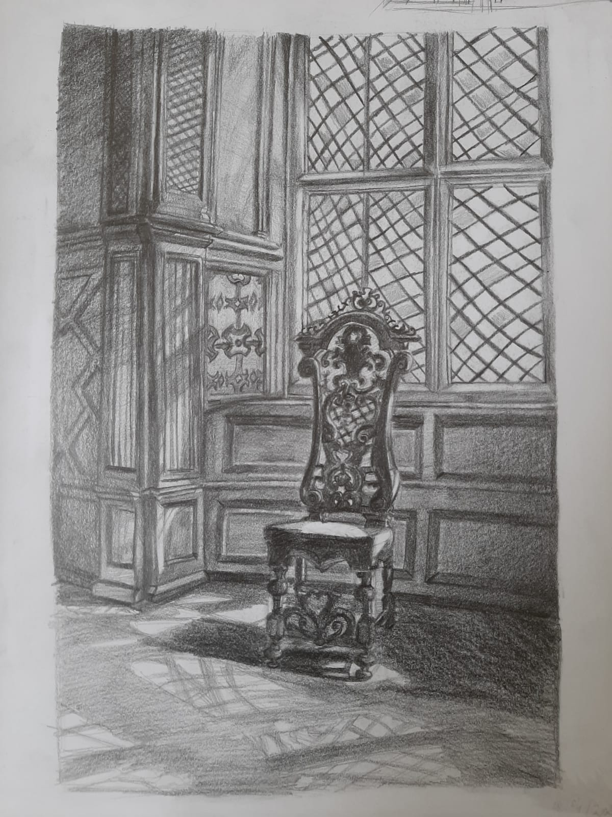
For this task I chose to do the interior composition. As usual, I first sketched some thumbnails, though at this stage I wasn’t completely sure if I wanted to do the interior composition or not.


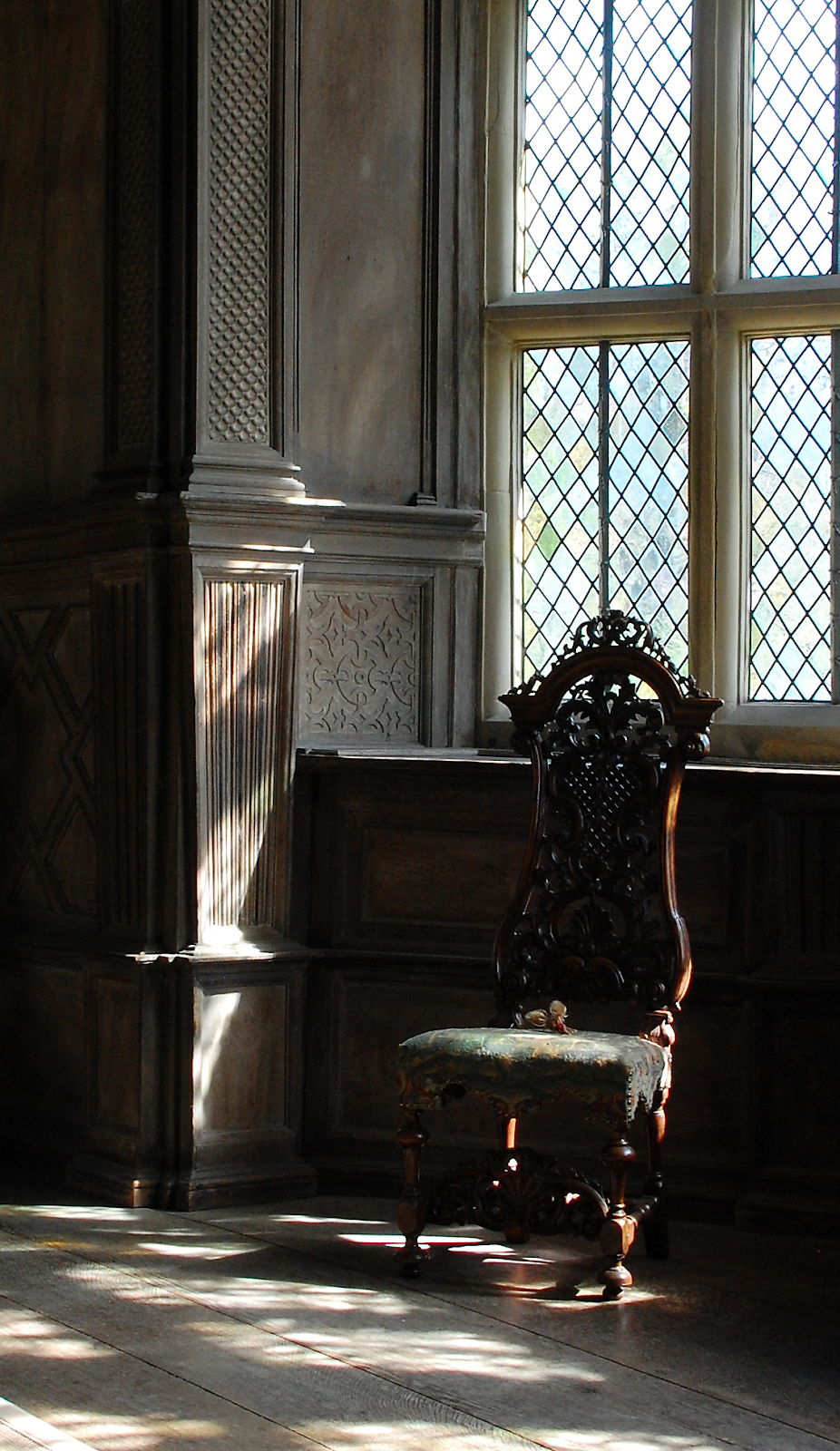
I chose the second one because the lighting was interesting and I could easily make the chair the focal point through contrast and detail. 


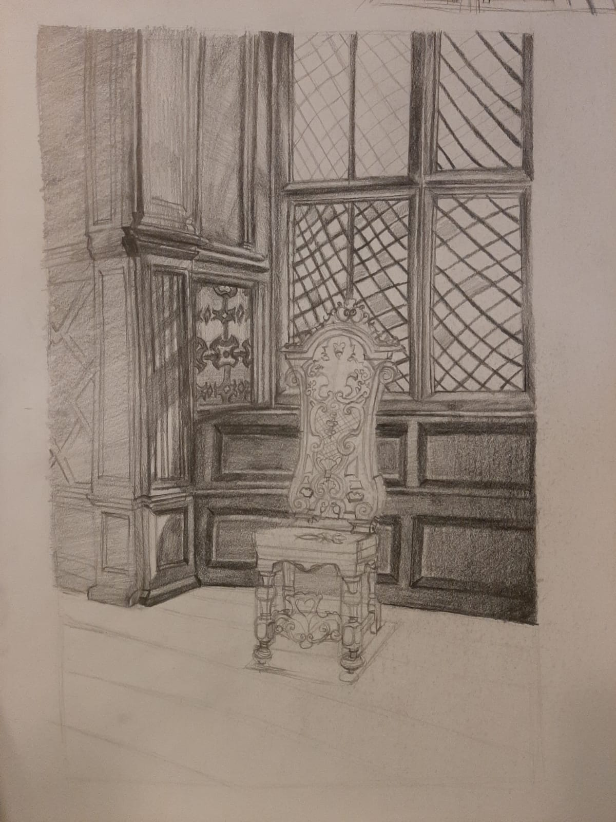
I sketched the big forms:


The added the details and started shading: 

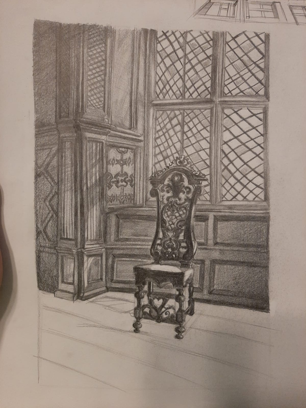
This was the drawing before feedback:

The edges of the wall were curved, almost giving the impression of liquid, of deformation in the whole drawing, so I straightened them. The shapes in the chair weren’t clear enough so it seemed to merge with the background. I also darkened the panels behind the light part of the chair and lightened the ones near the darker one. This is the final result:


Week 24: Composition and Compositional Principles (Part 2) Landscape

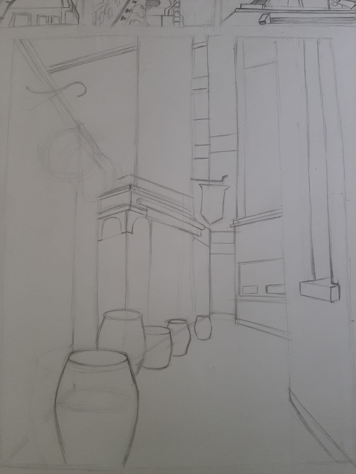
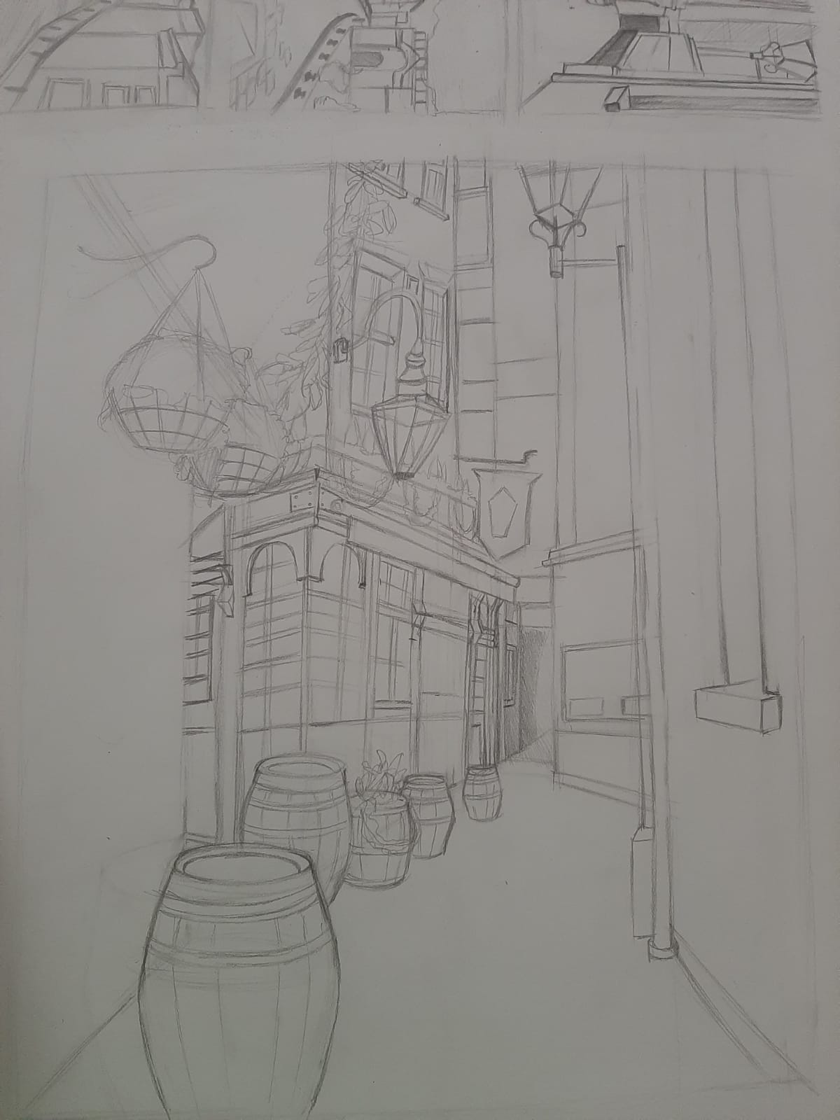
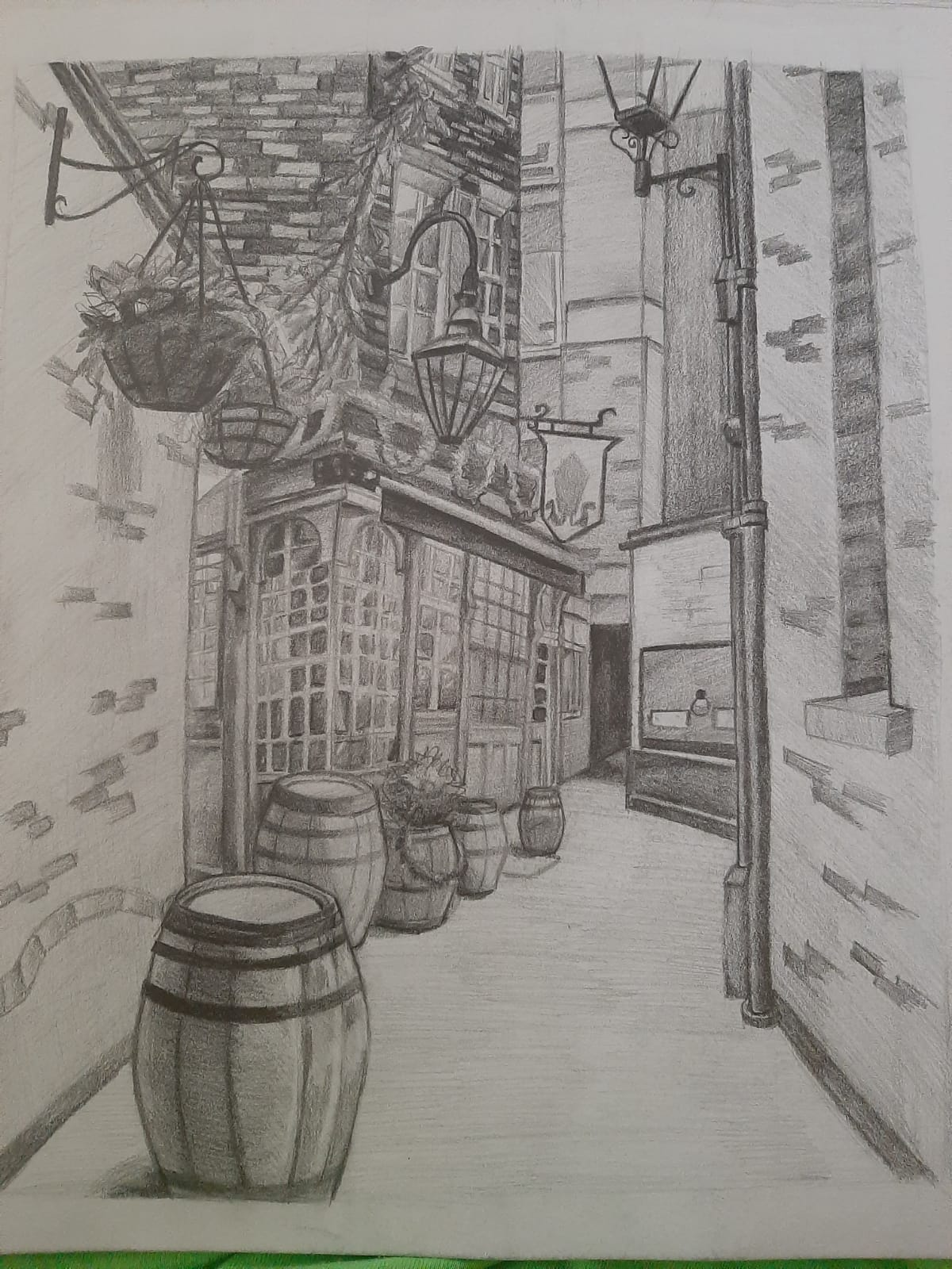
For this task I started by sketching out some thumbnails in order to decide the composition and chose the first one, as the lines of the street lead the viewer’s eyes towards the object that I wanted to be my focal point: the detailed building on the left. Also, the objects in the composition were layered nicely: some really close to the foreground, some a bit farther, and some getting lost in the background, giving the impression of depth. 


I made the sketch:

Then shaded it, putting the most detail into my focal point:

I had to add more contrast in the foreground and make the left part of the building darker since both were almost the same value. I also put more detail and contrast into the ivy, making the foliage on the left lighter and the one on the right darker so it would stand out. I also toned down the contrast in the background and added a bit of detail on the surface of the street. The ellipse on the fron barrel was also wrong, so I fixed it.

This is the final work after applying the feedback: 


Week 23: Virtual tour: The National Portrait Gallery

This was the first time after a while that I used colour in my work, so it was quite fun. There were a few issues though, in terms of proportions. I managed to fix them, but I recognize I could have done better.  

This was the reference image:

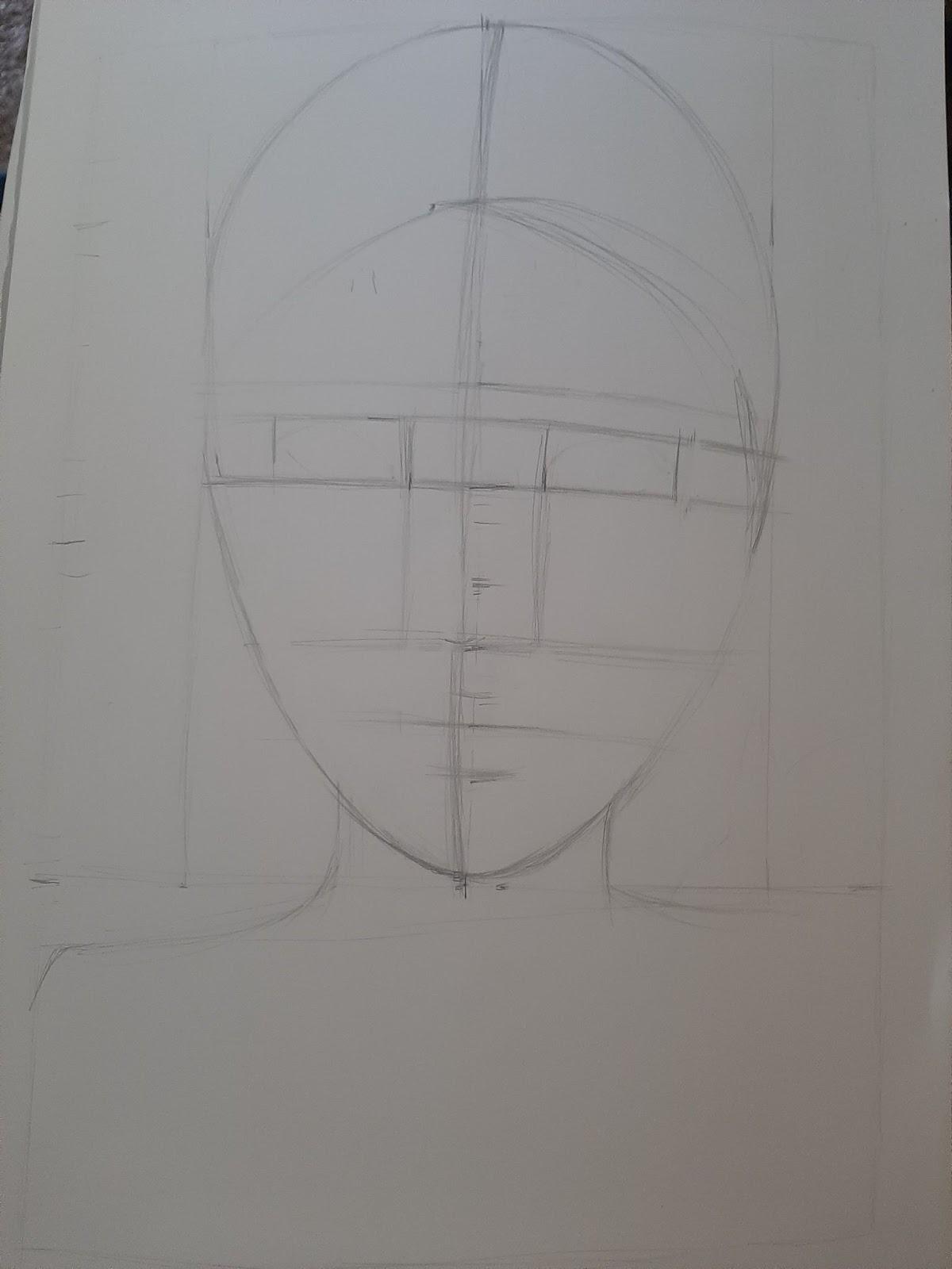
I started by blocking out the proportions. Looking back, I think the problems started from here, since the tilt of the head doesn’t seem quite right.

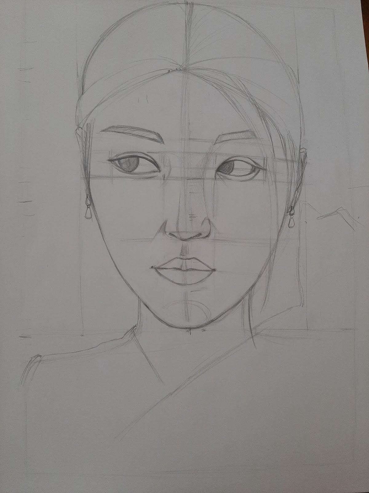
I then drew the face:

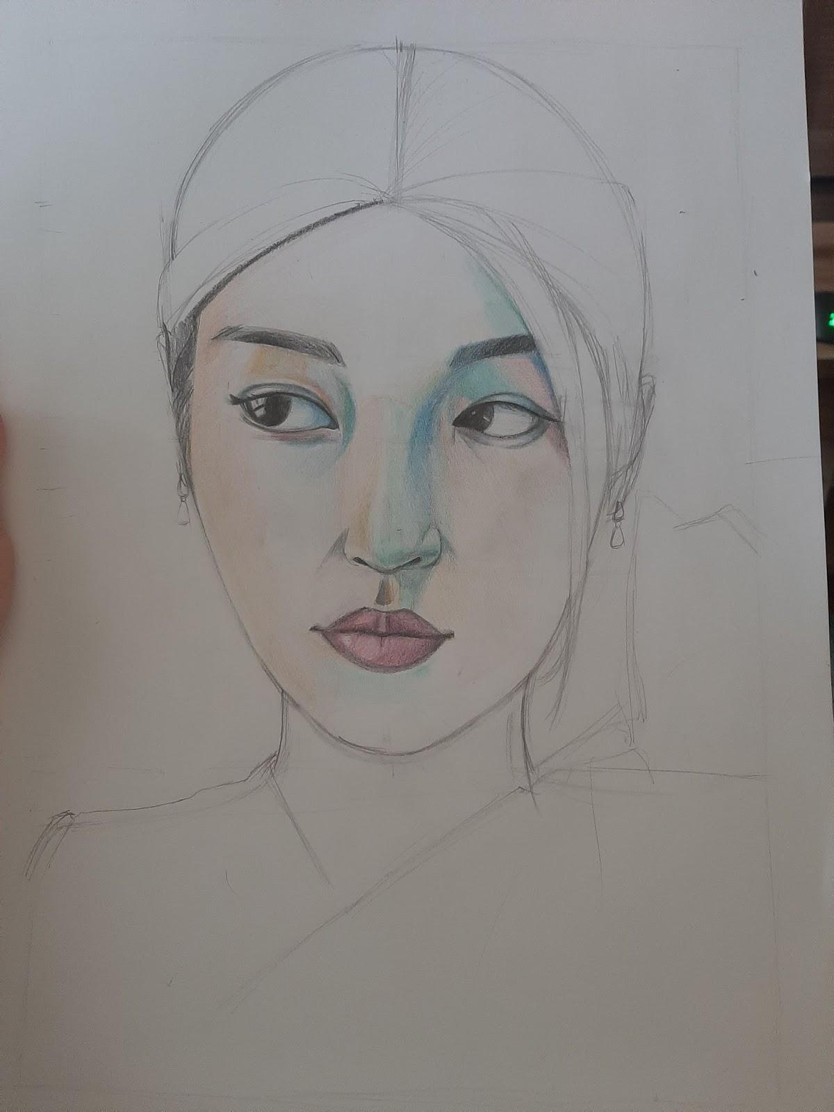
And started shading:

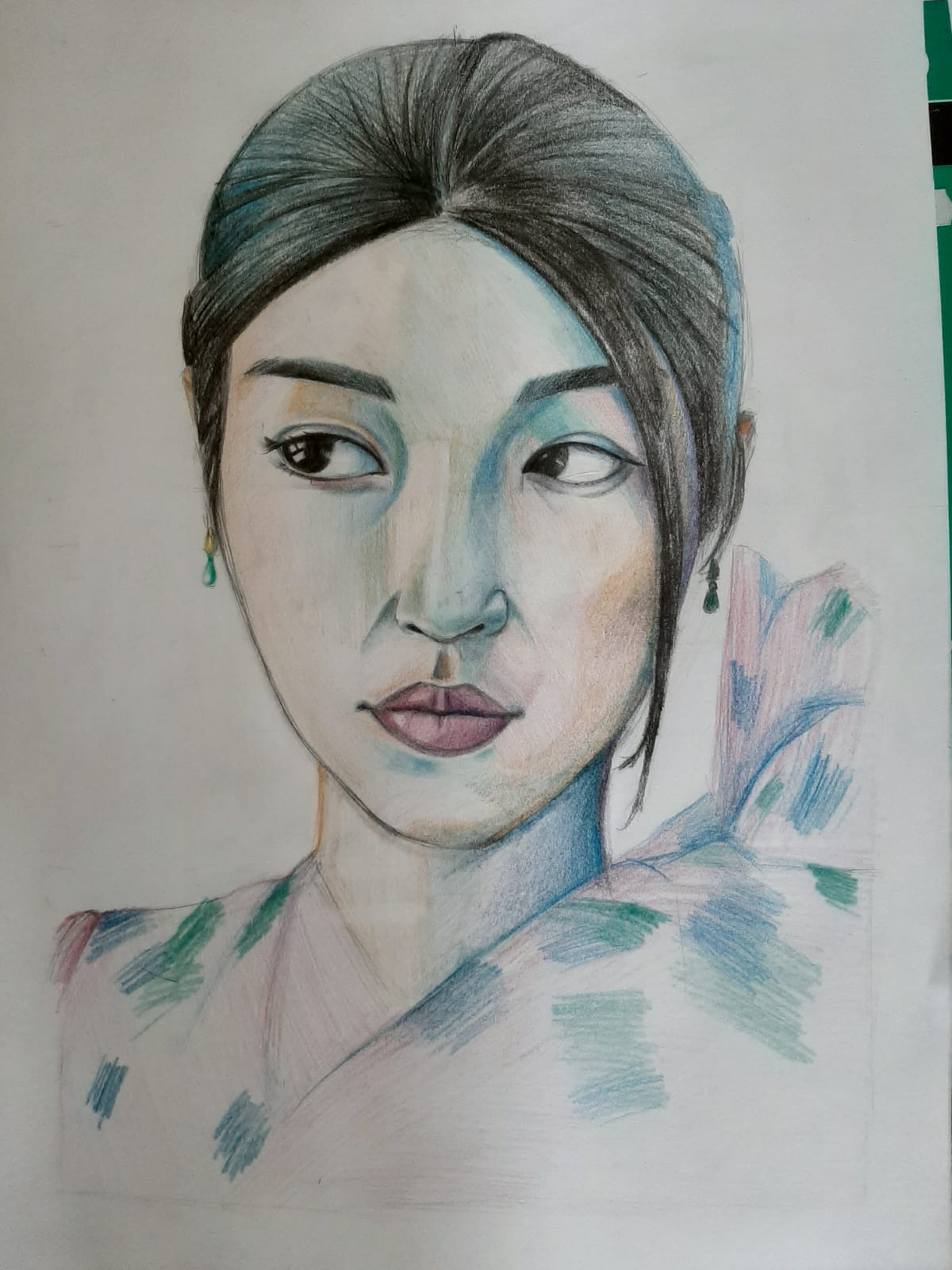
This was the drawing before feedback:

The lines around the eyes and nose were too harsh and the shading looked unfinished, or too flat in some areas. There was too much white in the eyes so I added the little space in the corner of the eye and shaded it a bit more. Also, the eyes are a bit too different and too far apart. This would have been hard to rub out, so I had to bring it closer in Photoshop. The clothes needed a bit more detail too. 

This is the final work:


Week 21: Renaissance. Focus on Portrait

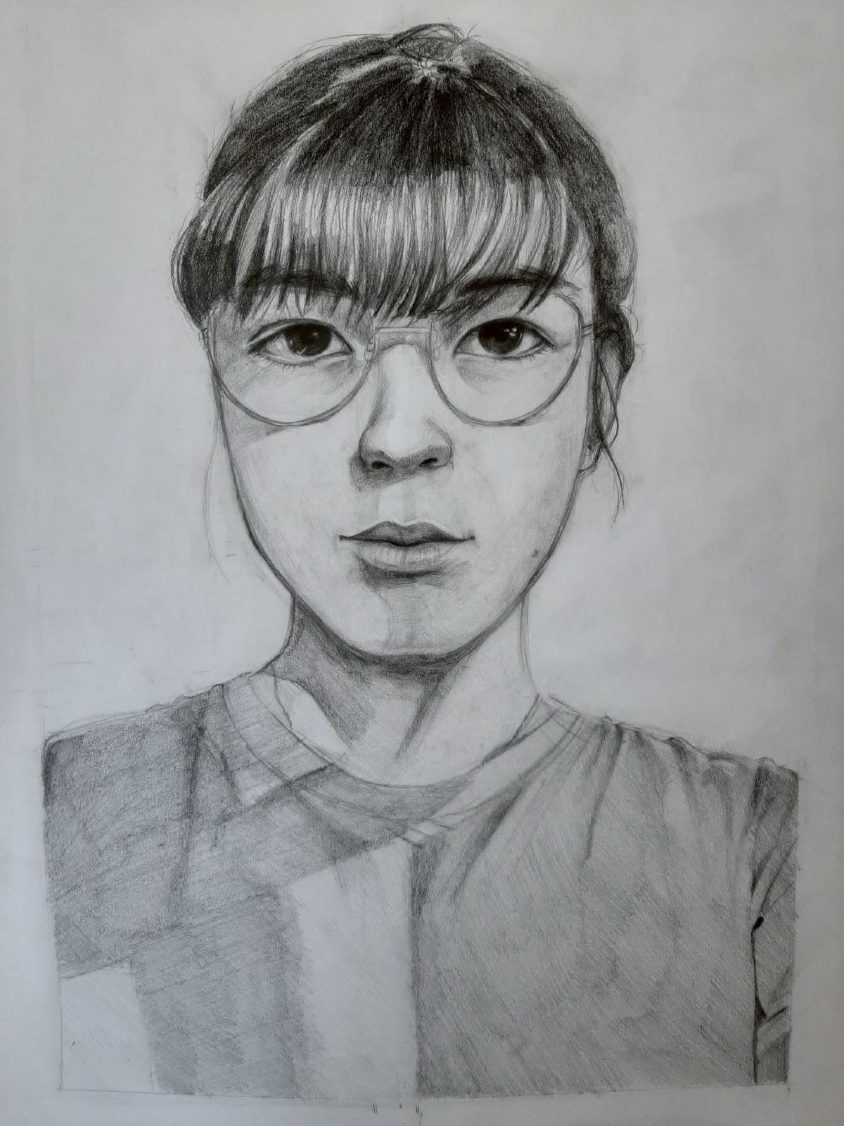
This task was quite scary for me. I had tried to draw my self portrait before. I was younger and had less practice, yes, but for me, when drawing my portrait, my own perception of myself and the way I look plays a big role, influencing my view. I was worried this might be the case this time too, but I did my best to keep it as accurate as possible by always checking my measurements twice.

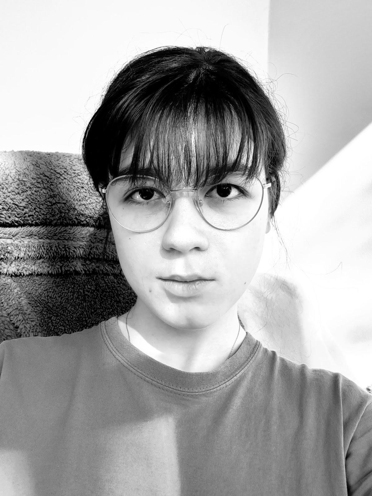
This was the reference:

I blocked out the proportions first, then sketched the face:


I then started to shade:

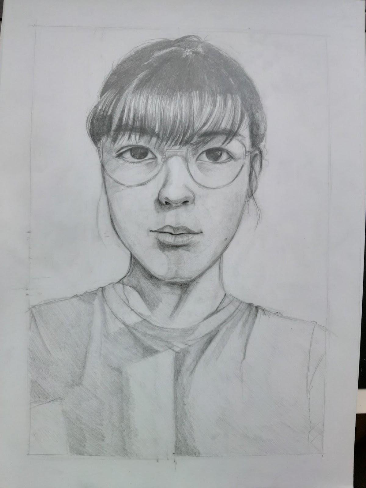
This was the first version of the drawing, before getting the first feedback:

The eyes were flat and the nostrils were different, while the shadow at the base of the nose should have been darker. Also, the bounce light on the nose was too strong and the lips looked flat, so I enhanced the shadow on the lips, especially on the top one since the light doesn’t hit it as strongly as on the bottom one. The ear was also a bit too high, it should have ended approximately at the height of the nose. I also had to enhance the shadow of the glasses. 

This was the drawing after applying the first feedback:

The shadow on the side of the nose was a bit too small, too abrupt, so I enhanced it. The shadow cast by the glasses needed to be a bit darker too and the shadow at the base of the nose even stronger. I also made the shirt slowly disappear towards the bottom to make sure the focus is on the face. 

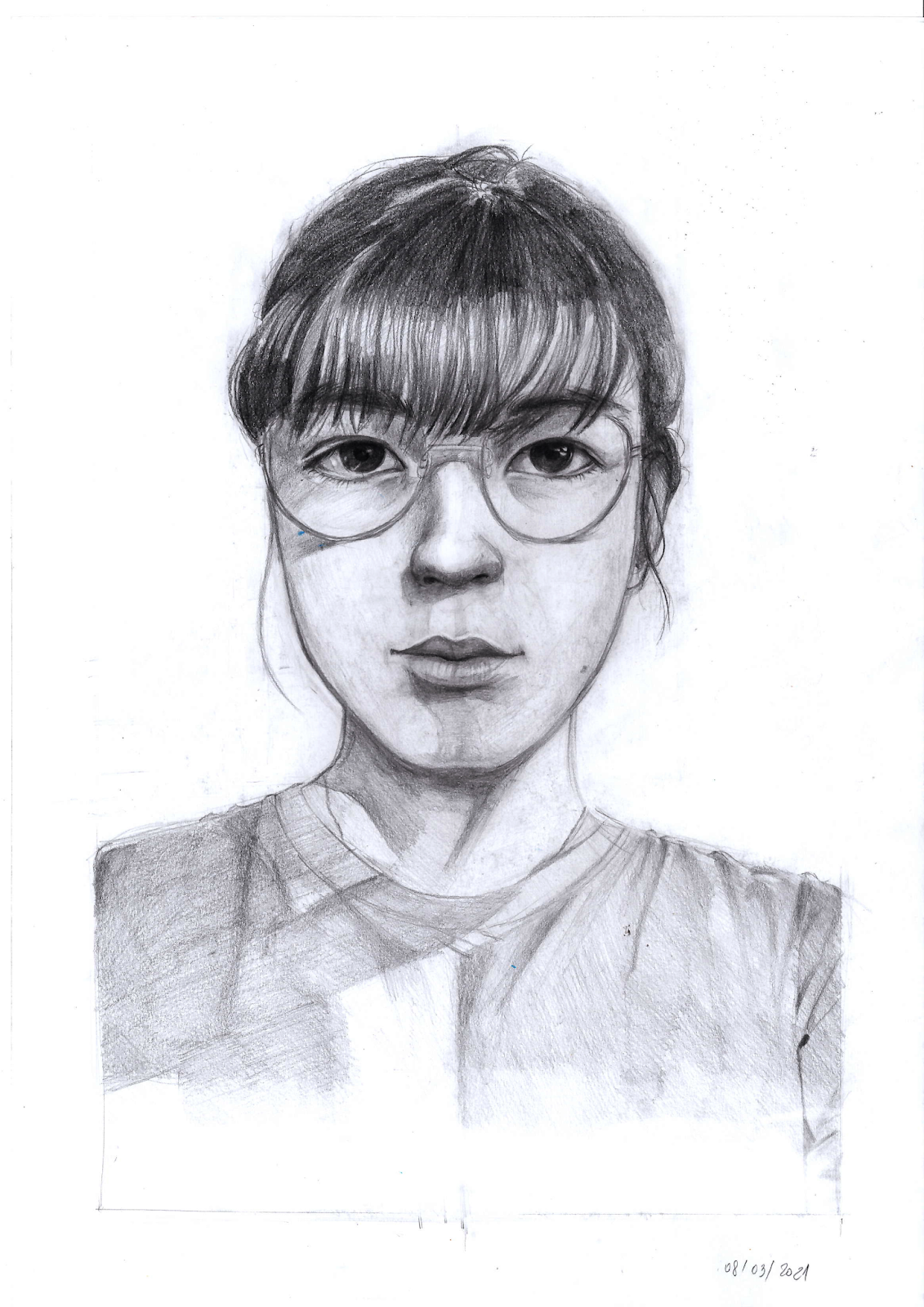
This was the final result:

For the first time I managed to make my self portrait actually resemble me, even if it might not be perfect. This is quite a success for me.


Major Project - "Gold": Texturing The Zmeu

 The texturing for Zmeu was the most tedious out of all of them. I used fill layers and masks as much as possible to give the scales some de...