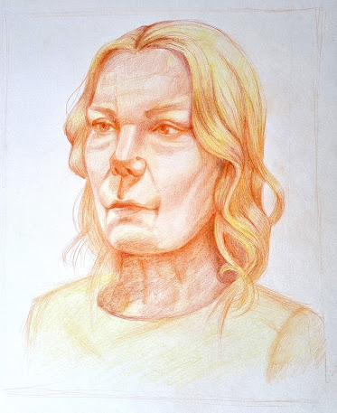
For this week's task we had to produce two portraits: one using warm colours and another using cold colours. To be honest, I always get nervous when it comes to working in colour, especially coloured pencils and pastels. I feel like I don't yet manage to properly use and blend them. Still, compared to last term's Chernobyl task and the coloured portrait from first year, in this task a lot of improvement can be seen.
I started by sketching out a quick thumbnail in order to establish the composition. Again, it wasn't too hard to figure out: I placed the portrait a bit to the right since it's in 3/4 view and I needed to leave more space to the left, in front of the face.
I then started sketching and did my best to also add some of the generic and darkest shadows as I went, in order to speed up the process and convey the shapes and forms better.There was already a high level of resemblance so I was quite pleased with the construction phase.
I then added the rest of the shadows and the midtones in the same orange colour. I think one of the things I regret is not adding the rest of the colours earlier. I think they might have blended together better.
After that, I added some yellow in the lighter parts and darkened the shadows with a warm, reddish brown. One of the problems I faced was the eye size. When I had constructed the face it was fine, but after shading they started looking quite small, so I had to fix that a few times and make them bigger to balance the effect.
Next, I added more yellow on the hair and clothes, to bring out the orange area which is the face, the focal point of the portrait, of course.
This is the result for the warm colour portrait:
For the cold colours portrait, I had to use the first one as reference. Looking back, it might have been a better idea to proceed onto this task using a model from the internet, but hopefully I achieved the proportions if not the resemblance.
After getting feedback, I got rid of the harsh outline on the jaw and added some shadows there and on the chin. I also added more yellow on the forehead, chin and nose and tried to increase the contrast. I darkened the eyes more too.
I started by sketching and adding the main shadows:
Looking at it, I realised that the eyes are too close together and the nose and face too narrow, so I fixed that before adding the midtones using some purple and light blue.
The face was too long and the lines a bit too harsh, so I shortened it and tried to soften the shape of the face. I also shaded the hair and I am quite pleased with how it turned out
For the final steps I added some more details and shaded the clothes.
The eyes still seem a bit too close together and the clothes could use some more careful shading so, after fixing these aspects and getting some feedback, I will come back to this post with the finalised result.
After getting feedback, I darkened the eyes and redrew the shoulder as it was too straight. I also added shadow on the jaw. I needed to photoshop it a bit back, as it was too pushed forward. I also darkened the left side of the face more.
That being said, I think I managed to recreate the model's personality quite decently. She had this slightly serious feeling to her that I think is more noticeable in the cold portrait. The cold colours make her feel more distant, pulling her away from the viewer, placing her farther, in a more distant plane of reality. Meanwhile, the warm colours brought out more of her warm side that, despite some of the harsher lines of her face, shone bright in the first portrait. The orange and yellow tones also made her seem closer and more approachable.
In conclusion, it was a nice experience and I am very pleased with my progress in using colour. I think I am on the right track of understanding how to better use it in my composition.


No comments:
Post a Comment