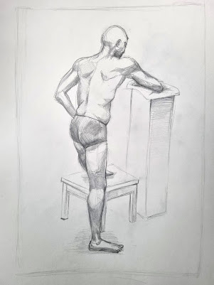
This week's task was quite a challenge: going from just a portrait to full body drawing requiring an understanding of anatomy and proportions. I also felt really pressured by the time limit, especially in the first sketch. I think it shows, since I believe the first one has the stiffest lines and shapes.
At first, I had taken a really technical approach to this, which wasted me time, so I instaed tried to use quick measurements, verticals and horizontals, in order to estabilish the sizes and distance between different parts of the body.
I then used some quick shading to highlight the main muscles.
The second one was tricky because of the foreshortening in the front leg, which I messed up on the first try. After getting some indications and a little help though, I managed to fix it.
I think the foot could still be a tiny bit bigger and maybe the head slightly smaller:
The third one I am quite proud of. It is more lose and the lines more flowy, more relaxed. The shading, altough simple, indicates the main shapes of the body, the main muscles, and gives it dimensionality. The perspective in the stool is slightly wrong, so I will have to fix that.
I also want to add more detail to my shading for all of these, so I will use this as an oportunity to further my knowledge of human anatomy and shading and return with the finished products.
My use of line in the first two could have been better, both of them a bit plain and quite stiff looking. The shading could also benefit from some detail too, although I like the chest and overall torso area on the first one. The third one I believe has a much better use of line and a much better flow, as well as more pleasant shading that effectively describes the forms of the body.
After getting feedback, I changed a few things:
For the first one, I added more tones on the arm and fixed the anatomy on the back leg. I also tried to use line weight more and faded the back leg a bit. For the second one, the knees were too small, breaking the foreshortening illusion, so I made them bigger as well as added some width to the thigh. I tried to add more details into the leg muscles and redrew the foot on the foreground as it looked awkward. I also defined the toes on the other one more. For the last one, I defined the shoulder more and the back of the leg. I got rid of the shading on the stand as it looked overworked and fixed the perspective on the table.


No comments:
Post a Comment