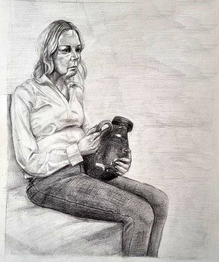
I really enjoyed this task and noticed that my ability to draw fast while still keeping the quality of my work has improved. I managed to almost finish the drawing during the session and only had to add the refinements to it afterwards. It surprised me, since I have always been slow in completing my work, but I am very happy with my progress.
I started the task by drawing a quick thumbnail. I placed the figure more to the left, to have space for the legs.
I then sketched the grid and used it to place the figure properly, so I wouldn't run out of space. I drew the main shapes using light lines, so I would be able to change them easily if the proportions proved to be wrong.
I then sketched the face and legs and started to shade. I tried to keep the contrast high for the shirt, but it started to looks slightly overworked.
I am proud of the level of resemblance I achieved in the face, since it's a smaller surface than usual, so it's harder to add a lot of details. I tried my best to not overwork it and I think I did a good job with the contrast too this time.
I then shaded the hair the clothes. I kept the jeans dark from the beginning, to ensure that there would be contrast between them and the shirt.
I added detail to the hands and folds to the jeans. I also rendered the vase, making it darker than the jeans and adding strong highlights to give the impression of a shiny, reflective surface.
I finished shading the figure and added a light background to not distract the eye from the figure. I also darkened the vase more.
After getting feedback, I added darker folds in the jeans and lightened the shirt a bit more, as it was looking overworked. I also added some accents using lines in the shirt to accentuate the folds. The back of the head was also too short, so I made it slightly bigger. The folds of the jeans were very similar and I tried to change them up a bit. I added accents on the hand too, to separate the fingers.
I really enjoyed this task and it's one of the works I am most proud of this term. I like that it has proper contrast and tonal variation, things I have struggled with all year. Looking back, it shows that my work this year helped me improve with every piece, so I'm pleased with my progress. I also like how the shirt folds turned out. I think the folds on the jeans could have been more detailed.


No comments:
Post a Comment