Tuesday, 27 April 2021

Week 20: Head Construction

 For this task I chose this photo, as I liked the way the hair added an interesting form to the general silhouette. I also love the strong, unique character of the model.  

I started by measuring and blocking the proportions, the space each part of the face occupies, using boxes. One of the challenges was trusting my measurements: even if I had checked and rechecked them, it's hard to say if they are accurate by looking at the boxes, so I had my doubts during the process:

I then sketched the features:

And started shading by blocking out the main shadows:

I then detailed them and added the rest of the values for the face:

The hair was my favourite part to work on.


This was the drawing before the feedback:

The shading on the collarbones, shoulder and chest was quite strong, making it look like very dark cuts, so I had to tone them down a bit by replacing them with wider, softer shadows. Also, the highlight at the top of the eyes made them look unnatural so I moved it. The shadow at the bottom of the nose was too light and the straight shading on the clothes made them look flat so I erased it completely to keep the focus on the face. 

This was the final work:


The portrait is quite a complicated thing to understand, the way the planes of the face work and how they are affected by the lighting. Making it resemble the model is quite a challenge too. Taking all of this into consideration, I am quite pleased with how this turned out.


Week 19: Drapery and Anatomy of Folds

Drapery and folds are a complex and detailed thing, so this drawing took quite a while to finalise. I started by sketching some thumbnails:


I chose the second one, as I considered it to be more balanced and interesting in terms of composition. This was the reference:

As always, I first blocked out the big forms, before adding any kind of folds, so I could make sure the general silhouette was in order:

Then added the folds and details. It was quite hard to keep track and observe all of them. 

In terms of shading, I first drew in the darker, main shadows:

Added the pattern on the top drapery:

Detailed the shadows, shaded the chair and added the background, making it darker at the bottom in order to bring out the light material, and lighter at the top to bring out the darker pattern. 

After the first feedback, I toned down the chair a bit in order to keep the focus on the drapery. I also added more contrast to the whole drawing, especially in the white fabric. I darkened the pattern too and enhanced the shadows. I also did my best to soften the transition between the darker part of the background and the light one. 

After the second feedback, I added even more contrast and darkened the pattern even more. I also darkened the chair to make it blend with the background and bring the rest of the composition out. There were also some white outlines on the folds of the top fabric that made it look flat, so I took care of them too.

This was the final result:


Week 18: Value: How Artists Use Value

 For this task I first sketched a few thumbnails, using what I had learnt previously to set up interesting compositions and choose the best one:


I ended up choosing the third one, since I liked the grouping of the objects to the left and the way the book was connecting the composition, making it look put together. This was the reference:

I first sketched the general form of the objects, not going into any detail, in order to check the proportions and perspective:

Then I added the details:

And started shading:

While shading, I did my best to keep the contrast high, especially in the tin in the foreground, since it was the most interesting object, the focal point of the composition, and was also the closest to the viewer.

This was the drawing before the first feedback:

I used scribbling to recreate the fuzzy surface of the towel, but left the outline of the fold straight, destroying the illusion of texture. Also, I needed to darken the bottle at the back and the left part of the tin, as well as enhance the cast shadows. The bounce light on the fruit was also too strong, making it look like a white cut in the surface of it and flattening the object. 

After the second feedback, I realised I had darkened the line of the fold too much. I also had to enhance the highlight on the tin more, to make the contrast stronger and give the impression of the shiny surface. The line in the background was also quite a bit dark in relation to the rest of the drawing. This was the final result:


Week 17: Virtual Tour – The National History Museum

Skulls are one of the most complicated things to draw, at least in my limited experience. There are many complicated forms, all of them merging into the general silhouette. To all of this, perspective must be applied properly. The surface of the skull is also a tricky one to render, as I have found out during this exercise. 


First, I sketched a few thumbnails in orders to choose the subject of my drawing:

I found the first one to be the most interesting in terms of form and texture. Plus, it had a clearer image in the virtual tour and I could zoom in more, enabling me to observe more detail:

I sketched the skull. As expected, I encountered some slight difficulties when trying to convey the proportions and add perspective, but overcame them quickly by measuring and blocking out general, simpler forms first. I then started shading:

This was the drawing before the first round of feedback:

As usual, my biggest problem when it comes to shading: lack of contrast. My drawing was clearly in desperate need of some tonal variation. Also, I had to add some of the texture of the skull, since the real life one wasn’t that smooth, so some detail was needed. The skull was also missing the cast shadow, otherwise it would make it seem like it was floating in a void.

After the second try, the drawing still needed more contrast and detail, so in the final version I did my best to add them as much as possible.


Week 16: Composition and Compositional Principles (Part 1): Still Life. Thumbnail Sketching.

 For this task I got to understand the principles of arranging my composition in the best way, as to point the viewer's attention to the most important part of my drawing and create a visually interesting piece of work.

I started by experimenting with different compositions and drew a few quick thumbnails: 


I chose the fourth one since it was the most interesting in my opinion: the objects grouped to the left are balanced by the glass jar on the right. Also, the eye is led by the line that the objects and towel are forming, taking the viewer through the whole drawing. 


This was the reference:

I constructed the objects, quickly sketching out their form, defining it, then started rendering:


I was quite pleased with how the fruits turned out, the surface variation showing the imperfections of the real-life objects.  

This is the final result before getting feedback:

The drawing lacked contrast, most of it having the same general value. The glass jar also had some symmetry issues as well as some problems with the ellipses. The can, being metal, also needed more contrast between the highlights and the darker portions. 


This is the finalised drawing after the feedback:


Week 15: Shading Techniques

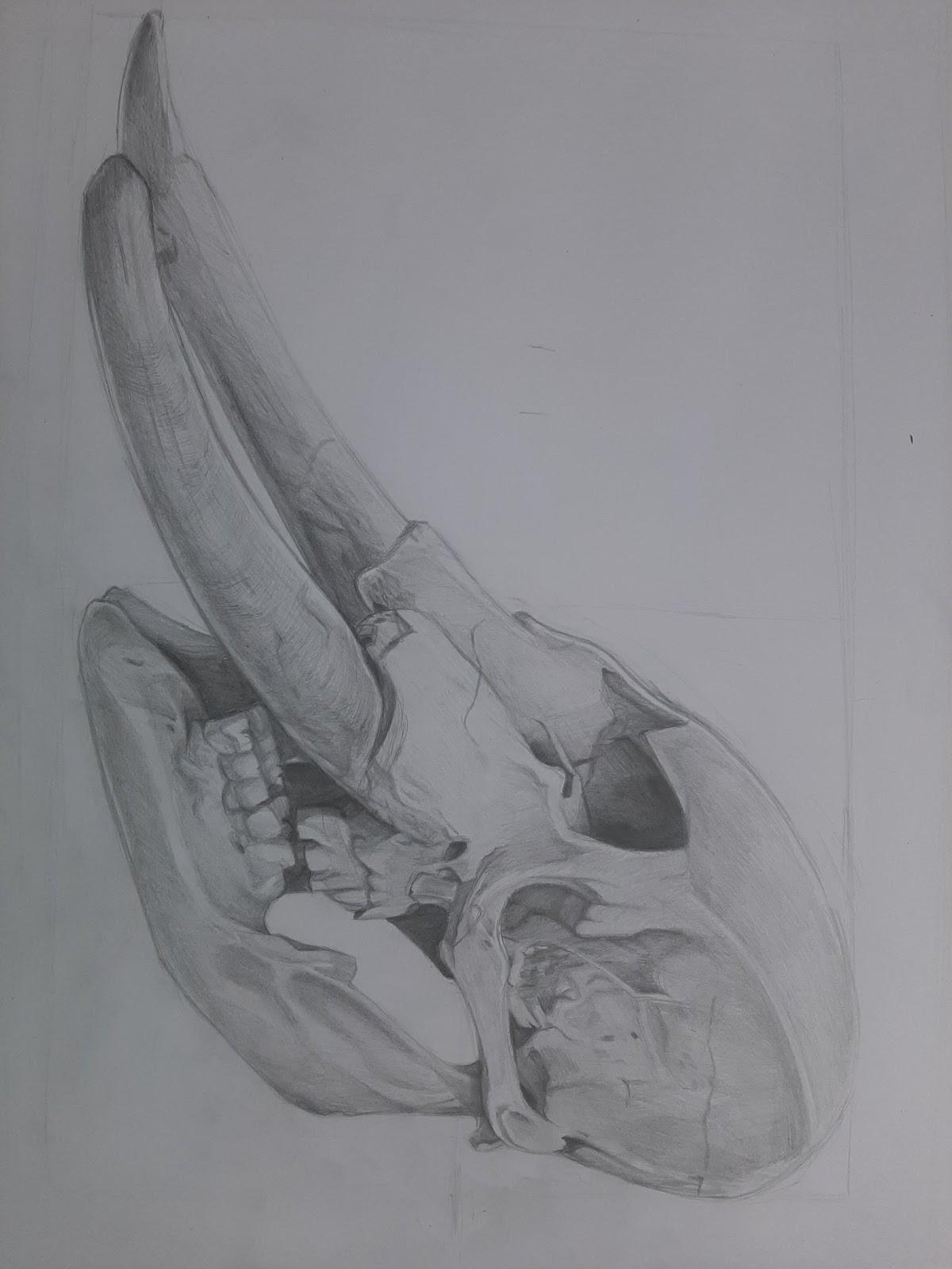
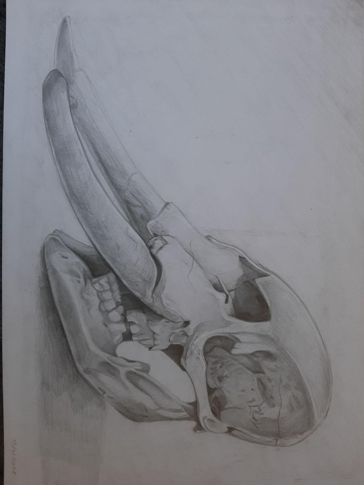
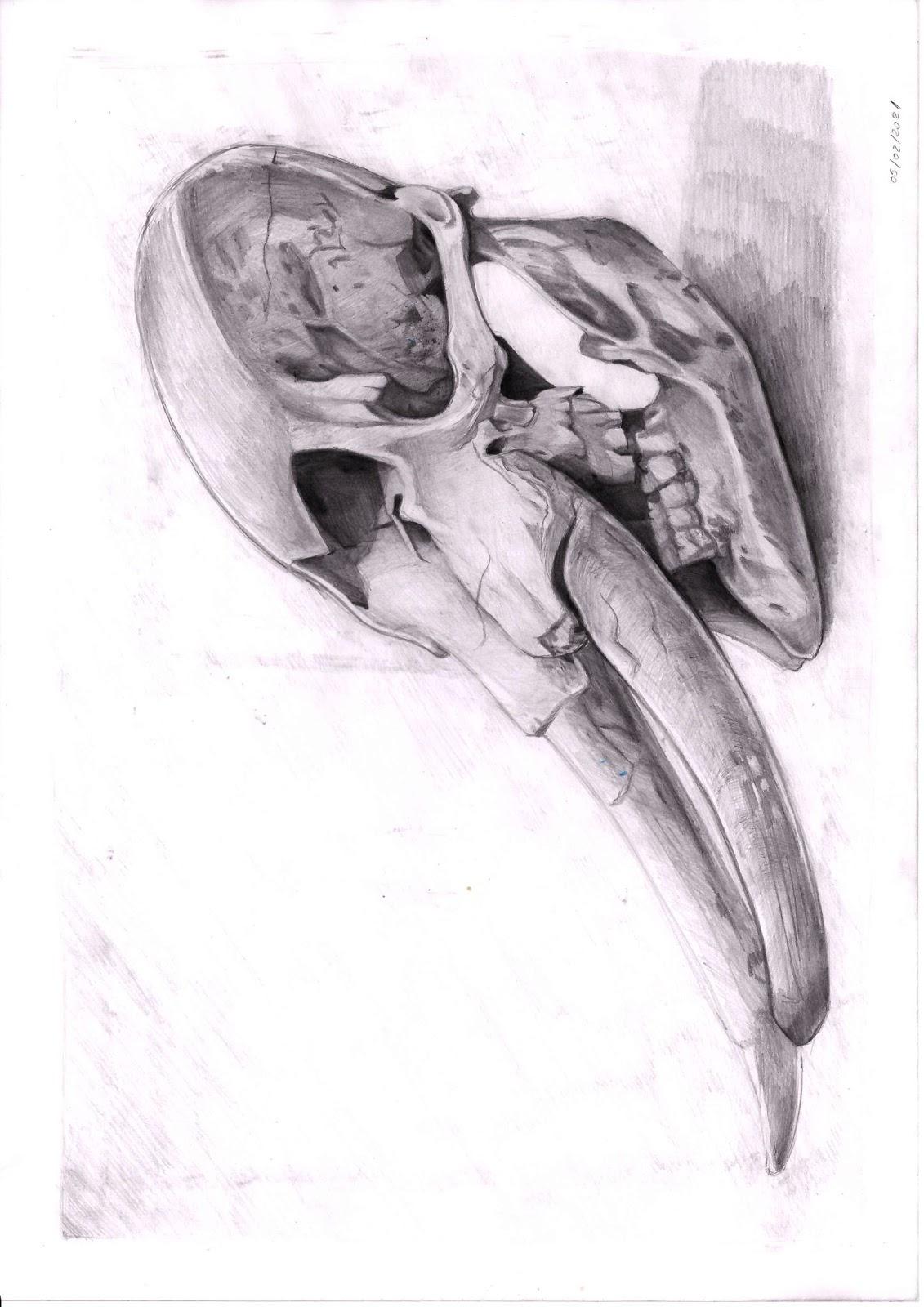
During this task, I got the chance to practice with some techniques I was already familiar with

and discover some I had never used before, such as scribbling and stippling.


First, I experimented with the shading techniques presented in the PowerPoint, starting with hatching:

I usually use light hatching for the background of my works and go for either cross-hatching or circling for the objects, though my general process could be described as rendering. The challenge with this was keeping the hatch lines straight, as I have the tendency of curving them slightly, which is mostly obvious in the background. I find hatching very useful, but I prefer using a multitude of techniques, so I wouldn’t see myself developing a work with only this one.

Next, I tried cross hatching.

This I am even more used to than to hatching, since I use it for pen and ink drawing mostly. That’s why I chose to use ink here. The disadvantage with ink though, was the fact I couldn’t erase my mistake: the darker line in the background. Even so, since this was just me experimenting with different techniques and drawing mediums I didn’t mind it as much. 

After this, I used scribbling, a technique I came to actually like in the end, despite my initial reluctance:

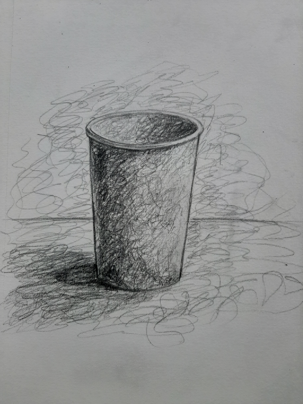
I admit I could have chosen the object better, but I learned from it. Now, I’m using this technique mostly for representing… fluffier materials, such as towels, plush toys, etc. Also, the symmetry in the cup is a bit off. 

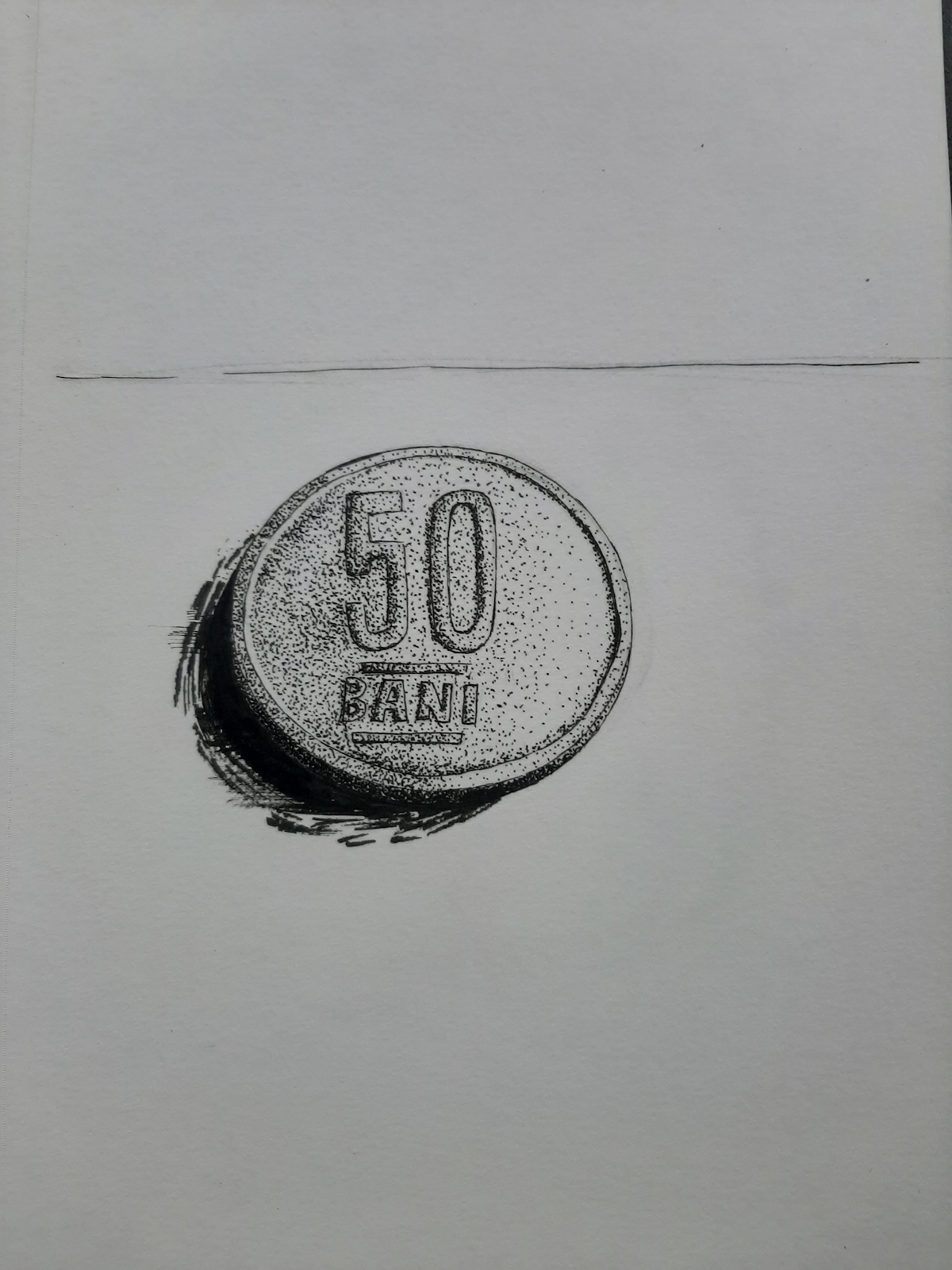
Next was stippling. I found it to be the easiest method, though I must say I don’t quite like it that much. Even so, I did my best to understand its uses and how to correctly represent shadow and light through it:

For circling, I drew a pencil case, aiming to represent the slightly rougher material it is made from:

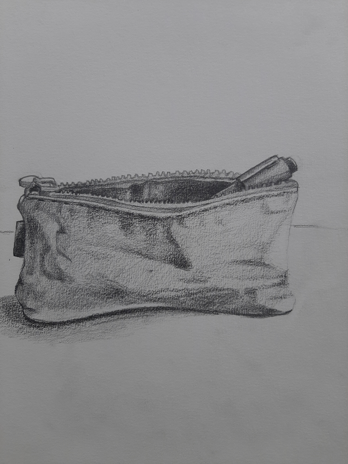
I quite like how this turned out, though the cast shadow should have been wider towards the middle of the object, since it is curving inwards. 

As for smudging, I chose to draw with charcoal. With this, I had some slight problems with the ellipses.


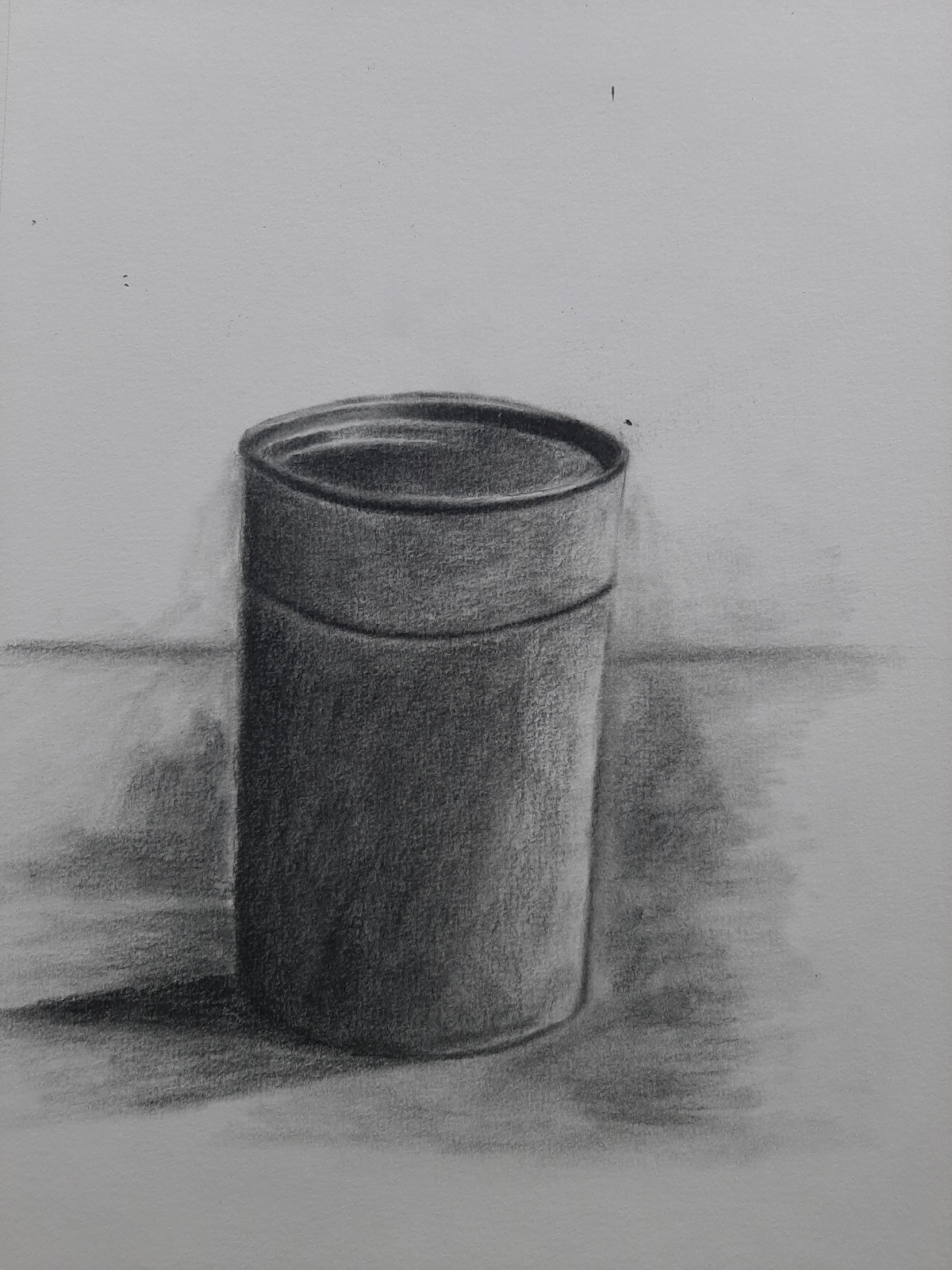
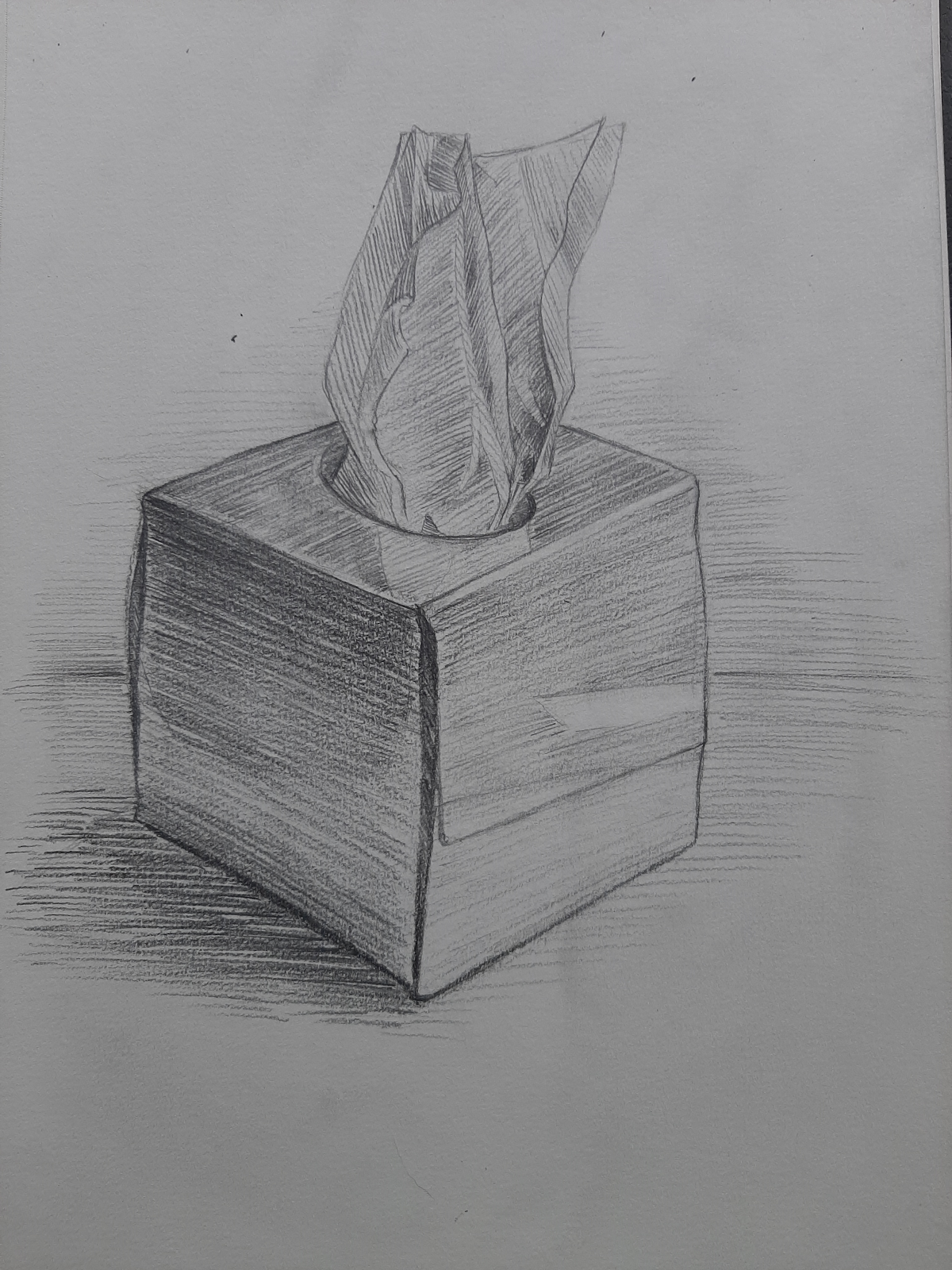
Then went on with rendering:

I think choosing a glass object for this was a good idea, though I didn’t really enjoy drawing with charcoal. It takes away some of my control over the drawing and doesn’t really let me add that many details, probably because i’m not that used to it. 

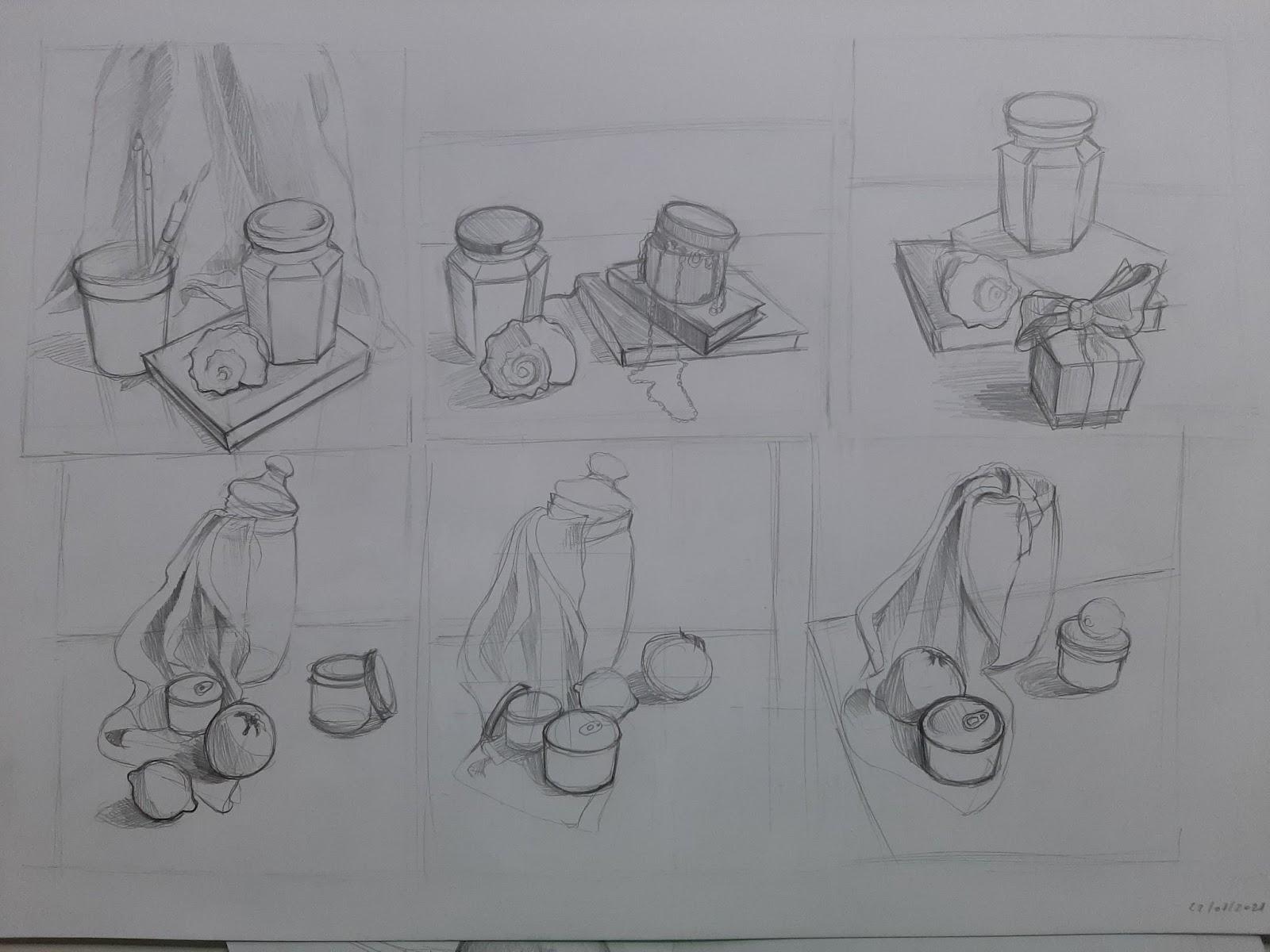
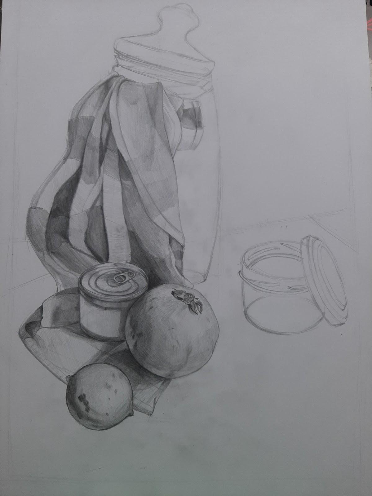
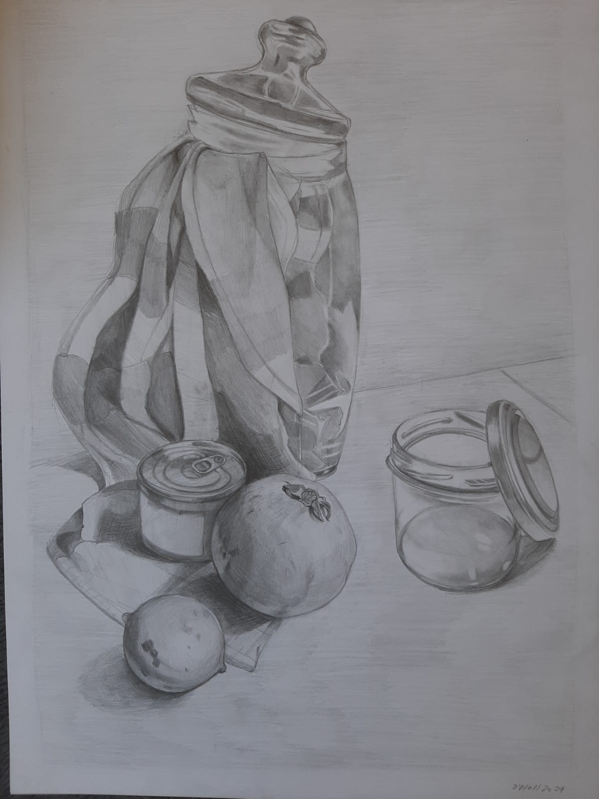
After finishing the experimentation, I chose my final composition and turned the photo to grey in order to make it easier to see the values:

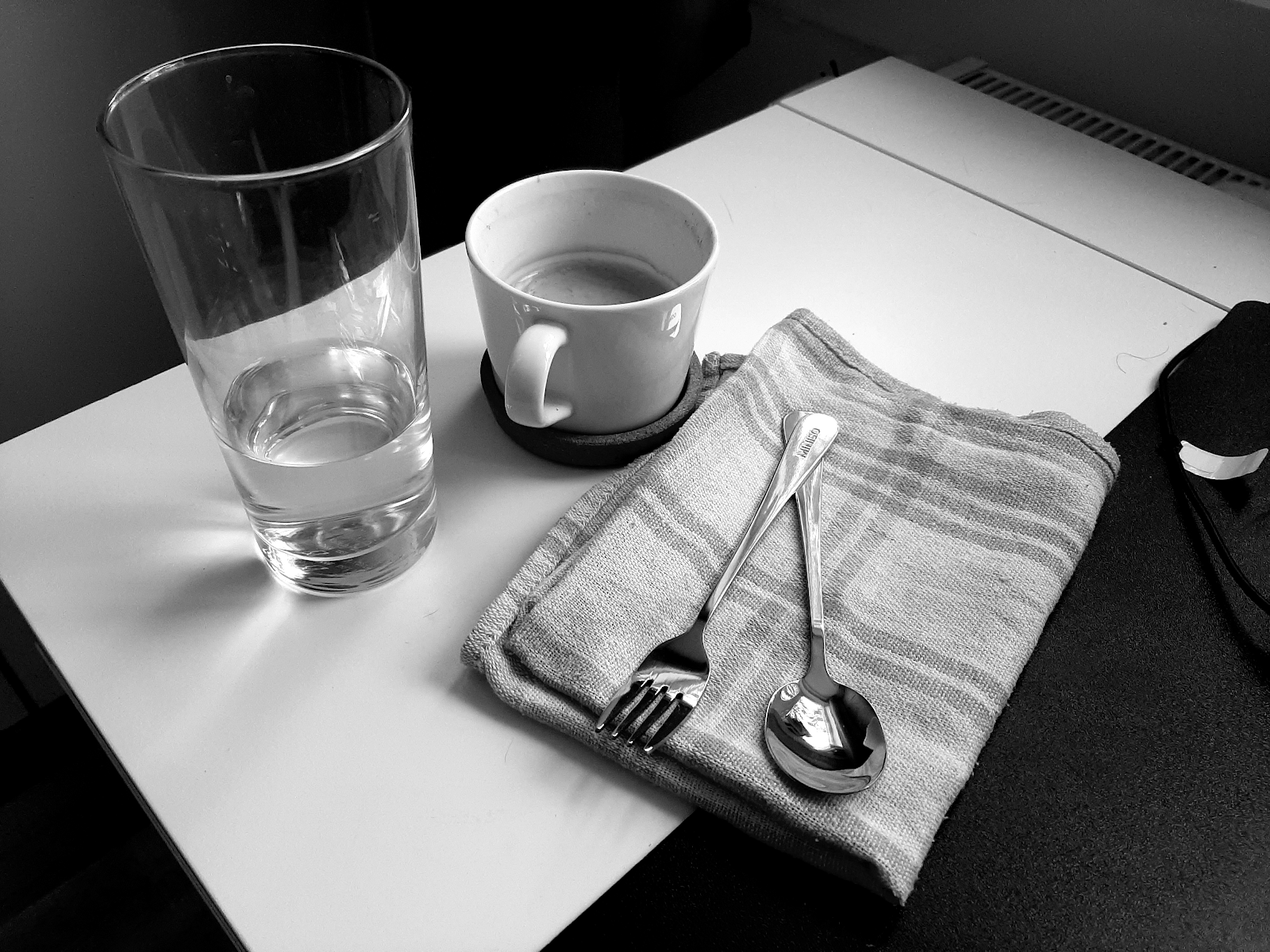
I started by constructing the objects quickly and deciding what techniques I would use: for the glass, fork and spoon I would use smudging so I could recreate the shiny surface and strong highlights, and for the coffee cup I would use hatching.

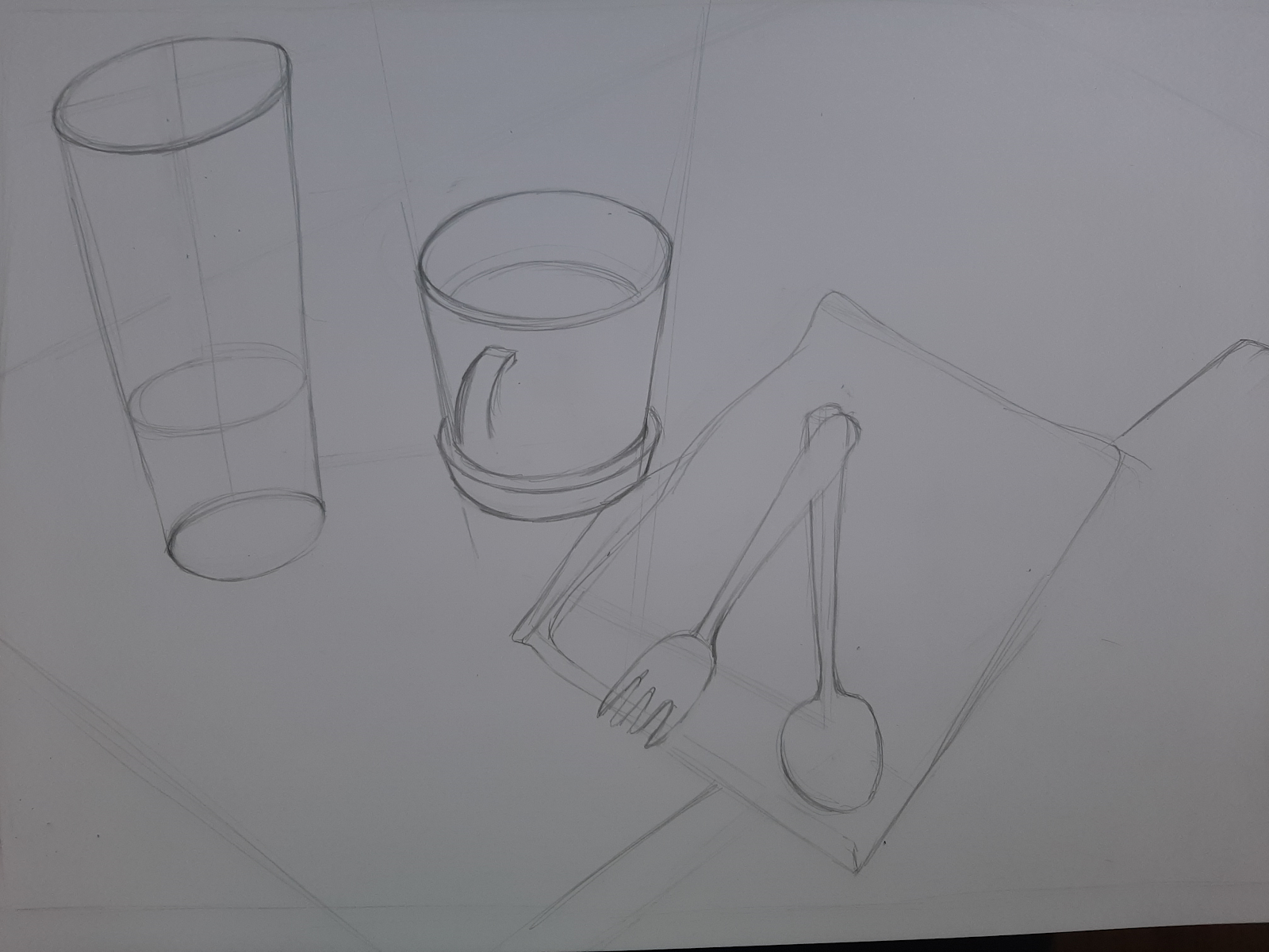
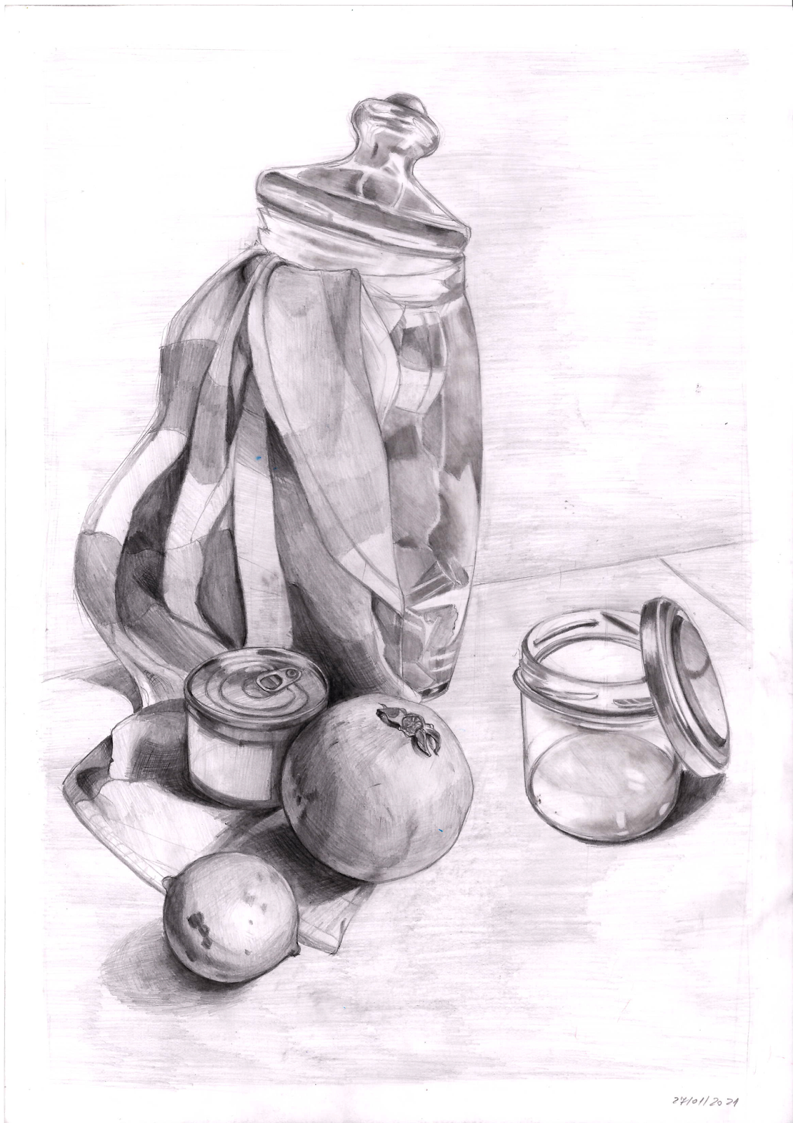
And this is the finalised work:

Looking back, I could have used more of the techniques I have experimented with, such as stippling on the towel, in order to accurately represent the texture of its surface. Overall, I really like the composition, its angle and perspective, and am very proud of how the fork and spoon ended up.

Major Project - "Gold": Texturing The Zmeu

 The texturing for Zmeu was the most tedious out of all of them. I used fill layers and masks as much as possible to give the scales some de...