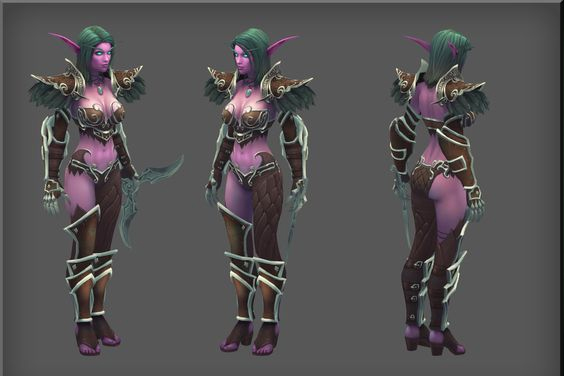
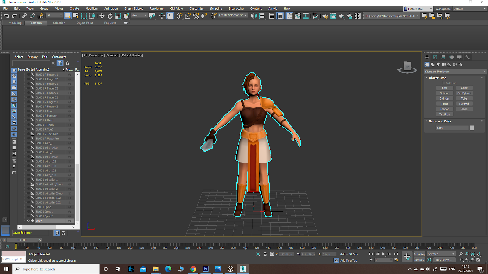
Thursday, 29 April 2021

Two Point Perspective: Ancient Temple

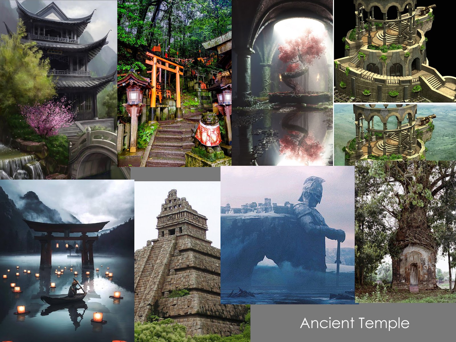
 For the Ancient Temple it was unexpectedly harder to come up with ideas, so my moodboard was composed from scattered ideas:


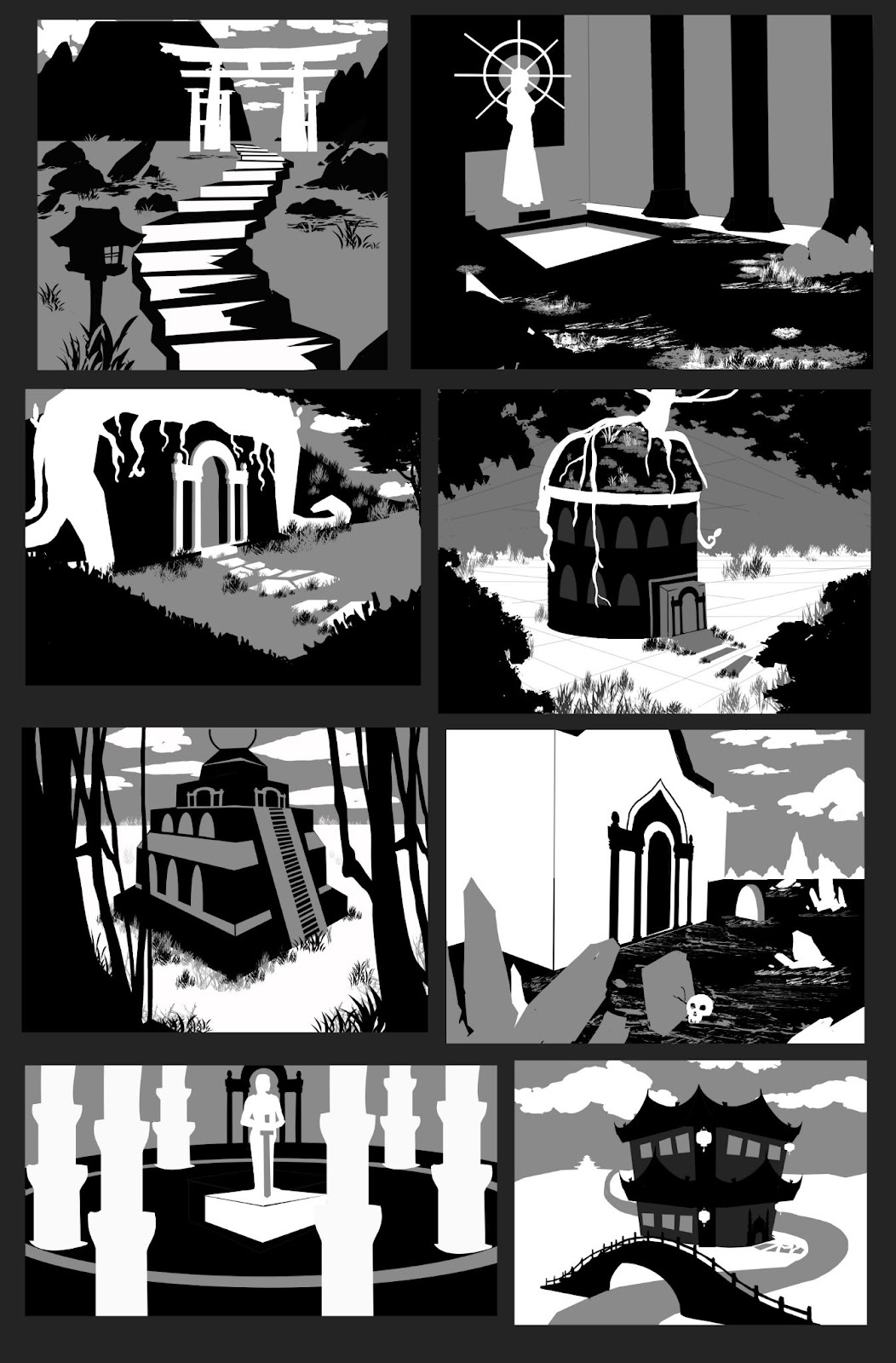
I then made the notans:


I chose the second one, since I found it to be the most interesting. 


I then detailed it:

Though I am proud of the general idea, looking at the drawing I realised that the perspective is messed up in some part, especially for the columns: they seem to have their own vanishing point, different form the rest, and that makes them seem crooked and, well, generally wrong. I will keep this mistake in mind and make sure I will not repeat it. Also, I will practice the two point perspective more. 


One Point Perspective: Sci-Fi Corridor

 For the Sci-Fi corridor I started by making a moodboard to get some ideas:


I then went on to make eight notans. I was a bit worried since I was used with drawing characters, but not environment. Plus, I’ve never actually drawn something “sci-fi” so when I searched for ideas through my head, it was absolutely blank. Still, I used the moodboard and the internet to get some inspiration and made the notans:


I chose the bottom left one, since it had nice depth and I could make the pipes in front the focal point through detail. The windows on the ceiling also gave me the opportunity for interesting lighting.


I then made the detailed drawing. This was the final result:


One point perspective was quite easy, as expected, but the sci-fi theme challenged my creativity to go in a different direction to what it was used to.


Future Tribes

 For the Future Tribes project I had a few ideas from the beginning, which I put into some messy sketches:


My main idea was one of a world where humans live as tribes in isolated domes, sending warriors outside to scout the immediate area and hopefully slowly eliminate the danger that has initially forced them into hiding. Though I had this idea about a warrior monk, I prefered to keep the general idea (asian inspired future tribes character) and experiment more. So I made a moodboard:
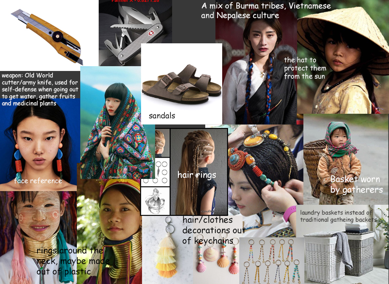

I also put together a mood board with materials I could use for my character:
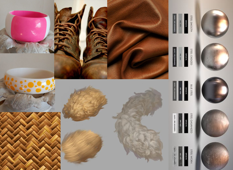
I then went on to make the iterations:
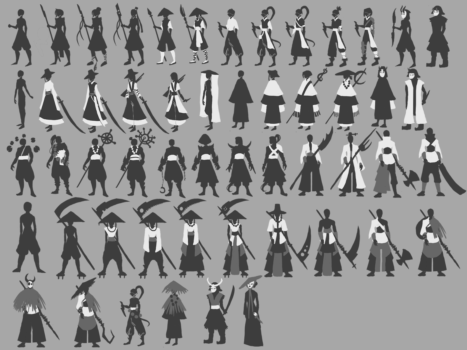
I chose a few that I liked best from these, dividing them by the category I meant them to be in a game: Ronin, Brawler, Assassin and Healer. I experimented with the warrior monk idea too, but I ended up choosing a completely different iteration.
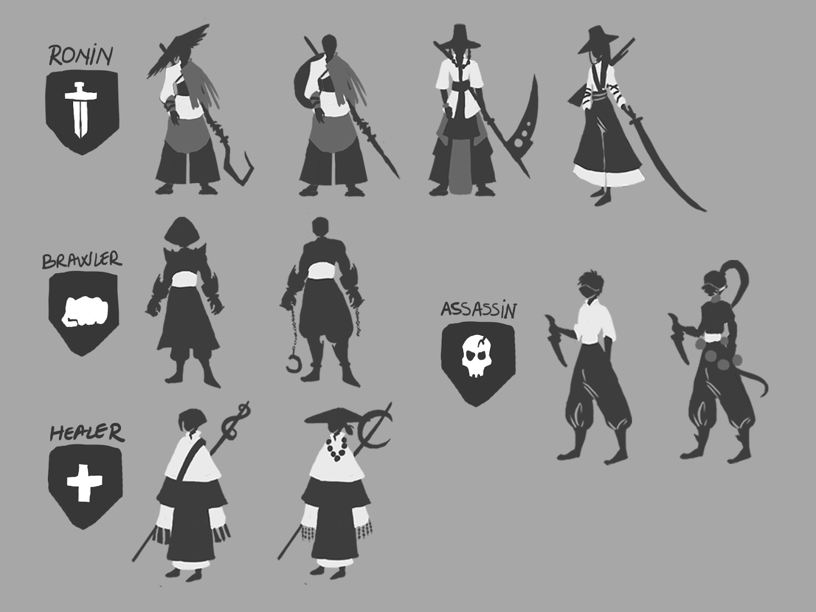

I then detailed my favourite from those:

By this time, I already knew which one I would choose. To be quite fair, I had set my eyes on this one from the first iteration stage, but decided to experiment more just to be safe. I chose the top left ronin character since I liked its flow and the unique weapon. Then I experimented with the values:
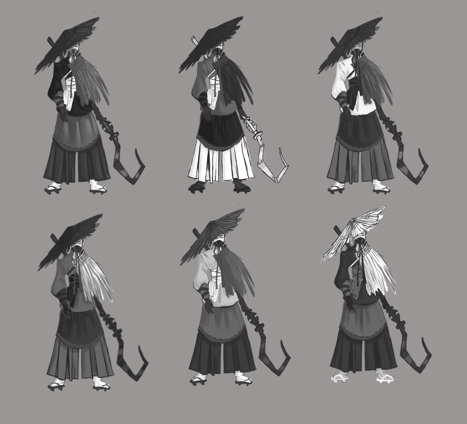
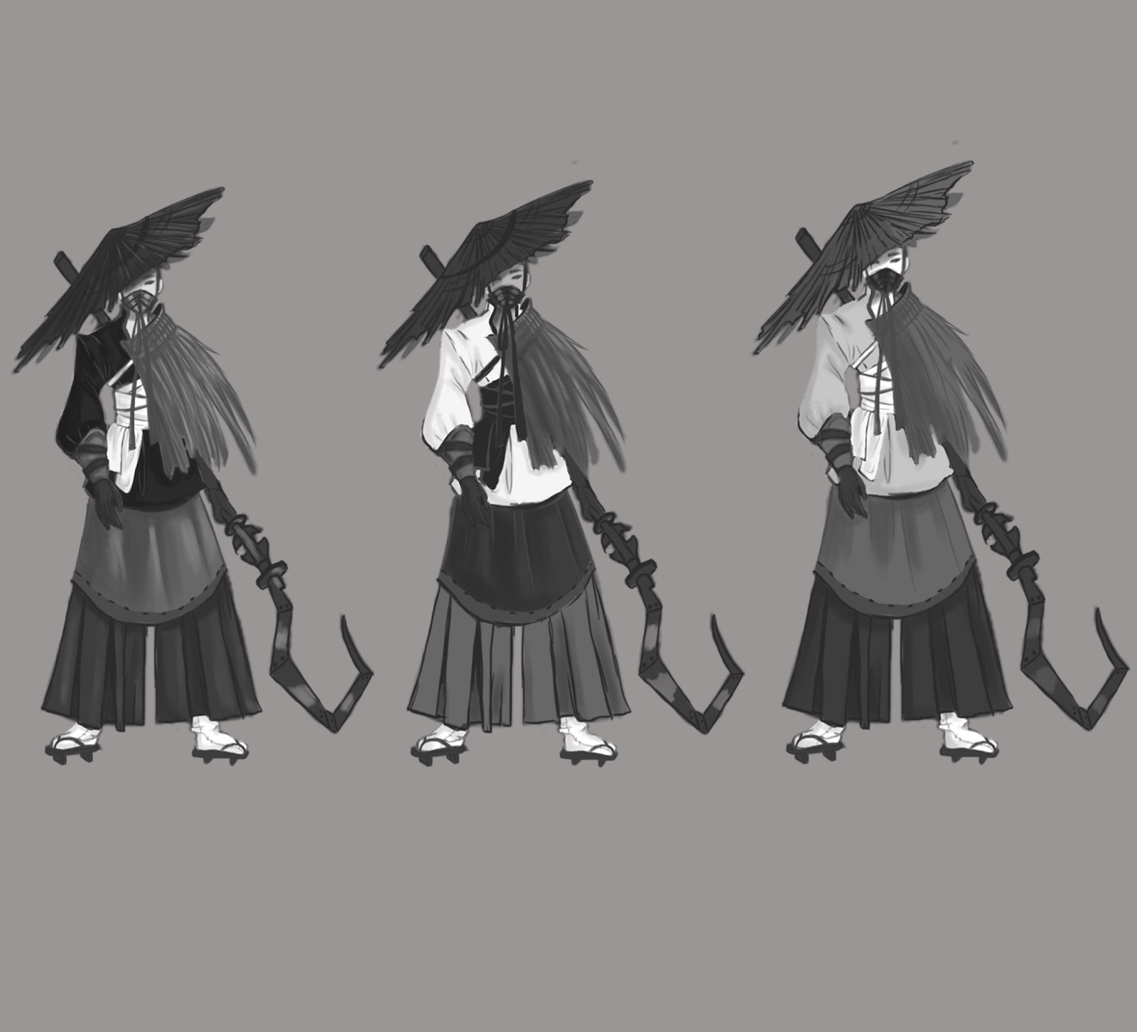
I chose these three as my favourite values since I considered them to be the most clearly readable ones, with most contrast and punch. From these, I liked the first one best. 


I went on by experimenting with colour:
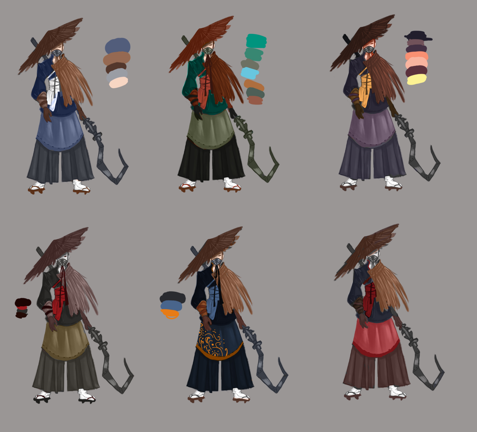
I liked the blue and orange one most and detailed it to see where I could go with it.


Next, I started sketching the character. Since my main interest has always been character art and I had taken some classes in drawing human proportions, I didn’t find drawing anatomy especially hard. Still, I made sure to double-check the proportions and use reference.
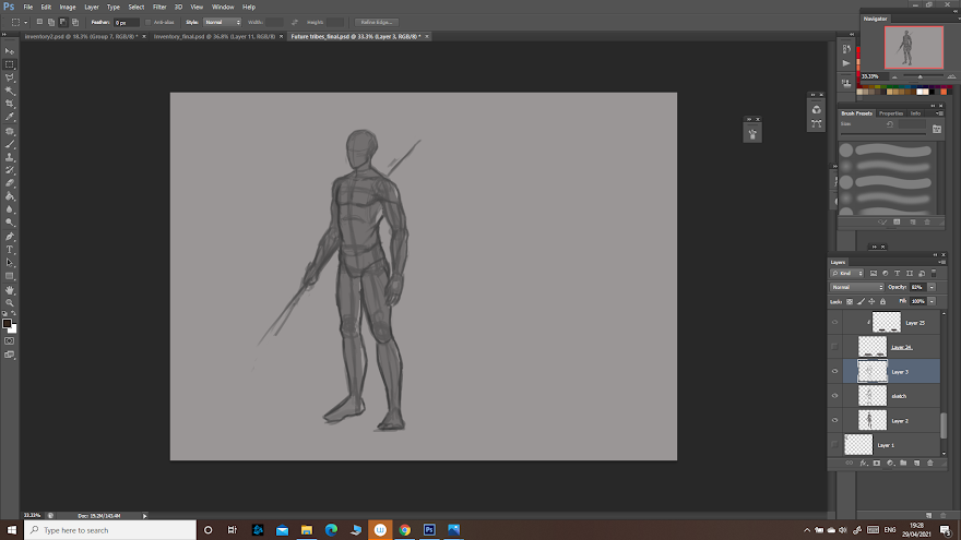

I added the details to the sketch, building up my character:


Then added colour and rendered it, adding the back and the cut-outs:
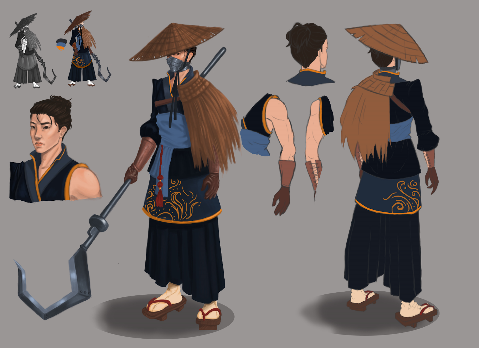
After getting feedback I added more detail on the straws as to show their texture, as well as on the gloves. I did my best to apply what I learned from the material studies. I also added a ribbon tied to the weapon so it would break up the monotony of the metallic surface. Also, I added some seams on the clothes to make them look more realistic:
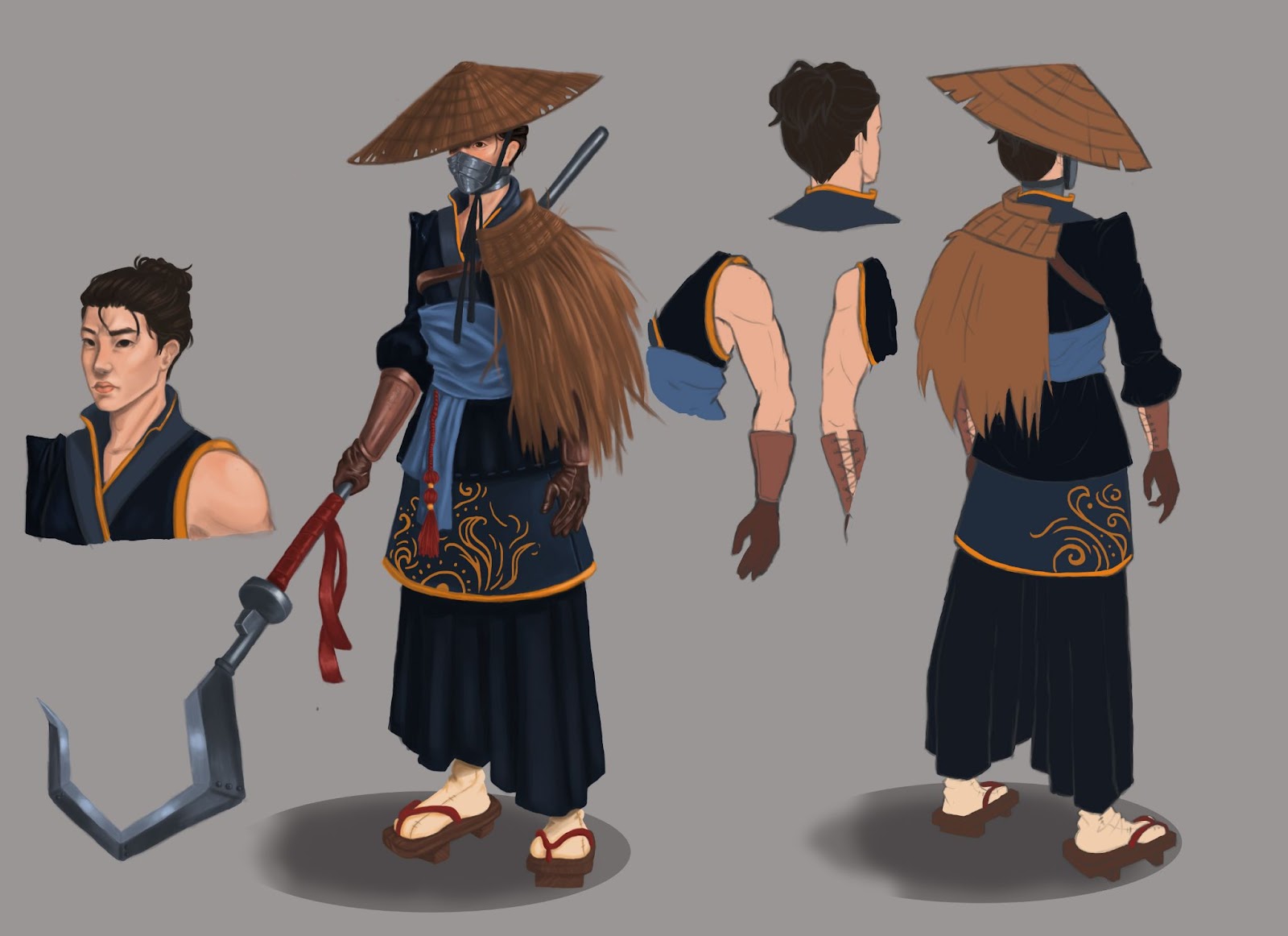
Overall, I am quite proud of what I achieved during this project, and I will do my best to learn and do even better in the next ones.
Going Forward

These days, knowing the first year is close to an end, I started thinking about the summer break and, of course, the second year. It was quite a challenge, the Game Art course, but it’s a challenge I would accept all over again and one that I will for sure take on next year too. 

During this year I learned a lot, not only about game art, but also about organising myself and my time. Next year, knowing what I know now about university life and game art, I want to manage my time even better and, honestly, stop panicking every time something goes even slightly wrong. I want to learn to calm down whenever that happens and find solutions with a clear mind. 

Over the summer break I will take on my own personal projects and also review everything I learned this year. I would also like to search for an internship, if possible, or at least do some activities that would add to my CV.

Creating games has proven to be more of a challenge than I had first expected, but it fascinated me and it still does. Maybe even more now. 

Honestly, at first I wasn’t sure this was what I wanted to do. It just sounded like something interesting to learn and something that would fit me seeing that I’ve been drawing and playing video games since I was little. Now, though, I know for sure. 


PBR Project: Fireplace

 For this project, my aim was to make a Hobbiton-like hearth, so I gathered some references for my moodboard, to get an idea of what it should look like and how I could accomplish it. 

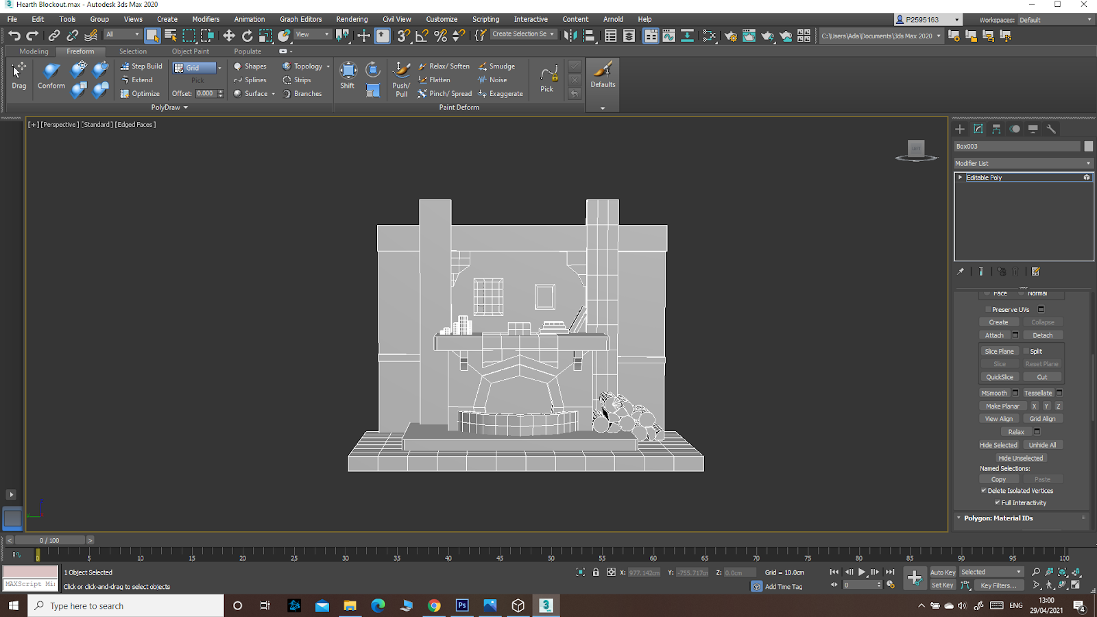
I thought about how I would hit the requirements of the brief and made a 3Ds Max blockout:

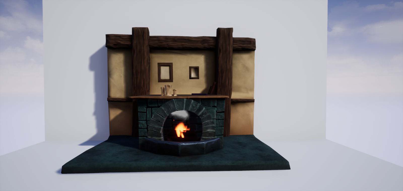
The fireplace itself would of course be rock, there would be the wooden beams on the walls and the part of the fireplace where all the props are would also be wood. The piece in front of the fireplace would be metal, as to fit the requirements of the brief. The wall would be plaster. And, of course, there would be props: candles and books and the two paintings on the wall. 

During the process, though, I encountered problems while modelling the details in Zbrush: the file would not open at all. I figured it was because of how big it was, how much information the fireplace contained, so I had to make the choice of giving up on some details to make it work (while making sure it still hit the requirements, of course). 

Retopology, as well as Baking and texturing in Substance Painter was quite quick, though I must admit I could have done a better job. Given the circumstances of having been left with less time after the problems I had with the Zbrush program though, I would say they ended up looking fine in this situation. 

This is the final result, after making the fire effect too: 


Though I encountered some problems and maybe the Hobbiton-like hearth look might not have been completely achieved, I’m quite proud of what I made despite of the setbacks.


Gladiator: Lighting and Presentation

 In order to create the setting for taking the beauty shots of my gladiator, I researched the 3-point light setup:

Key Light - a bright light that emphasizes the form and dimensions of the subject. It must be the brightest light in the setting.

Fill Light - set opposite of the key light; has the role of filling the dark shadows cast by the bright key light. 

Rim Light - placed behind the object. Adds a light outline to the subject.  

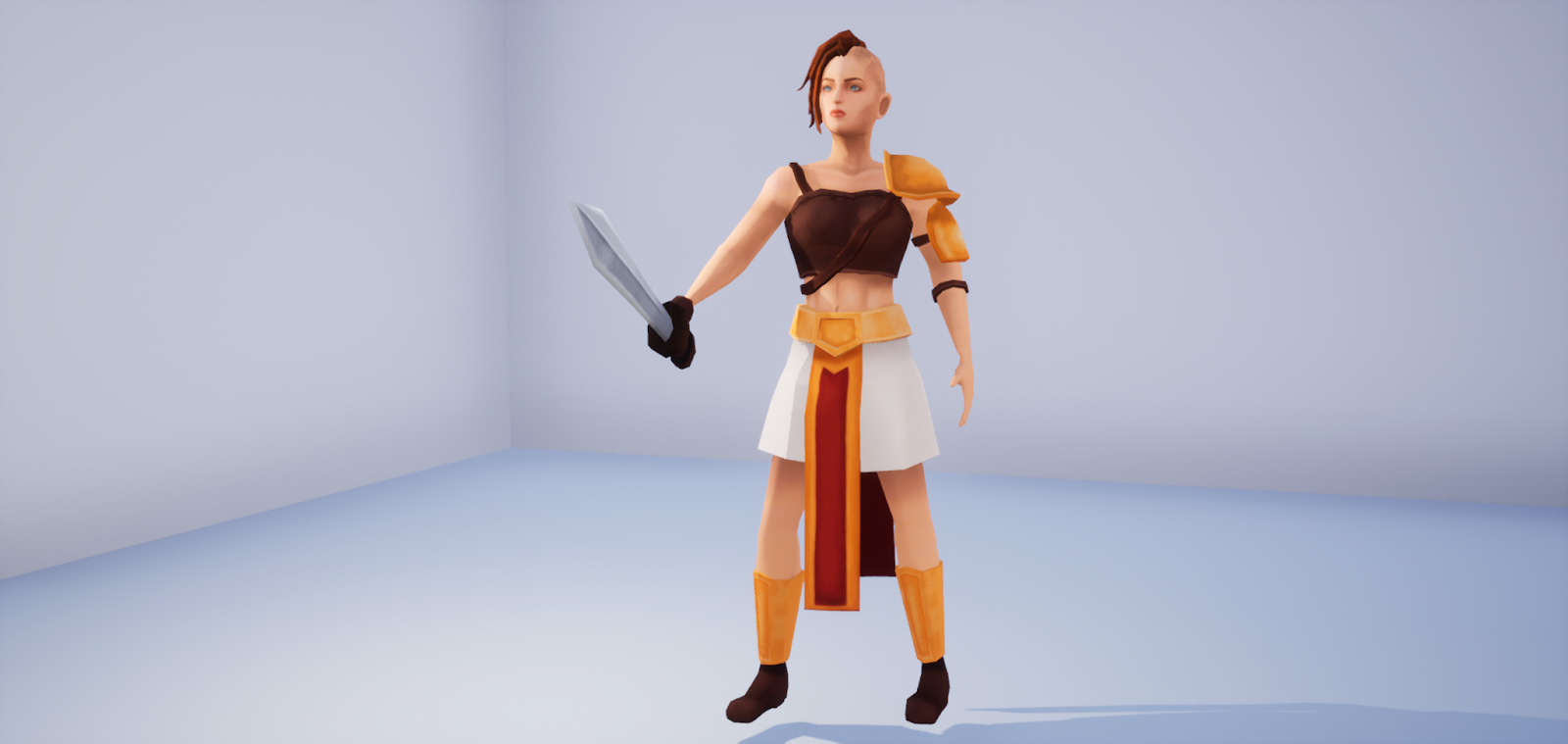
With this information, I went on to place my character in Unreal and take the screenshots:

Gladiator: Final Steps

 In terms of unwrap, being quite an organic and complex form, it was a difficult and long process, making sure that the seams would be as hidden as possible, that the checker pattern was even and as unwarped as possible. Unwrapping and straightening the hand UVs took an especially long time. 

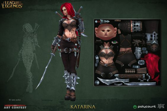
When texturing, it was even more complicated, since I had to always check the model to see if the textures fit it. The face was most difficult: at the beginning it looked absolutely horrendous and I was scared I would not be able to make it look like an actual human being. But after a while, with a little bit of work and some references, the results started to show and I found the process quite enjoyable. During it, I also searched for how professionals do the texturing of a low poly character: I looked mostly at league of legends characters’ textures and World of Warcraft ones. 

This was the result:

The rigging and skinning went well too, though they were a detailed process, especially doing and correcting the skinning while looking at the animation. Not all the movements looked completely natural, but I would say I managed to make it look decent and prevent most of the clipping and other major problems.


Major Project - "Gold": Texturing The Zmeu

 The texturing for Zmeu was the most tedious out of all of them. I used fill layers and masks as much as possible to give the scales some de...