Wednesday, 20 October 2021

Week 1 - Insect-Human Photobashing

For the insect photobashing task I began by browsing for interesting-looking creatures so I could get an idea of what I was going for. I searched specifically for bugs that could serve maybe as armour or weapons or that simply make for interesting shapes and details. 


From the get-go I knew I wanted my character to have a helmet so that I could use the interesting shapes to the fullest. This is, in my opinion, the best and most efficient way to replicate the look of the insect I'm going for. Also, I usually like to concentrate the detail on the top part of the character, to guide the viewer's eyes there. After all, when we first meet someone we look at their face, so I want to make the helmet the most interesting and most detailed part of the composition. 


At first, the moths inspired me the most and the idea of an agile moth-like lady assassin came to mind. I used curved lines and sharp forms in order to recreate a lean, slender and feminine look, but also aggressive and fast. I think the overall triangle shape reinforces that.

The second design is a bit weak. I think I had to get a bad idea down on paper too so I could come with a better one in the end. The overall vibe is child-like, which with maybe some modifications might turn into something, but I think it lacks a general pattern/idea that would hold the composition together and make it make sense. 

The last one. I absolutely love it. This one is definitely a tank, her armour made of beetle shells, her shield of a bugs wings. I like how the spider eyes give the impression that she will most definitely see you, target you and charge at you. It doesn't look like her armour is actually made of bugs, but more like she is some sci-fi cyber soldier whose armour imitates insects. The only thing I think I will change are the wing-like spikes on the boots, which imply agility, going against the idea of a tank character with heavy bulky armour. I first added them to repeat the shape on the glove, but now it doesn't seem like a good idea anymore. 

As you might have guessed, I went for the last design. But the first one will remain in my drafts for possible future projects. 


Saturday, 16 October 2021

Week 2 - Pumpkin Retopology

The second week of the project I spent retopping the pumpkin in 3ds Max. There were a lot of elements to take care of, such as the vines and leaves. It took longer than I would have liked, but I somewhat expected it since the design phase, where I made things harder for myself. Even so, I believe the final asset will be worth it. 

The mouth of the pumpkin posed the biggest challenge, because of the stitches that demanded a lot of attention. I concentrated most of the detail there, then, using triangles, I decreased the polygon count for the rest of the pumpkin, that isn't that detailed. 


The lid and stalk were also a bit more detailed. With the vines, after modelling the first one, I just copied it and conformed it to the rest, tweaking a few things in order for it to fit the high poly model. Same with the leaves. 

Inside, I left the pumpkin hollow, since the interior isn't important and I would just waste time and budget on it. 

I ended up with a final count of 1557 tris. I might use some of the rest to add more topology to the model, making sure all the details will bake properly, then proceed to unwrap it. 


Week 1 - Pumpkin

After reading the brief for the pumpkin project, I had a vague idea of what I wanted it to look like, or at least the vibe I wanted it to give. I knew most Halloween pumpkin carvings are scary-looking and I did want to preserve that feeling, but I also wanted to add something: a cartoony, cute childish vibe that makes things that are supposed to be scary even more unsettling. Like children in horror movies. Or Tim Burton's animations. 

So I went digging for reference.


I plan placing a candle inside the pumpkin and using a particle system in UE4 in order to light the inside of the pumpkin, so I gathered reference for the candle too. I then made a quick sketch to cement my idea: 


My friend even told me it gives Tim Burton movie vibes, so I guess that's a win.

I then went into Zbrush to model my pumpkin. 


I gave it a tear drop-like shape because I wanted it to have a more unique silhouette. I think it gives it that kind of cute, dumb and pityful look that combined with elements like the stitched mouth make it look kind of unsettling. Also, even though I knew It would make my job a bit harder later on with retoping, I didn't want to keep the symmetry, since I believe it would have made the design a little boring. 

This is the final model in Zbrush:


I believe I achieved the cute-creepy look I was striving for. Though I must admit, sometimes the controls of Zbrush give me the creeps more than any Halloween pumpkin 😅. 


The Art of "Journey"

Journey, indie video game produced by Thatgamecompany (besides great video games they seem to also have a great sense of humour), won the hearts of players from all over the world, including myself, with its breath-taking visuals and unique gameplay. I chose to write about this game because I first started playing it a few days ago, and I couldn’t put it down until I got to the end. The story world is immersive and fascinating through its simplicity. You never know what is waiting over the next dune. The premise of the game also intrigues players: you are thrown in a desert without knowing anything about your quest. Soon enough though, your eyes are directed towards the mountain in the distance, contrasting with the sun shining behind it.

With a rather simple art style, it is one of the games that shows best how employing basic colour theory and composition techniques can take you a long way.

Take this image for example:

Journey - Thatgamecompany
Journey - Thatgamecompany; screenshot

It is such a simple piece of art, but it somehow managed to take my breath away. It made me linger in the moment instead of charging right back into the action of the game.

It uses only two complementary colours and their tones: blue and orange. The dark blue gives off a surreal, eerie feeling, making the player wonder what mysteries wait to be discovered. It creates expectations and makes them want to continue playing. The orange creates a much warmer vibe, reassuring in a sense. The place where the character stands is still safe, but you must leave it in order to continue your journey.

The lighting also plays a great role in directing the player’s attention to the next checkpoint. The light beam contrasts with the rest of the image, which is darker.

The only fine details in the drawing can be found on the character in the foreground, where the viewer’s eyes are first directed. They are then led towards the light beam, framed by the columns. The character is also the darkest in the image, attracting the player’s attention first.

It also uses the Rule of Thirds: the character is placed where the lines meet, while the altar and the light beam are in the middle of the page.

As for the shape language, the triangular shape of the character indicates dynamicity, rather than masculinity or force, since the character's form is rather small and thin, indicating agility and speed. This way, the purpose of the character (making the journey) as well as the way they move and travel is made clear from the beginning. The triangle shape is repeated in the altar far away. The sqaure shape of the collumns symbolize their stability in the face of the passing time and disaster that hit the old civilization which built them. 

Overall, Journey uses simple forms, complementary colours and lighting in order to catch the viewer’s attention and keep them immersed in the game’s world, while also creating dynamic pieces of artwork. 

Week 1 - Reinforcing Skills Line and Line Weight

This week I reinforced my knowledge and practice my skills regarding line and line weight.

I first drew a thumbnail in order to have a general view of my composition and make sure I know how to fit it into the page. Still, I must admit I had some problems in this part, but the use of grids helped a lot. I chose not to draw the garlic because I felt that from the angle I viewed the composition, it wouldn’t add much to it. I also decided that I would try to make the flowers slightly bigger than they are in reality, in order to direct the attention towards them, since I believe they are the most interesting part of the composition and good subjects for a line and line weight themed drawing.


I sketched the vase and flowers first, since they take the most part of the page and are the focus point of the composition. I had too little space left on the left side so I moved the frame line a bit farther out.

After sketching the rest, I realised the pineapple was touching the edge of the frame too so I moved that a bit farther down too and shortened the pineapple leaves. I later changed the shape of the stems to more organic and rounded forms since they were too angular.


I then started adding the details and line work. I conveyed the darker areas through thicker, darker lines and used lighter ones for the objects that are further away or less of an interest point. I concentrated the details into the flowers mostly and a bit in the vase too.


This is the final result: 


Thursday, 29 April 2021

Materials

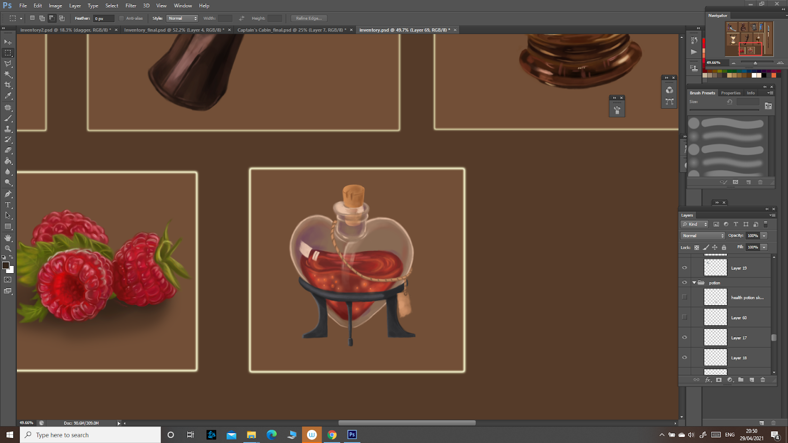
 For the materials project I started by making a potion bottle. At this point I wasn't really sure what I was doing and how to do a material study, how to observe these things. As a result, the final product looked quite stylized instead of realistic:


After the feedback though, and after studying more glass and gaining some experience, I come to understand how the glass reflects the light and how the highlights work, adding the impression of reflectivity. I then added some to my potion to make it look at least a bit more realistic. 


Also, for this whole project I must admit I didn’t use a very organised workflow, but rather one that might be considered destructive. I painted the studies like I would do traditionally, since I am more used to traditional painting than to photoshop. This being a study, I believe the observation and the learning outcome to be more important, so I continued like this for the next ones too. 


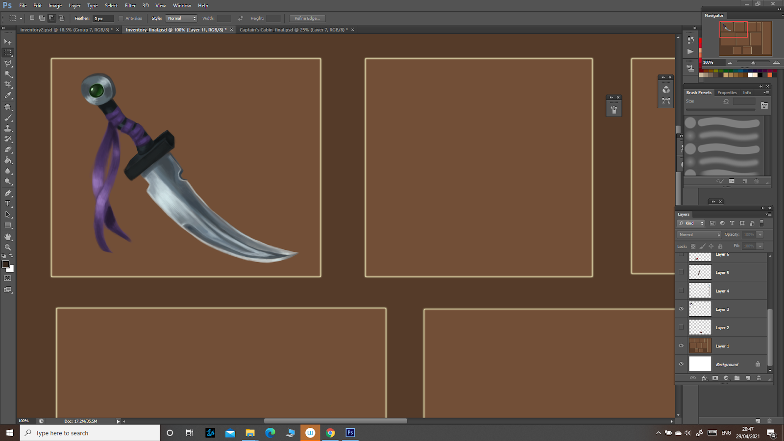
The dagger ended up looking a bit more realistic, but it still held that stylized look that I was trying to avoid. 


During this study, I observed how the metallic surface is affected by light, reflecting it. It was quite similar with the glass in terms of characteristics, since metal is also reflective. Still, as I noticed while studying this material, it’s reflectiveness depends on some properties such as how damaged/corroded the metal is. The dagger, being made from new metal, reflects the light more, creating lighter portions, especially on the sharp edge. 


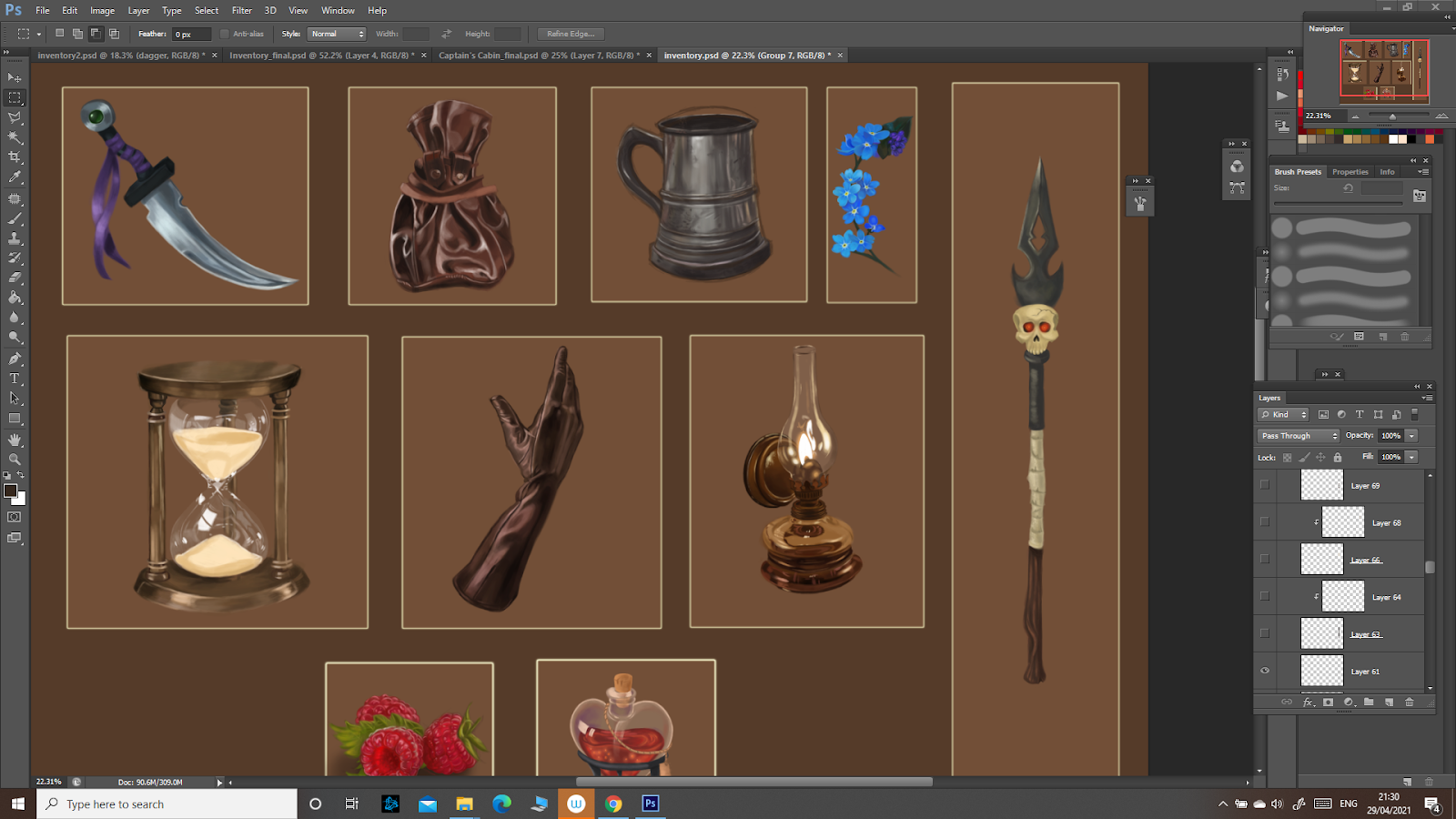
I then drew a spear and frankly, it was quite a disappointment:

It was simple and very stylized and didn’t reflect the properties of the materials it is made of. At the end of the studies I noticed how much it contrasted with the rest of the more detailed realistic objects. 

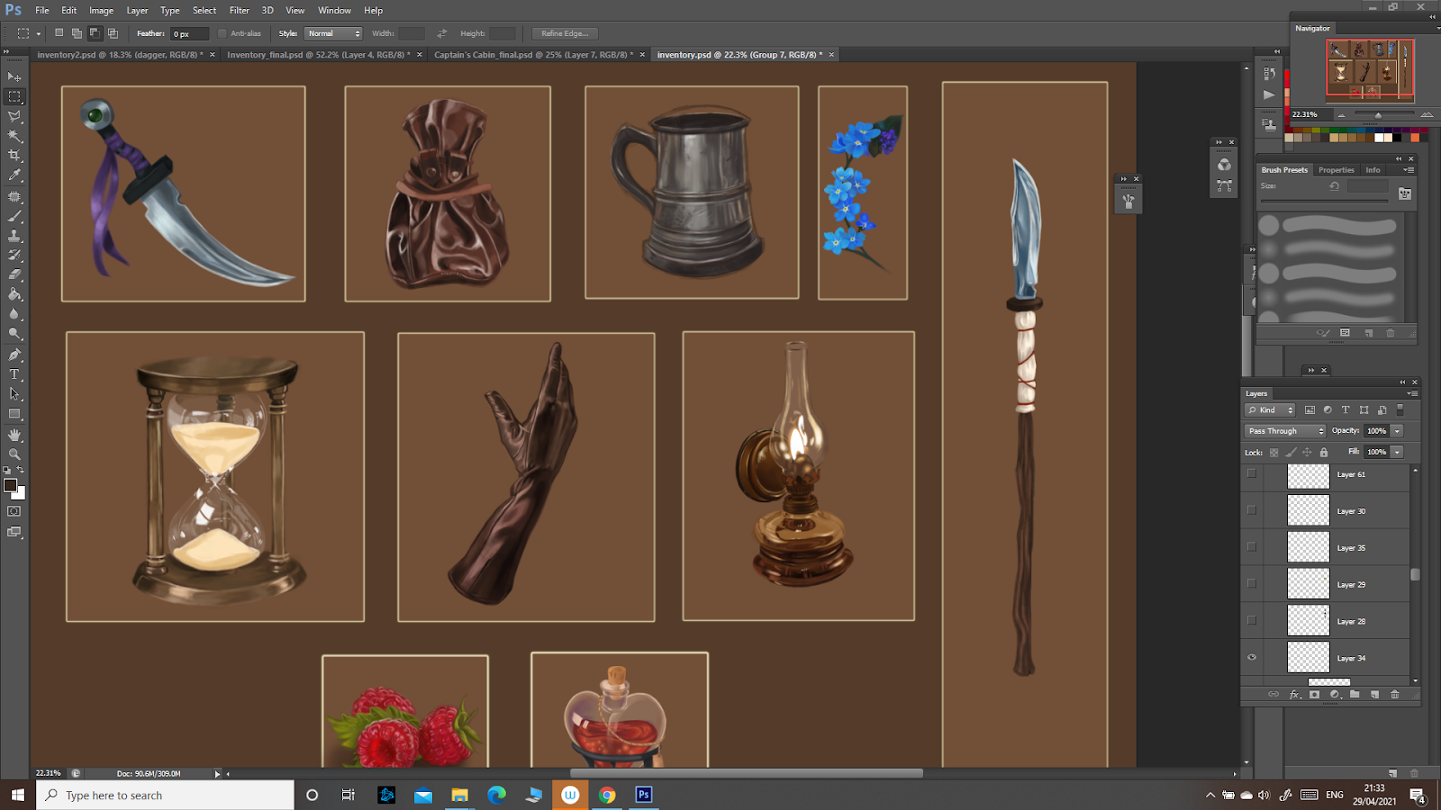
I decided to use what I learned to make it look at least a bit more decent:


It might not be perfect since it was a bit rushed, but at least in terms of the metal blade it looks a bit better.


 I went on to study the next material: leather. 


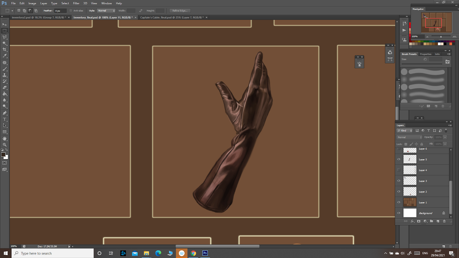
It is of course not as reflective as glass and metal, but it can still be a bit shiny depending on the type of leather. Also, the light and shadow depend on the folds and creases of the material. This study went well and I managed to achieve the realistic look I was going for. 

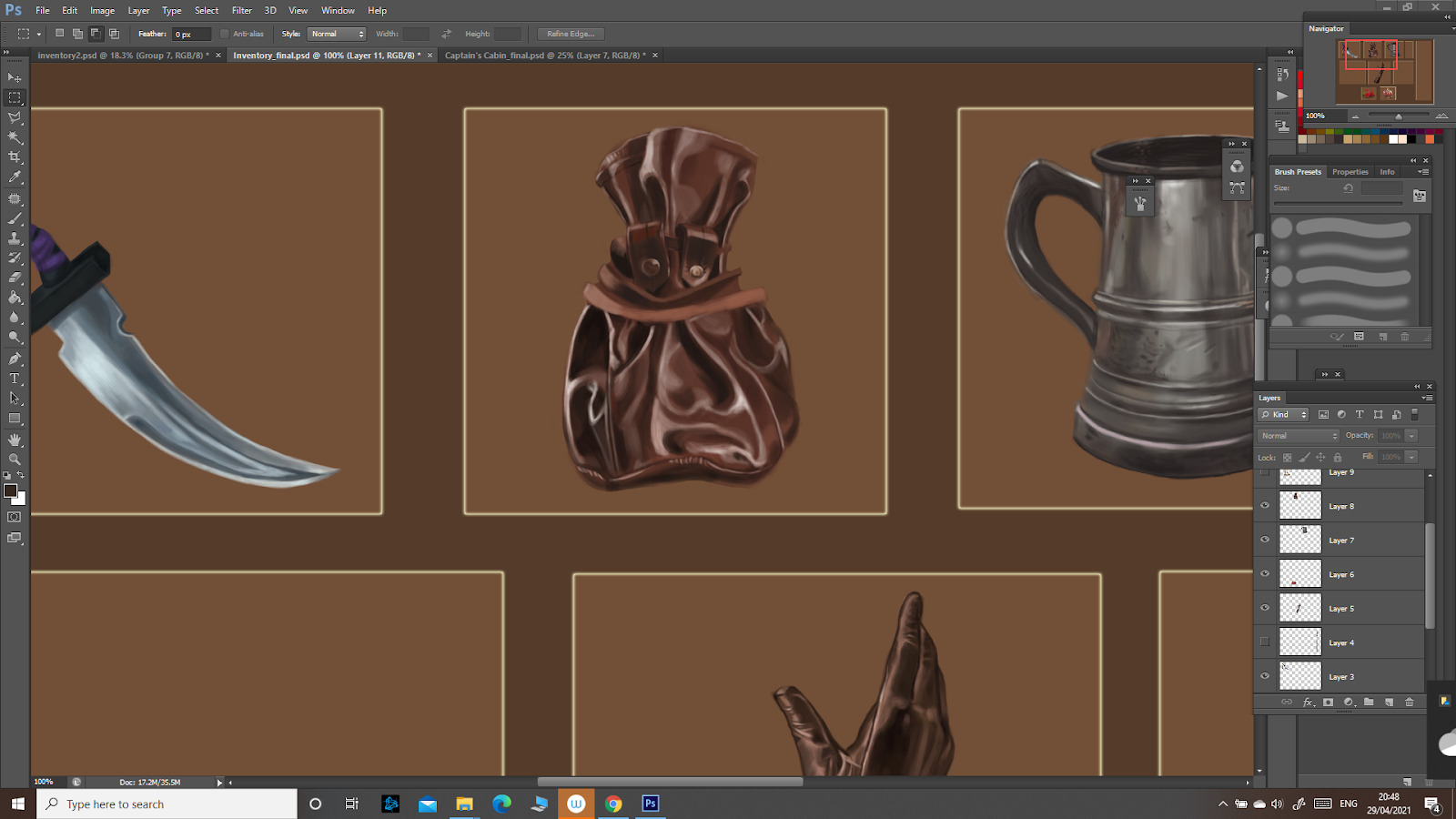
Next, I continued with leather and drew a leather pouch, which I am really pleased with:


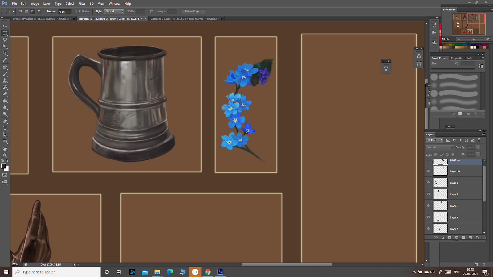
I then took on a challenge in terms of detail:


Here, I observed the subsurface scattering in the raspberry at the front. The light, penetrating the rasberry, makes the colours on that part seem very bright, like they are burning. To recreate that, I used a very saturated colour. 


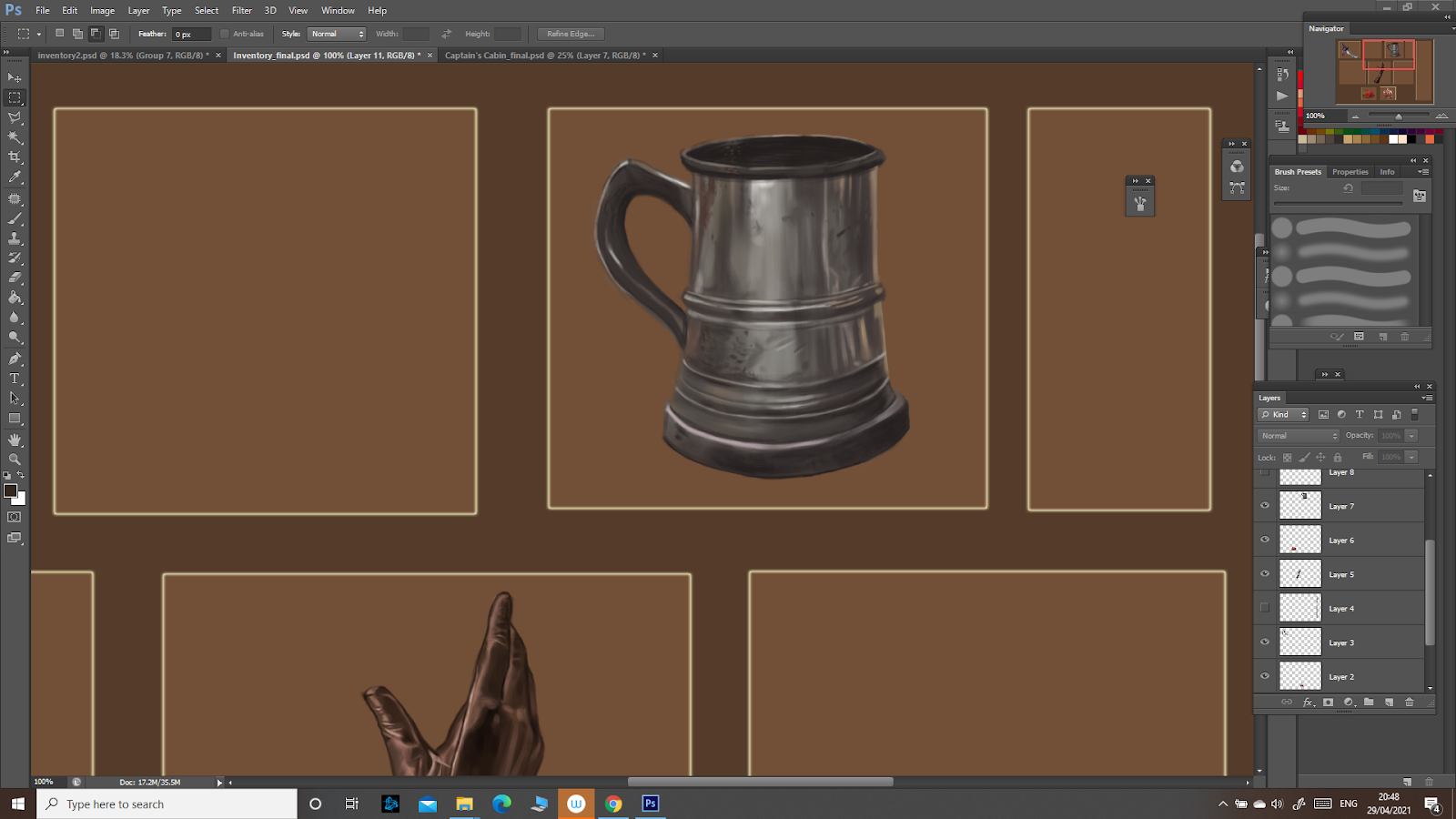
I then went back to drawing metal, this time a more damaged, scraped one, so it was less shiny then the dagger.


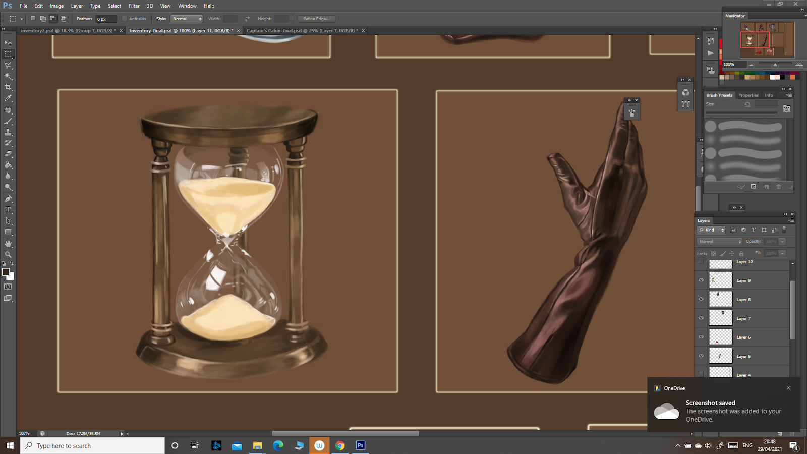
Next I drew an hourglass and continued studying metal and glass:


The improvements when drawing glass are clear here: the highlights are more detailed, following the form of the hourglass. Some are stronger, depending on how the light hits the surface. The metal is less reflective, scattering the light a bit more, so the highlights are weaker. 

The next drawing was a challenge in terms of detail:


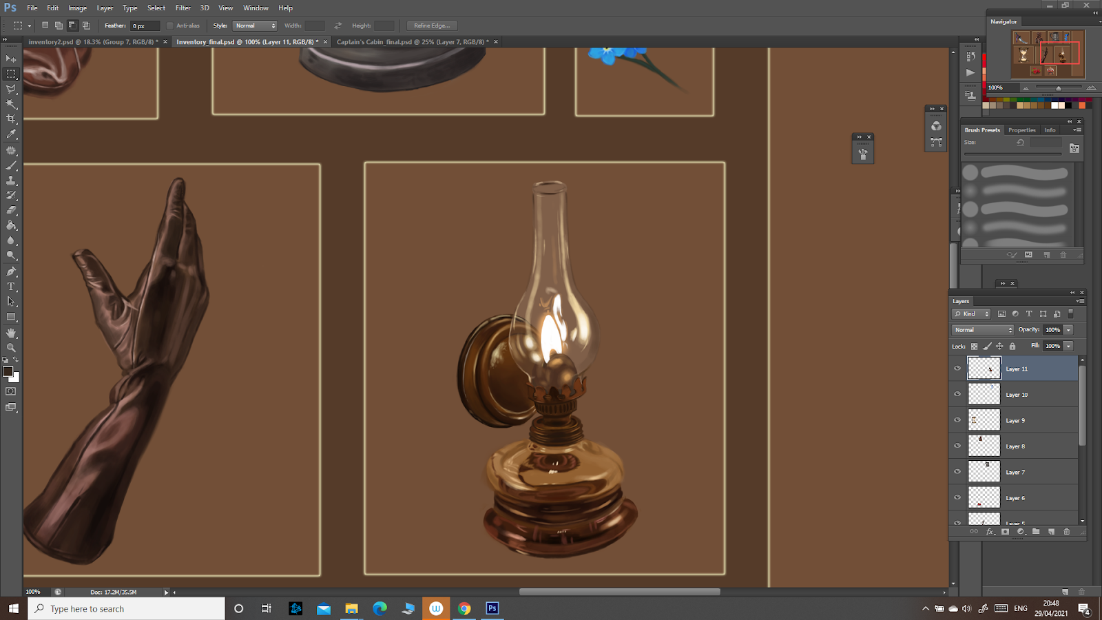
Next, I drew a lamp:


As for the other ones, the glass reflected the light strongly, especially since the light source is so close, and follows the form of the object. For the flame I used almost pure white, then added a yellowish glow with a soft brush. The metal was quite reflective too. 


This is the final outcome:


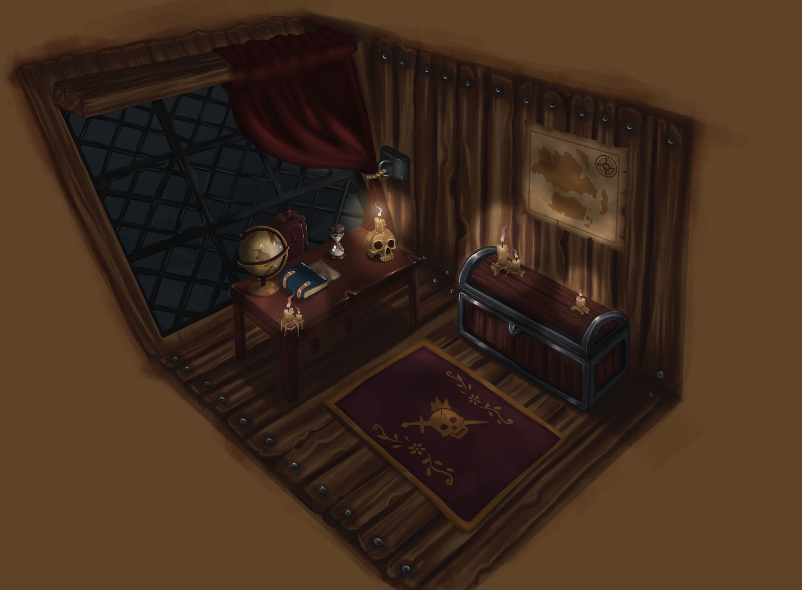
Three Point Perspective: Captain's Cabin

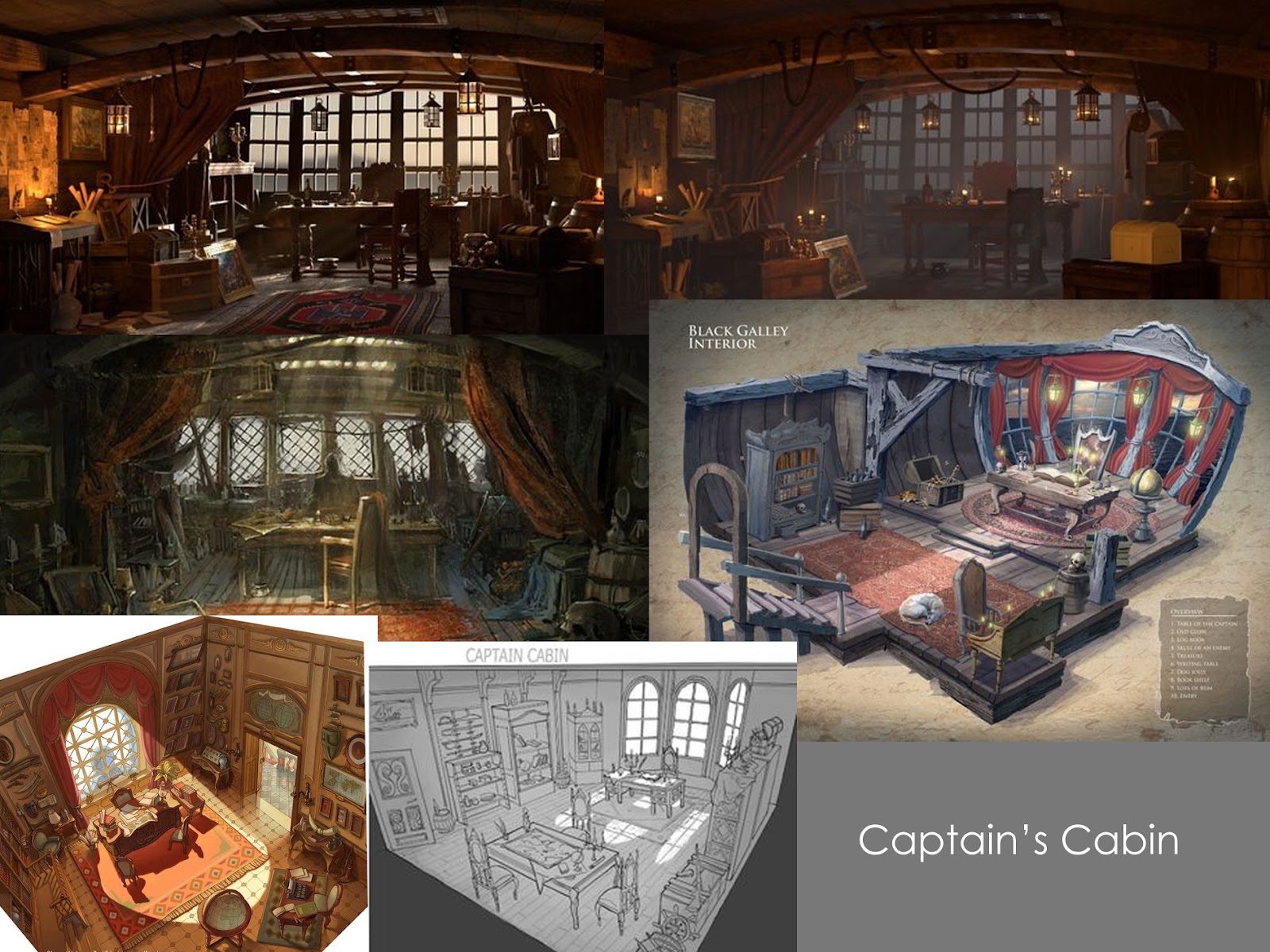
 For the three point perspective I already knew what I wanted to draw: a pirate captain’s cabin. I first put together a moodboard to get some inspiration:


I then made a few sketches to get a better idea of what I wanted to do:


I chose the second one since I found it to be the most interesting: the desk would be the focal point, with props and also the light source from the candle. 


Next, I drew the detailed, refined sketch:


I want to specify that the back wall is quite inclined not due to a perspective error, but because the captain’s cabin was usually at the back, where the ship wall had this specific form.


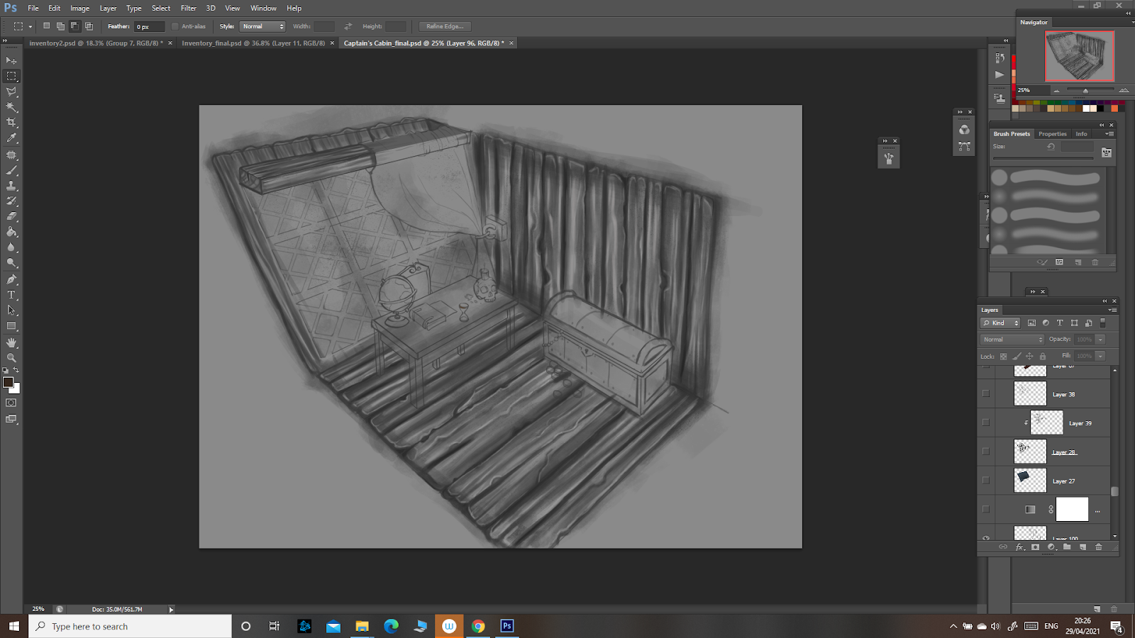
I started drawing the wooden planks with grayscale values and added a gradient to quickly get done the majority of the room:

I then rendered all the objects and the rest of the room:

After getting feedback, I added a pattern on the rug, a map on the wall since it was a bit plain and then used a mask to add a more dramatic lighting in the room. I also drew more candles to add more interest. This is the final outcome:


Major Project - "Gold": Texturing The Zmeu

 The texturing for Zmeu was the most tedious out of all of them. I used fill layers and masks as much as possible to give the scales some de...