Monday, 2 May 2022

Animal Project: Texturing the Fox and Implementation

For texturing, I chose a stylized look to fit the sculpt style.

I started by using a couple of fill layers with procedurals to add more variation to the colours and add a watercolour like effects. I mainly used cloud procedurals, but I also used a Crystals one, that gave it a subtle brush stroke like effect. Afterwards, I used layers with the Mask Editor generator to add shadow in the cavities and highlights on the edges. 

I also used two Light generator layers to add more variation to the colours, giving it the darker orange fur bits. 

I then painted some darker spots using a brown fill layer and painting into the mask, to keep the workflow non-destructive. I did the same for painting the black and white parts on the fur. I added some yellowish colour into the white parts, to make them more interesting. 

For the saddle, I used a similar process: used procedurals to add colour and roughness variation, then used Mask Editors to darken the cracks and lighten the edges. For the blanket, I made the pattern in Photoshop, the imported it and placed it on the model. 


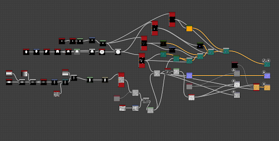
I made a simple eyeball texture in Substance Designer using the Shape node as a base. 


For the presentation, I made a cartoony grass and flowers texture, using a grass texture I made before as a base and adding the stylized flowers to it. 


I used a Shape node set to the disc shape and offset it using the Transform 2D node. I then offset it to the other side and blended the two together, creating the shape of the petal. I used Splatter Circular to put the petals in the shape of a flower. I used multiple Tile Samplers to put everything together, then added colours. At first, I had made the grass really green, but after getting feedback, I changed it to a more teal colour, to match the blue on the fox's saddle. 

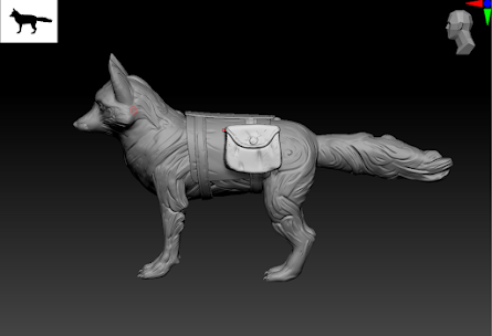
I put the fox together in Unreal and lit it using a Rectlight. I used an emissive Material and a Particle System to create blue fireflies around Brutus (the fox).

Here is the outcome:


Words can't describe how happy I am with how this turned out. I managed to achieve the exact style I was hoping for at the beginning and I am really pleased with how the fur patterns turned out. The magical vibe I was aiming for is there too, so I am really pleased with my fox. 


Week 25 - Realism and Art Nouveau

For the last task of the year, I did my best to use everything I learned about using colours and drawing the human figure and I am really happy with how it turned out. I began by sketching a quick thumbnail, then by drawing the general figure using light lines. 


The knees were too small, breaking the illusion of foreshortening, so I made them bigger and also proceeded to draw the details on the face. I am happy with the level of resemblance I had achieved even at this stage.


I then added more details and folds to the clothes and began shading the face, also varying the colours as I went. I added yellow on the face to reflect the yellow in his shirt. I am also pleased with the fact the silhouette doesn't look stiff.


I started placing the colours on the shirt so I could figure out how to reflect them in the rest of the drawing too. I also worked on the arms and used yellow again for the lighter tones. The fingers were weird and a bit stiff, so I tried to define them more. Even though they do look better, I feel like I could have not used such a dark line. 


After getting feedback, I added some red and blue in the figure and reflected some of the red from the shirt in the background, armchair and jeans. I made the eyes darker and the nose and tried to improve the contrast of the face. I also added more folds in the torso, since the figure looked cut in two because of the single fold I had drawn. 

This is the final work:


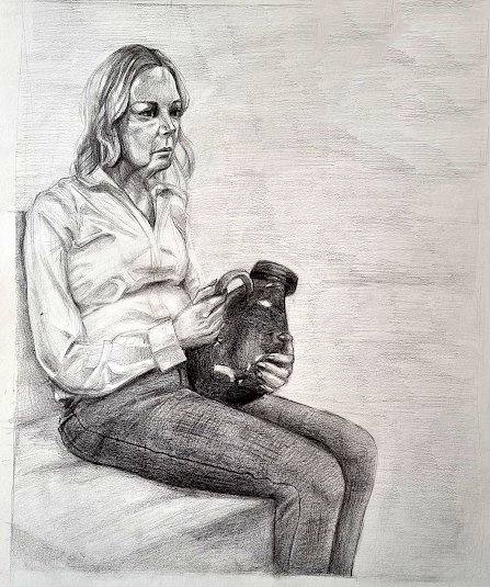
Week 24 - Classicism and Neoclassicism. Focus on Human Figure

 I really enjoyed this task and noticed that my ability to draw fast while still keeping the quality of my work has improved. I managed to almost finish the drawing during the session and only had to add the refinements to it afterwards. It surprised me, since I have always been slow in completing my work, but I am very happy with my progress. 

I started the task by drawing a quick thumbnail. I placed the figure more to the left, to have space for the legs. 


I then sketched the grid and used it to place the figure properly, so I wouldn't run out of space. I drew the main shapes using light lines, so I would be able to change them easily if the proportions proved to be wrong. 


I then sketched the face and legs and started to shade. I tried to keep the contrast high for the shirt, but it started to looks slightly overworked. 


I am proud of the level of resemblance I achieved in the face, since it's a smaller surface than usual, so it's harder to add a lot of details. I tried my best to not overwork it and I think I did a good job with the contrast too this time. 


I then shaded the hair the clothes. I kept the jeans dark from the beginning, to ensure that there would be contrast between them and the shirt. 


    I added detail to the hands and folds to the jeans. I also rendered the vase, making it darker than the jeans and adding strong highlights to give the impression of a shiny, reflective surface. 


I finished shading the figure and added a light background to not distract the eye from the figure. I also darkened the vase more. 


After getting feedback, I added darker folds in the jeans and lightened the shirt a bit more, as it was looking overworked. I also added some accents using lines in the shirt to accentuate the folds. The back of the head was also too short, so I made it slightly bigger. The folds of the jeans were very similar and I tried to change them up a bit. I added accents on the hand too, to separate the fingers. 

I really enjoyed this task and it's one of the works I am most proud of this term. I like that it has proper contrast and tonal variation, things I have struggled with all year. Looking back, it shows that my work this year helped me improve with every piece, so I'm pleased with my progress. I also like how the shirt folds turned out. I think the folds on the jeans could have been more detailed.  


Week 23 - Muscle Structure. Combining Black and Colour Media

For this task, things got trickier again because of the paper. I thought I would avoid what happened with the charcoal drawing and use more textured paper. It proved to be hard to control, so it was a bit of a challenge, especially since my experience with pastels was limited. Even so, I thinnk the paper created an interesting effect. 

I started by drawing a thumbnail, which I later also used to test the colours before applying them on my drawing. 


I sketched the figure using orange and started describing the muscles, using lighter lines. Then, as I progressed, I tried to add more contrast. The foreshortening on the closer leg was a bit difficult, as well as the shape of the foot behind, as the position was a bit awkward for me to draw. I decided to just indicate the foot with a few lines, so I would be able to fix the foreshortening using shading. 


After testing the colour palette, I added more variation by using some red for the midtones and brown dor the shadows. I tried to add as much detail as possible. The hands were the most difficult to define using pastel, but I quite like how the hand in the back turned out, especially the knuckles. I also managed to make the back foot look less awkward by using shading and redrawing the toes in perspective. I used blue in the background to ballance the palette. 


At the end I added the charcoal, in the darker parts and for the more interesting shapes -  more for the arm and leg closer to the viewer, to accentuate them.


I think the drawing could have used more contrast and more tonal variation, which in future drawings I will try to add as much as possible, as soon as possible in the process. Using charcoal to define the forms was interesting, as it allowed us to use shading and rendering, as well as gestural lines. The complicated part was choosing where to place the dark lines, without overusing them.

Overall I enjoyed the task, although I did find it complicated because of my lack of experience using pastels. Even so, it was good practice and something I had a lot to learn from. 


Thursday, 3 March 2022

Animal Project: Retopology, Unwrapping and Baking

The retopping and unwrapping went smooth overall, but for some little setbacks. When making the deformation loops for the face I failed to actually make them loop around the eyes and mouth, so I had to redo them. Once I got the hang of it though, it went quickly. 

I retopped one part of the fox and mirrored the other half in, but after mirroring it, the loops broke again. I am not sure if it's because of the modifier or something else happened, but I managed to fix and make them loop properly pretty quickly. 

After retopping the saddle too, I was still a lot underbudget, so I added more topology using the Swift Loop tool. I ended up with a final count of  18,572 tris for both the fox and the saddle. I also added material IDs to it so it would make it easier to texture each part individually in painter while still having the whole model baked together. 


I then unwrapped the body and the head onto two different UV sheets. I didn't try to straighten them, since it's an organic shape and it wouldn't have worked, I tried to use the space as best as I could, though there is always space for improvements. Still, I believe I am getting slightly better at using the UV space, even if it isn't perfect. 


For the saddle, I straightened the bits I could without deforming them and it made it easier to fit them on the UV sheet. 


The eyeballs I just cut in half and made the back part smaller as it wouldn't be visible.


I baked the fox in Substance Painter. The bake came out well but for a few errors on the normal and ambient occlusion maps, spcifically on the saddle. I tweaked the model and baked it again. This time, there were less errors and I could paint over them in Photoshop. 

This is the baked model:


Animal Project: Sculpting the Fox

The fox sculpt was quite enjoyable to do, and I am really happy with how it turned out in the end. I could also definitely see an improvement in how fast I sculpt, as it didn't take nearly as long as other times, even though I had to sculpt an animal, which is quite a complex thing. 

I started by making a block out, starting from a sphere for the head and then using symmetry and inserting shapes to build up the main forms. The legs were a bit long, so I shortened them, before proceeding to sculpt details. 


Here is where I made a mistake. I hadn't noticed the toes had merged together and messed up that part of the mesh. I had already sculpted a lot of the detail for the face and started the body, so starting over was definitely out of question. Thankfully, there was an easy fix for it: I duplicated the mesh and fixed it, then transferred the details from one mesh to the other using Project.


I continued sculpting the pattern on the body. At first, I had made it too plain compared to the head, going in a straight line across the fox, which didn't offer much interest. So I changed that into a more curved, swirling pattern that still followed the shape of the body, but in a more interesting way. 


After sculpting the fox itself, I sculpted the saddle too: I first made the base using Extract for the blanket and ZModeller for the harness straps. I sculpted the bags from a square, softening it's edges by subdividing it and using the Move and Trim Dynamic tools. I added some detail using Mallet Fast and Orb Cracks and it was done. 


Backyard: Decal, Implementation and Presentation

Making the decal and putting the scene together were the last steps of my project. For the decal, I needed something to break the repetition of the cobblestones and also to give the tree a hole in the pavement were it could be growing from. So I made a decal for that, with cracks at the edges. I first sculpted it in ZBrush using Mallet Fast and Orb Cracks: 


Then I took the resources into Substance Designer and began editing them to make the decal. I used the grass and flower nodes from the cobblestones to keep the same look for the flowers, since they are the same as the ones sprouting from between the stones. I added a bit of noise to the cracks, but otherwise I kept it simple, to match the rest of the floor. 


I then took everything into Unreal and started building up my scene. I added blue lights to the windows and fire (that I had built beforehand using a particle system and aiming for a stylized, cartoony look), to make them glow brighter and have a bigger impact. I added warm light to the lamp. I love how it contrasts with the cold one from the fire. 

This was the final result:


I think it turned out alright, although there are some things I would change now:
- add more colour variation to the tree crown
- add something to frame the scene and not make it seems so empty (like some wooden posts framing the wall and maybe a little part of the roof of the house on top of it.)
- I also would make the tree trunk a bit less shiny, cause even if it's stylized I could have toned it down a bit. 

Overall, I really like how the assets turned out, but I think I could plan out my scenes a bit better. 


Major Project - "Gold": Texturing The Zmeu

 The texturing for Zmeu was the most tedious out of all of them. I used fill layers and masks as much as possible to give the scales some de...