Thursday, 27 January 2022

Week 15 - Human Head Construction. Part 3 – The Human Face

This being the first time I drew a portrait looking at an actual real life person in a long time, it is safe to say I was really nervous. I was mostly panicking about not being able to get all the features right on the page before class ended, so I forgot to take photos of the process, which I apologise for. 

That being said, I started by quickly sketching a thumbnail to figure out the format and the placement of the face and features on the page. It wasn't anything too complicated since I was viewing the model almost directly from the front, so I drew the portrait in the middle of the page, just slightly to the right since she was a bit turned to the left.


When it comes to figuring out the placement of the features and constructing the face I encountered the same problem as always: the distance between the eyes was too big. Still, I figured out what I was doing wrong. I realised that instead of measuring from the inner corners of the eye, I was measuring from the outside, which of course made the distance too big. I also initially made the eyes a bit too generic, not quite resembling the model's, so I spent a bit of time fixing that by carefully observing their shape, the way the upper lid folded over the eye. I also mistakenly placed the eye highlight wrong, as I was seeing it in real life, which made the eyes seem weird and lifeless. I was then explained how drawing the eyes properly goes:


Since the light source comes from the top right, the shadow of the eyelid will fall on the white of the eye. The darkest part of the eye is the pupil. Next is the iris, which is darker at the top and around the highlight. The bottom part of the iris is lighter. After I fixed that, the portrait looked more lively, more human and had more personality. 

This is the final outcome:


Looking at it in another light now, I feel like it could use some more contrast, especially darken the areas under the nose and eyes and also the chin. I will fix that and update this post. 

Drawing from nature after such a long time was definitely a challenge, but it helped me improve my ability and understanding of how to convey depth in a drawing: when I couldn't exactly understand how different features deform due to perspective, I could move a bit and see them as a whole, understand their structure and how it's distorted in space. Also, since the model isn't just a photo, but a living person, you can't just capture a single moment and freeze it on the page. You have to capture their personality that you observe during the time you draw them. Not to mention, the time limit pushed me to draw as best as I could in a shorter time, be more organised in my workflow so I could get the main features down on paper as fast as possible. 

After getting feedback, I darkened the eyes and defined the nose more, as well as added shadow on the chin and jaw and got rid of the harsh line between the chin and the jaw. I also darkened the left side of the background and ,lightened the hair to make it stand out. I added some details for the neck and darkened the white on the left corner of the mouth as it was too strong. 


Wednesday, 26 January 2022

Week 9 - Reinforcing Skills: Still Life with a Skull/ Plaster Head

For the last task of the semester, I chose the plaster head composition instead of the skull. This is the photo I took of the still life. It's not the same exact angle I was viewing it at, but it's close enough and it gave me enough information and detail. 


I first sketched some thumbnails quickly to see what the best composition would be, figure out the format and the size of the objects in relation to it and to each other. First, I considered drawing the skull composition, before trying the plaster one. The second thumbnail was a bit too cramped so I tried to place the box farther away, which worked out in the end. Even though the other two objects themselves in the plaster head composition weren't as interesting as the sketchbook and the flowers from the skull, but the composition overall, the placement of the objects was better. So I chose the last one. 


I started the drawing with loose lines: an oval shape to indicate where the face would be in relationship to the drawing format. I began with the eye that was closest to me, as usual, then figured out the placement of the rest by comparing it to that, using verticals and horizontals. I also placed the darkest shadows: the ones under the brows, at the bottom of the nose and on the chin under the mouth.


I then built the softest shadows and started adding detail through more subtle shading. 


Before getting the feedback I had a couple of errors: there wasn't enough contrast in the nose, chin and upper lip, so I darkened them to achieve it. The box was also lacking contrast, which wasn't good especially since it's a foreground object. I also needed to add some indication of the material so I used lines in order to achieve the fibers of the wood. 
I also did more work on the drapery, which was quite simplistic and pretty much a blur of grey.

This is the final outcome:

Since this was the last task of the first term, I would like to use this paragraph to go over everything I've learned in this time. Firstly, we went over the use of line and line weight one more time, which was very useful in order to improve the skill even more. After the exercises from first year my use of line improved drastically and so did my art thanks to that, so another recap was more than welcome. I also practiced my ability of conveying material properties through proper observational skills and shading techniques. I also explored the techniques that can be used in order to convey a certain mood and atmosphere through grey values as well as colour. Lastly, we got a taste of what human head construction means and the basics that will help us when drawing actual portraits. Throughout all of this, I did my best to identify my mistakes and weaknesses and so I will strive to fix them in the next semester. 


Week 8 - Human Head Construction. Part 2 - Plaster Head

 For the plaster head task things went smooth but for some small construction problems. 

I started by sketching a thumbnail quickly, to figure out the format and how the object will be placed in it, as well as some key features. 


I then proceeded to build the features. As I always do, I started with the vague shape of an oval to get just the idea of a face on the page and the placement in the drawing format. I first drew the eye closest to me and used lines, horizontals and verticals, in order to figure out the placement of the other features in relation with the eyes. I had a problem with the distance between the eyes, as well as with the size of the farther eye which I had to tweak a few times because shading it made it look even smaller. 


For the rendering part, I first got in the general shading and darkest areas before proceeding to a finer level of detail. 


I then added the more subtle shading and left the lighter areas almost white, since the object was very light. This was the outcome before the feedback:


The features were too angular, which made her look almost like a man. I tried to soften them without losing the resemblance, as well as added some more contrast. The shadow on the nose was also a bit too harsh, so I softened the edges. The eye was again too small, so I opened it up a bit more. 

This is the final work:


Monday, 17 January 2022

Week 7 - Human Head Construction. Part 1 - The Human Skull

For the skull task I mostly had problems in terms of the construction of the orbits, the most prominent mistake being placing them too close to each other. But once fixed, the rest of the construction was easier to accomplish, since I could compare the distances to the placement of the orbits by using verticals and horizontals to figure out the distance between the features. 

Unfortunately, I lost some of the progress photos for this task, so I will do my best to describe the process as well as possible.

This was the photo taken in class, for further reference:


I turned it to grey values to better see the tones and contrast when I'd have to shade the skull. Note: the photo is taken from a slightly different angle then the one I was viewing it in from my place. It is a bit from farther up.

I then sketched the big forms: the round shape of the back of the skull and a boxy, kind of rectangular shape for the jaw. I then drew in the orbits and the shape of the nasal bone and cavity. Even though I initially missed the placement of the orbits, I somehow managed to get the nose right. The mouth I had placed a bit lower then it was, but that was easily fixed since I hadn't yet added any detailed shapes. 

I didn't add much detail using lines and went on to add them through shading, as to make them look as natural and realistic as possible. 

I first placed some wide, simple shading, starting from the orbits, one of the darkest bit of the skull. I did my best to keep the lightest bits completely white, to preserve the contrast. I also tried to keep the edges of the orbits and nose as natural as possible, though the ones of the nose bone became way harsher than intended. I fixed that later through more delicate and subtle shading. 


Though I sadly don't have the photo of the skull before feedback, I can tell you it was no way near detailed enough, so it looked a bit stylized, almost cartoonish. I fixed this by adding two more layers of detail. I also darkened the back of the skull more, as it was too light. I tried to replicate the imperfections of the skull and the variety of shapes in the bones.

This is the finalised work:


Tuesday, 11 January 2022

Backyard Project: Retopology and Unwrapping

The retopology step went quite smoothly and quicker than I expected. There is not much to say about it, since this time I didn't face major challenges. 

I started with the door and stairs and kept the forms as simple as possible, only adding more detail where it was needed, as not to waste topology. I am really proud of how clean this turned out.  

The tree was the biggest asset and the one that needed to stand out. At first, I made the mistake of keeping the topology way too simple before realizing that the asset would end up looking to faceted because of that, so I added topology to make sure that wouldn't happen. for the rope I kept it simple, adding the detail and shape just in the front, where the player's attention would go most. I used planes for the pieces of paper with runes. For the crown, I tried my best to make the simple form of the plane fit the form of the crown I sculpted in ZBrush as much as possible, so the leaves would bake well. 


The rest of the assets were quite simple forms, so I didn't have any problem retopping them quickly and cleanly. 


I then unwrapped the assets on four 2048x2048 sheets.
First one: The door, the window, the stairs and the lamp:


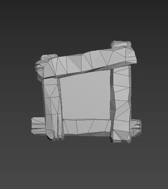
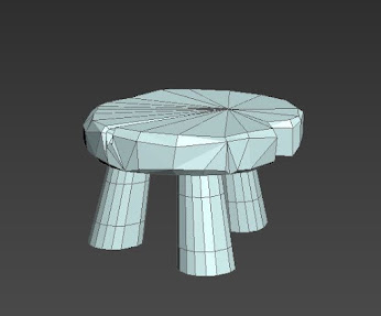
Second one: the stool, barrel, vase and fence.


Third one I packed the fire plinth, the candles and the tree trunk.


And on the fourth one, the tree crown:


Backyard Project - Substance Designer Tiling Textures

Substance Designer was quite a tricky one to learn, especially because besides the artistic and visual judgements I had to make, it is a more technical workflow than artistic, so I had to get used to that.

I started with the cobblestone texture, which I made following this tutorial and analysing it to better understand how I can use these tools further down the road, for this project, as well for future ones: https://youtu.be/dpWKcIdOLGU

I started by making a base using a Polygon2 node then a Histogram Scan and a Flood Fill and Flood Fill to Gradient to generate the shape of the cobblestone, the rocky hard surface. I repeated the step a few times to vary the shapes. I blended them together as I went using Blend nodes. I added some edge imperfections by using Perlin Noise and Warp.


I then made the grass and flowers by using Waveform and Gradient Linear and blending them together to make the shape of the petal/grass. For the grass I left them like this and plugged the node straight into the Tile Sampler, while for the flower I used Splatter Circular to arrange them in a circular shape, then put it into the Tile Sampler too. I added noise by using some Clouds.


I then blended the cobblestones and grass together, added Gradient Maps, tweaked a few things here and there and it was done. 

This is the final graph:

And the texture:


I'm quite proud of how it turned out. I changed a few things to better fit my project, one of them being the colour of the flowers and grass. Since I have a lot of blue accents in my composition, I thought blue flowers would fit better. Plus, blue always makes me think of magic, and since I am making a Sorcerer's backyard, I thought it fitting. 

Next was the plaster, which was trickier. 
I tried following a tutorial for making plaster with wood, like the medieval kind of walls, but I encountered problems. (This was the tutorial: https://www.youtube.com/watch?v=1Pz2R610A_c)


The error showed up as a really dark line around the piece of wood. This is how it looked on the normal map:


My theory is that something from the Bevel step caused it, but I couldn't find any solution to fix it, just make it less obvious, which didn't quite work, so I was advised to start again. 

The second time, I made a simple plaster node by myself, recognising that I might get errors again if I didn't properly understand a tutorial as I am following it. 

I used a tutorial just for making the cracks, and made sure I understood fully how it works: https://www.youtube.com/watch?v=62vCvWMzVt8


I used a Polygon3 node to generate a slightly curved shape, then used splatter to multiply it. I used a Bevel to further model the shape towards what it needed to be, then a blur set to a really low intensity to make the edges less harsh, then a Curvature and Histogram Scan to obtain the black lines that are gonna be the cracks. It was easy after that, I just had to use an Invert Grayscale. I then used Fractal Sum and Levels to add some gradient to the cracks and Directional Warp to vary the shapes. 


I then added some dents in the plaster, using a technique I learnt from making the stone wall tiling texture that I'm gonna write about next. I added noise and blended everything together, then added a Gradient Map and it was done. 

Next, I made the stone wall that will be at the bottom of the plaster one. For the base, I followed this tutorial: https://youtu.be/zu9tq1P_Q9M


I used Cells 3 and Edge Detect to make the shape of the rocks, then a Directional Warp with Perlin Noise to make the edges more uneven. I used once again Perlin Noise together with Slope Blur to add more of that imperfect shape to the stones. I used Flood Fill and Flood Fill to Gradient Multiple times to model the shape of the rocks, similarly to what I did for the cobblestones and used levels to lighten it back and bring back the contrast. 


I used the Shape node set to Paraboloid pattern and added more variation to the shape using Perlin Noise, then plugged it into a Tile Sampler and masked some of the pattern out so I would only get the few dents in the stone I was looking for. I later reused the shape with another tile sampler to add even more variation to the shape of the stones, then again for the base of the moss. 


I made the moss by blending the pattern I had already made for the stone shape with a couple of noises - Moisture, Perlin, Clouds 3 - , and tweaking it using Levels, Blur and Histogram Scan to reach the look I wanted. 

I then added the Gradient Maps and it was done.


Animal Project: Moodboards and Research

For the animal project I decided on a fox. Specifically a "messenger" fox. They can move fast and sneak through forests, so I was thinking they could be used by some kind forest dwelling population as a way to carry letters across the woods from tribe to tribe. Considering this narrative, I want to add some tribal like patterns on the saddle. 

I started by searching for photos of foxes, from the front, profile and back so I have my reference for sculpting convincing forms and anatomy. I also searched for the skeleton and other anatomical details that I need to keep in mind. 


I think it is really easy to turn a fox into a wolf without knowledge of their anatomy, so I tried to notice the differences in their silhouette. Besides the fact that they are smaller, foxes are a bit more slender and have more curves to them, while wolves seem more massive. The fox's muzzle has more of a triangular shape, meanwhile the wolf's is more boxy and rectangular. 

Since it's gonna be a messenger fox, it is not going to be saddled for the purpose of being ridden, rather, it will have a blanket to protect it from being hurt by the harness. Attached to the harness there will be some messenger bags on each side to carry letters in. 

I will go for a more stylized look to simulate the fur. I found these really nice sculptures of animals that I want to draw inspiration from, give the fox that mythical ethereal kind of feeling through the circular shapes in the fur:


In the end, I'd like to achieve a magical, kind of playful look with the fox.


Major Project - "Gold": Texturing The Zmeu

 The texturing for Zmeu was the most tedious out of all of them. I used fill layers and masks as much as possible to give the scales some de...