Texturing-wise, there is not much I can tell, as I've used mostly the same techniques as I did on the Hero and used most of the materials across all three of the characters, since all of them are part of the same world and need to maintain the same art style and look cohesive.
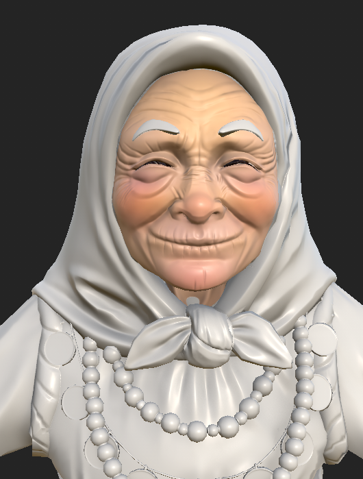
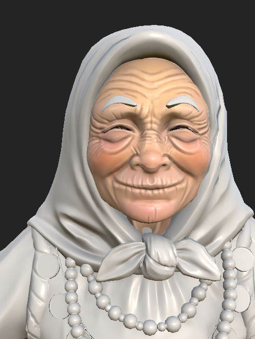
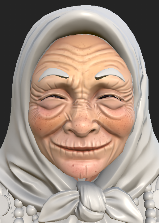
For the skin, I first added the tones of the face: some red on the cheeks and chin, some blue on the jaw and some yellow on the forehead. For Saint Friday, I used more of the yellowish tone and didn't lower the opacity of the layer as much, as I think the yellow makes her skin look older.
I also made the cheeks and chin a bit glossier using a fill layer with only the roughness on.
I then used fill layers with generators (mostly mask editor) in order to darken the cavities and lighten the edges, as well as add some ambient occlusion.
Lastly, I painted some darker spots on her skin using a Splatter brush.
For the cloth I used the same material as the Hero's shirt and only changed the colour.
I used the same leather material as I did on the Hero for the shoes, but had to control the edge highlights using a white mask and erase them as they were too strong and some of them placed weirdly. I also used a position gradient in order to control where the mud would be on the shoes and keep it only on the bottom part.
I used the same shirt material from the Hero together with the height information from the Wool smart material in Substance Painter.
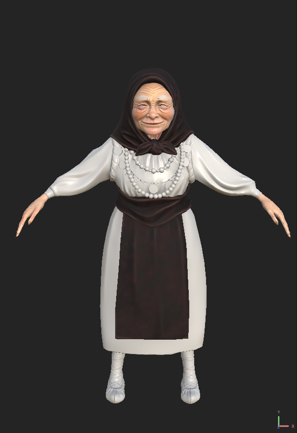
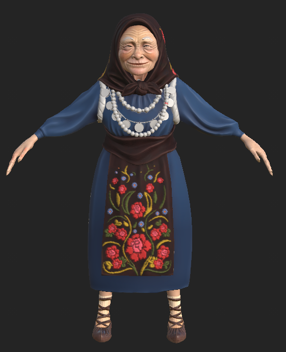
I then used stock photos from the same site I got the patterns used on the Hero, as well as pieces of patterns mixed and matched from different photos in order to create my own pattern for granny's apron and headscarf. The most well known version of the popular costume is the red cloth one that I got inspiration for the Hero from, but I couldn't repeat that. So I used the colorful patterns on dark background version for it.
For the dress: same material as for the Hero's shirt. At first, I also intended to keep it the same colour, but after getting feedback I realized that might not be a good idea. So I went through a few other options and decided on this shade of blue:
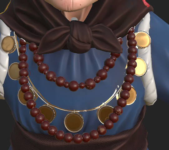
While texturing the coins, I used the metal material I used on the Hero too, only I toned down the wear and tear and the roughness, as I wanted the shiny coins to contrast with the rough beads. When texturing the beads, I used a fill layer with a procedural in order to make it look like the paint and lacquer on them was wearing off, revealing the lighter wood underneath.
For the backpack, I kept things simple. For most of the objects I used materials from the Hero: the blanket and the bag were using the shirt material as the base, while the pouch used the same leather, and the metal on the boxes was the same as the one used on the Hero's armour. I had to make the metal on the wooden box's lock look more worn, as it was a bit too shiny and didn't quit fit.
I added details such as blood dripping and staining the bottom of the green bag, making you wonder what granny is carrying in there and adding to the creepy subtext along with the bones and fingers hanging onto the backpack.
At the end, I used a dark blue fill layer with a position gradient all over the backpack, in order to add some unity to it.





No comments:
Post a Comment