Monday, 28 February 2022

Week 22 - Enhancement Week: Artwork Analysis


"A Solitary Temple Amid Clearing Peaks" is one of the few remaining painting attributed to Li Cheng, said to be the pioneer of this style of landscape painting in Chinese art.

In comparison to the Chinese painting style, Western landscape paintings are more grounded into physical reality and portray nature in a more material way. The subjects are usually countryside landscapes and the orientation is usually horizontal. Oftentimes, human figures are portrayed in the environment and are most of the times one of the interest points. 

Meanwhile, Chinese landscapes show nature in a more divine, ethereal way and convey the insignificance of humanity in contrast with the divine of nature. The verticality found in the mountain and the orientation of the drawing format portay the idea of an axis mundi, a center of the world which everything builds around in balance. The lines pointing upwards symbolise divinity and enlightment - the ultimate goal of Buddhism. The overall look and feeling of the painting is more flowy and less earth-bound than its Western counterparts. Afterall, it represents mountains, a symbol for the divine and a middle space between sky and earth, usually home to mountain gods and spirits in Chinese folklore. 

The painting uses soft, curved strokes for the mountains, in contrast to the straight, rigid lines used for the man-made temple. The building is small in comparison to the vast landscape, insignificant in the eyes of gods. 

The trees in the foreground contrast to the background. The lines used are darker and more aggressive than the cursive soft lines of the mountains, which brings them, as well as the temple they frame, into focus. The details are painted with smaller, thinner strokes, probably after the painting had dried. 

The foreground is visibly darker overall, while the mountains in the background fade out the farther they get, which creates the impression of depth through atmospheric perspective. The mountain fades to almost white at the bottom, around the temple, which frames the building bringing it forward. It might also represent fog, giving the painting an even more mysterious, immaterial look. 

The composition makes a winding shape, leading the viewer's eyes from the bottom, zigzagging up through the mountains. 


A Solitary Temple Amid Clearing Peaks (晴巒蕭寺圖), Attributed to Li Cheng (李成, 919–967), Five Dynasties period (907–960)


In conclusion, the differences between the Chinese landscape paintings and Western ones are visible throughout the themes portrayed and techniques used. It proves how art encompasses culture and is able to visually convey it to anyone and everyone. Even if we don't notice the specifics, the feeling we get loooking at this work tells us its story and shows us its origins. 

Saturday, 26 February 2022

Backyard: Texturing the Assets

For the textures, I made a general material for one of them (eg. wood) and then reused it on all of the assets that used it, changing settings where necessary to fit the object. This helped me work faster as well as make the assets look similar and the scene put together and pleasant to look at. 

I started with the door. I made the wood material for the pieces of wood framing it and the window. I made it using mask editors and mostly tweaking the general settings as well as the curvature ones to add the highlights on the edges and the darker tones in the cracks. I also used the light generator and some procedurals to add colour variation. I kept it simple to not break the stylized look. I then copied the material over the main part and changed its colour to purple as well as changed a few settings where needed. 

I then made the stone and the metal material and added the colour and the emissive layer. 


For the fence I used the wood material made for the door and just changed a few things since the white highlights were very strong and made it look very noisy. 

Same for the window and added the blue part and the emissive, as well as the same metal material from the door for the nails. 

Again here, for the stairs and stool. 

For the tree I changed the colour to a more reddish brown, as it didn't stand out among the other assets as it should have, but as a base, I used the same wood material. 

I then added the rope and the paper sheets hanging from it. I added a bit of reddish tint using the light generator on the rope, as I think it looked too simple and this makes it more interesting without looking out of place. I added the emissive on the glowing runes. 


I proceeded to texture the treecrown, adding some colour variation through procedurals. I also added the light edges and the darker cracks using mask editors. I added the opacity afterwards, in the engine. Looking back, I think I could have added more colour variation. I think one of my biggest mistakes was not beginning the texturing with the central asset and rushing through the last steps because of this. I will remember to not repeat this mistake next time when I work on a bigger project with multiple assets.


For the smaller assets it went faster. I didn't spend much time on the vase as it wouldn't be very visible and it would be small. 


For the candle support and the plate holding the fire I just took the metal material from the doorknob and changed the colour as well as some details. I also like how the purple fits in on the candles. For the lamp I took the metal material and just added the emissive part. 


Overall, I am really happy with how the assets turned out. The only thing I would change is the treecrown, which needs more detail and should have been more interesting as part of the central point of the scene. 

Week 21 - Human Body Dynamics. Using Indian Ink and Ink Washes

I was really excited for this week's task after such a long time using just pencils and charcoal. I had been in love with watercolour for a few years before starting to work more with pencil, so I was really happy since ink washes are similar, just that the tones are gray. 

Even so, when I was painting with watercolours, I would always sketch beforehand. Since I wasn't allowed to do it this time, it was quiet nerve wrecking to put brush to paper at first. I started with using light tones and then switched to even lighter just to be safe, until I had the general shape. Then I used a slightly darker tone to work into the strongest shadows and midtones. I really liked how the really strong light area on the leg looked, so I avoided adding much more definition there.


After it dried a bit, I added even darker tones and quickly added some shadows on the face to indicate the general shape. I added some details, like the shadows of the ribs. I also added the background, since it looked like the model was floating in a void and this weird feeling distracted from the drawing itself. Plus, the overall darker background makes the person stand out. 


For the next drawing, I had to use ink washes to indicate the tones and shapes of the muscles and anatomy, then use line in the darkest parts as well as in places with interesting shapes. This time, I wasn't as scared of making a mistake at the beginning, so I managed to move faster and leave the drawing to dry a bit before adding the line, so it wouldn't spread and smudge. I really like how the shadows and muscles on the legs started to take shape and the highlights and the contrast were already forming.


Afterwards, because the drawing was lacking detail, I observed the shadows further and overall added more contrast. The shadow on the leg underneath was quite flat, so I worked on that and I must say I am really proud of how it looks. Now, the shadow gives even more tridimensionality to the leg. If I'm honest, I think the leg area is my favourite of this drawing. I also added the background and made the cast shadow really dark so the model would contrast against it and be the focal point. 


The next one was my favourite, though I really enjoyed all of them. I think because it was the last one and the first ones allowed me to get used to making more gestural drawings and portraying the human body in a more dynamic, subjective way, I gave myself the freedom to draw more loose, more expressive lines.

This time I was allowed to start with a quick pencil sketch and I was happy to see how gestural even my sketch ended up being. I then faded the pencil lines with a putty rubber and started adding lines, as I didn't want to spend much time on the sketch.


I tried to keep everything as curved and organic as possible, in order to keep the shapes from becoming stiff. I really like how the left leg turned out, as well as the shadow on the chest. The "shading" on the leg was a mistake that I plan to fix it with a bit of white tempera.


Lastly, I added the background using really loose lines to convey the folds of the drapery, as well as added cast shadows to bring more contrast and push the focal point, the model, forward. 


I really enjoyed this task. I think it helped me learn to build the shapes without using lines and at the same time taught me to use more gestural line to make my drawings more dynamic and expressive. I like that none of the drawings ended up looking stiff and actually have quite some flow to them. I think the tones could have had even more variation and the drawings could have overall been a bit tidier, but I think that is something that will most likely come with practice.

I will make the last few corrections and then post the final drawings here.


Sunday, 20 February 2022

Week 18 - Impressionism and Post Impressionism. Artwork Analysis.

For this artwork analysis task, I chose one of Vincent Van Gogh self-portraits: "Self-Portrait with Grey Felt Hat." Van Gogh is one of the most renowned figures in art history, due to his eccentric painting style and tumultuous life. He was an adept of the post-impressionist movement, which reflects heavily in his paintings through its thick layers of paint applied in broad, unblended lines to reflect certain emotions.

Unlike Impressionists, who were mostly focused on recreating the subject in a realistic way, Post-Impressionists concentrated more on bringing forward the subjective view the painter had of his painting's subject. In this case, the strokes, applied in a circular shape on the background around the portrait and the lines that seem almost like they concentrate to the centre of the face, bring the attention of the viewer towards the focal point, the portrait itself. The eyes, the sole area where only a single colour has been applied - green - are framed by these lines, bringing them into focus as they stare at the viewer. 

The way the unblended strokes of strong colour are being used reflects the mental state of the painter, who is also the subject of the portrait, as well as his view of himself: the painting gives off the feeling of a turbulent, chaotic personality, and of an anxious and troubled mind.

The face is the only area where warm colours were used, though a faint echo of yellow can be visible in the hat too. Even so, the face is where they are most concentrated and vivid and the use of orange, the warmest colour, contrasting with the blue - coldest colour and it's complementary - background guides the viewers attention towards the face. The shadows themselves are also really colourful: on the left side of the face, green is used more heavily to create the impression of shadow, while on the grey hat blue is used for this. On the clothes, a greyish brown was used in the darker parts.

Vincent Van Gogh -Self-Portrait with Grey Felt Hat, 1887

In conclusion, as a post-impressionist painter, Vincent Van Gogh concentrated more on emotion and the feeling his paintings would evoke, as well as his artistic interpretation of the subject, rather than the degree of realism in his work. 


Week 20 - Nude Figure on Black Paper

This one was trully a challenge... It took everything I knew about shading and rendering and turned it inside out. It also forced me to rely less on line and more on shading, which is something I really need to learn to do. So I might practice more using white pastel on dark paper from now on.

I began by sketching the shapes. My first mistake was outlining too much, which made it dificult to make the shapes three dimensional afterwards. On the other hand, I am really happy with how the leg pointing forward came out. By breaking it down into simple shapes and properly measuring the model's proportions, I managed to achieve quite accurate foreshortening, which is something I've been struggling with until now. So this was really a win.


I had problems with the foreshortening in the other leg though, since the angle was weird and pretty complicated, but with some indications and help it turned out well. I started shading, trying to go from the lightest areas to the darkest and also erasing the outlines I had created previously.


The hands were really simple and flat, so I added more detail and midtones by using my putty rubber. I worked changing between the pastel, the putty rubber and the normal rubber to create light parts and then modify the dark areas by carving into them with the erasers. I also added more of the background in order to make the darker shadows of the model stand out.


After shading the whole body I went on to add the hair and work more on the drappery to have a solid background to contrast the figure to.


I then tried to work on the face, but at some point it started to look scary and grotesque, due to the amount of detail I was trying to fit in such a small space. 


Following the advice I had been given, I made the face more generic and simplified it to its basic planes. It immediately started looking better. I also darkened some of the shadows and lightened some of the highlights in order to add some more contrast and make the figure stand out.


This is the final work:


I will look at some references in order to add further detail to the hands.

It took a while for me to get the hang of this process as it was completely different of what I was used to: instead of going from the darkest shadows to the highlights, I had to go from lightest parts to the shadow. It was a challenge, but it made me work more with the shading rather than with lines, which is something I really want to practice more.

After the feedback, I added more tonal variation and built up the white more. I added more details and darkened the left shoulder. There were also too many repetitive elements in the torso, so I fixed that and added more consistent shadows on the drapes.


Week 19 - Focus on Anatomy

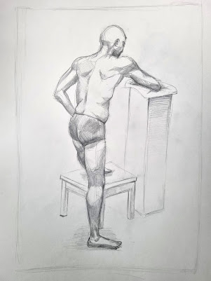
This week's task was quite a challenge: going from just a portrait to full body drawing requiring an understanding of anatomy and proportions. I also felt really pressured by the time limit, especially in the first sketch. I think it shows, since I believe the first one has the stiffest lines and shapes. 

At first, I had taken a really technical approach to this, which wasted me time, so I instaed tried to use quick measurements, verticals and horizontals, in order to estabilish the sizes and distance between different parts of the body. 


I then used some quick shading to highlight the main muscles.


The second one was tricky because of the foreshortening in the front leg, which I messed up on the first try. After getting some indications and a little help though, I managed to fix it.


I think the foot could still be a tiny bit bigger and maybe the head slightly smaller:


The third one I am quite proud of. It is more lose and the lines more flowy, more relaxed. The shading, altough simple, indicates the main shapes of the body, the main muscles, and gives it dimensionality. The perspective in the stool is slightly wrong, so I will have to fix that. 

I also want to add more detail to my shading for all of these, so I will use this as an oportunity to further my knowledge of human anatomy and shading and return with the finished products.

My use of line in the first two could have been better, both of them a bit plain and quite stiff looking. The shading could also benefit from some detail too, although I like the chest and overall torso area on the first one. The third one I believe has a much better use of line and a much better flow, as well as more pleasant shading that effectively describes the forms of the body.

After getting feedback, I changed a few things: 
For the first one, I added more tones on the arm and fixed the anatomy on the back leg. I also tried to use line weight more and faded the back leg a bit. For the second one, the knees were too small, breaking the foreshortening illusion, so I made them bigger as well as added some width to the thigh. I tried to add more details into the leg muscles and redrew the foot on the foreground as it looked awkward. I also defined the toes on the other one more. For the last one, I defined the shoulder more and the back of the leg. I got rid of the shading on the stand as it looked overworked and fixed the perspective on the table. 


Week 18 - Impressionism and Post Impressionism. Portrait in Cold and Warm Colours

I want to start by saying I am quite proud of how my use of colour si evolving. Yes, it might not be perfect, but in just two tasks it had gone from an unblended mess of missused colours to quite a decent choice of pallete and blending, so I am really pleased and excited to develop my skill further.

I started by sketching a quick thumbnail in order to establish the composition.  


I placed the portrait slightly to the left, since I had a partial 3/4 view. I then started constructing the face by meassuring and using verticals and horizontals in order to figure out where each part of the face was in relation to the others. This time, I worked with multiple colours from the beginning in order to make sure they blend and fit well together. I used pure blue only in the eyes, in order to make them the focal point, as I believe they are one of the most expressive features of the face. They are believed to be "a mirror of the soul" so bringing them forward would also help convey the personality of the model better. I used purpled and a warm brown for the shadows.


I then added the midtones using an orange colour and, for the lighter tones, yellow. 


After shading, I had the same problem as I did with the warm colour portrait. The eyes became too small for the face because of the dark shading, so I had to make them bigger and bring them a bit outward to not mess up the proportions of the face. 

This is the final outcome after working on the clothes too. I think some more contrast on the face would be useful, as well as some more work on the clothes area.


After fixing this, I will post the final work here. 

After getting feedback, I tried to add more colours and blend them more, as some of the transitions were harsh. I added more contrast to the eyes and fixed their positioning as one of the pupils was slightly off and the right iris was too small. I blended more purple in the light side of the face. 


Overall, I am starting to enjoy using colour, and I am quite proud of the palette choice here as well as of the shading on the face. I think after adding more contrast it will look even better. 


Week 17 - Composition in Portrait. Colour Aesthetics and Drawing Techniques

For this week's task we had to produce two portraits: one using warm colours and another using cold colours. To be honest, I always get nervous when it comes to working in colour, especially coloured pencils and pastels. I feel like I don't yet manage to properly use and blend them. Still, compared to last term's Chernobyl task and the coloured portrait from first year, in this task a lot of improvement can be seen.

I started by sketching out a quick thumbnail in order to establish the composition. Again, it wasn't too hard to figure out: I placed the portrait a bit to the right since it's in 3/4 view and I needed to leave more space to the left, in front of the face.

I then started sketching and did my best to also add some of the generic and darkest shadows as I went, in order to speed up the process and convey the shapes and forms better.

There was already a high level of resemblance so I was quite pleased with the construction phase.


I then added the rest of the shadows and the midtones in the same orange colour. I think one of the things I regret is not adding the rest of the colours earlier. I think they might have blended together better. 


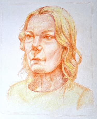
After that, I added some yellow in the lighter parts and darkened the shadows with a warm, reddish brown. One of the problems I faced was the eye size. When I had constructed the face it was fine, but after shading they started looking quite small, so I had to fix that a few times and make them bigger to balance the effect.


Next, I added more yellow on the hair and clothes, to bring out the orange area which is the face, the focal point of the portrait, of course. 

This is the result for the warm colour portrait:


For the cold colours portrait, I had to use the first one as reference. Looking back, it might have been a better idea to proceed onto this task using a model from the internet, but hopefully I achieved the proportions if not the resemblance.

After getting feedback, I got rid of the harsh outline on the jaw and added some shadows there and on the chin. I also added more yellow on the forehead, chin and nose and tried to increase the contrast. I darkened the eyes more too.


I started by sketching and adding the main shadows:


Looking at it, I realised that the eyes are too close together and the nose and face too narrow, so I fixed that before adding the midtones using some purple and light blue. 


The face was too long and the lines a bit too harsh, so I shortened it and tried to soften the shape of the face. I also shaded the hair and I am quite pleased with how it turned out


For the final steps I added some more details and shaded the clothes.


The eyes still seem a bit too close together and the clothes could use some more careful shading so, after fixing these aspects and getting some feedback, I will come back to this post with the finalised result. 

After getting feedback, I darkened the eyes and redrew the shoulder as it was too straight. I also added shadow on the jaw. I needed to photoshop it a bit back, as it was too pushed forward. I also darkened the left side of the face more. 


That being said, I think I managed to recreate the model's personality quite decently. She had this slightly serious feeling to her that I think is more noticeable in the cold portrait. The cold colours make her feel more distant, pulling her away from the viewer, placing her farther, in a more distant plane of reality. Meanwhile, the warm colours brought out more of her warm side that, despite some of the harsher lines of her face, shone bright in the first portrait. The orange and yellow tones also made her seem closer and more approachable.

In conclusion, it was a nice experience and I am very pleased with my progress in using colour. I think I am on the right track of understanding how to better use it in my composition.


Major Project - "Gold": Texturing The Zmeu

 The texturing for Zmeu was the most tedious out of all of them. I used fill layers and masks as much as possible to give the scales some de...